9Dashboards, Storytelling & Putting It All Together
8
Dashboards, Storytelling & Putting It All Together
Bringing it all together – business applications, social good, ethics, and your portfolio
9.1 Learning Objectives
By the end of this chapter, you will be able to:
Apply visualization skills to real-world business problems
Understand visualization for social good and justice
Navigate ethical challenges in data visualization
Build a visualization portfolio that demonstrates range and depth
Synthesize all the skills from this book into a complete project
We have arrived at the final chapter. Over the preceding seven chapters you have built an extraordinary toolkit: you can perceive visual patterns, apply design principles, construct layered graphics with ggplot2, choose appropriate chart types, wrangle messy data into tidy form, add interactivity, and map geographic data. In Chapter 6, you also saw a demonstration of Shiny – R’s framework for building reactive web applications. This chapter brings it all together. We ask the questions that matter most: What will you do with these skills? Who will benefit? And how will you ensure your work is honest, inclusive, and purposeful?
This is the culmination of the book – not just a final project, but a moment of integration. The technical skills you have acquired are powerful, but power without direction is hollow. This chapter connects your craft to purpose: business value, social good, and ethical responsibility.
9.2 Common Errors – Capstone Troubleshooting
These are the most common issues encountered when working on comprehensive R Markdown documents. Save yourself hours of frustration by reading these before you start.
“My R Markdown won’t knit”
Check for unmatched backticks, missing library() calls, or chunks that depend on objects created in earlier chunks that errored out. If Chunk 3 creates an object called my_data but Chunk 3 has an error, then Chunk 5 which uses my_data will also fail. Fix errors from the top of your document downward.
“My plot looks different when knitted vs. in RStudio”
The knitted version uses the fig.width and fig.height values from the chunk options, not your RStudio plot pane dimensions. Set these explicitly in each chunk header: ```{r}. The default is often too small for complex multi-panel dashboards.
“Interactive widgets don’t show in PDF”
Interactive widgets (plotly, DT, leaflet) only work in HTML output. If you need interactive elements in your capstone, make sure your YAML header says output: html_document, not output: pdf_document. You cannot have both – choose HTML if you want interactivity.
“My code works when I run it line by line but not when I knit”
Knitting runs in a fresh R session. It does not have access to objects you created in the console, packages you loaded manually, or data files you read in outside the .Rmd file. Make sure every library() call and every data loading step is inside a code chunk in your .Rmd file. A good test: restart R (Session > Restart R), then click “Knit.” If it fails, you have a missing dependency somewhere in your document.
9.3 1. Business Applications of Data Visualization
In industry, the ability to create clear, compelling visualizations is one of the most sought-after analytical skills. Every function of a modern organization relies on data visualization to make decisions:
Marketing: Customer segmentation plots, A/B test result comparisons, campaign performance dashboards, funnel analysis charts
Operations: Supply chain monitoring dashboards, quality control charts (SPC), process flow visualizations, inventory level trackers
Human Resources: Employee engagement survey results, diversity and inclusion metrics, attrition analysis, compensation benchmarking
The key insight for business visualization is that the audience is almost always a decision-maker who is short on time. Your chart must answer a question in seconds, not minutes. Labels must be clear, colors purposeful, and the main takeaway unmistakable.
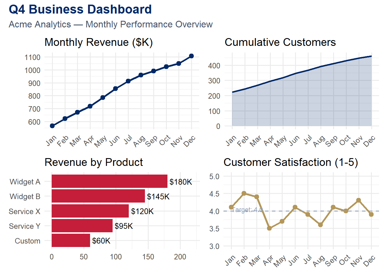
Let us build a multi-panel business dashboard that a manager might review at a Monday morning meeting. We use patchwork to compose four distinct panels into a single cohesive view:
Code
library(tidyverse)
── Attaching core tidyverse packages ──────────────────────── tidyverse 2.0.0 ──
✔ dplyr     1.1.4     ✔ readr     2.1.5
✔ forcats   1.0.0     ✔ stringr   1.5.1
✔ ggplot2   4.0.0     ✔ tibble    3.3.0
✔ lubridate 1.9.4     ✔ tidyr     1.3.1
✔ purrr     1.1.0
── Conflicts ────────────────────────────────────────── tidyverse_conflicts() ──
✖ dplyr::filter() masks stats::filter()
✖ dplyr::lag()    masks stats::lag()
ℹ Use the conflicted package (<http://conflicted.r-lib.org/>) to force all conflicts to become errors
Code
library(patchwork)set.seed(2024)# Simulated business datamonthly <-tibble(month =factor(month.abb, levels = month.abb),revenue =cumsum(rnorm(12, 50, 15)) +500,customers =cumsum(rpois(12, 20)) +200,satisfaction =round(runif(12, 3.5, 4.8), 1))p1 <-ggplot(monthly, aes(x = month, y = revenue, group =1)) +geom_line(color ="#002967", linewidth =1.2) +geom_point(color ="#002967", size =2.5) +labs(title ="Monthly Revenue ($K)", x =NULL, y =NULL) +theme_minimal(base_size =12) +theme(axis.text.x =element_text(angle =45, hjust =1))p2 <-ggplot(monthly, aes(x = month, y = customers, group =1)) +geom_area(fill ="#002967", alpha =0.2) +geom_line(color ="#002967", linewidth =1) +labs(title ="Cumulative Customers", x =NULL, y =NULL) +theme_minimal(base_size =12) +theme(axis.text.x =element_text(angle =45, hjust =1))# Product breakdownset.seed(2025)products <-tibble(product =c("Widget A", "Widget B", "Service X", "Service Y", "Custom"),revenue =c(180, 145, 120, 95, 60)) %>%mutate(product =fct_reorder(product, revenue))p3 <-ggplot(products, aes(x = revenue, y = product)) +geom_col(fill ="#C41E3A") +geom_text(aes(label =paste0("$", revenue, "K")), hjust =-0.1, size =3.5) +labs(title ="Revenue by Product", x =NULL, y =NULL) +xlim(0, 220) +theme_minimal(base_size =12)p4 <-ggplot(monthly, aes(x = month, y = satisfaction, group =1)) +geom_line(color ="#B4975A", linewidth =1.2) +geom_point(color ="#B4975A", size =2.5) +geom_hline(yintercept =4.0, linetype ="dashed", color ="#94a3b8") +annotate("text", x =1, y =4.05, label ="Target: 4.0",hjust =0, size =3, color ="#94a3b8") +labs(title ="Customer Satisfaction (1-5)", x =NULL, y =NULL) +ylim(3, 5) +theme_minimal(base_size =12) +theme(axis.text.x =element_text(angle =45, hjust =1))(p1 + p2) / (p3 + p4) +plot_annotation(title ="Q4 Business Dashboard",subtitle ="Acme Analytics — Monthly Performance Overview",theme =theme(plot.title =element_text(face ="bold", color ="#002967", size =16),plot.subtitle =element_text(color ="#475569", size =12) ) )
Study this dashboard carefully. Notice how each panel answers a distinct question: Is revenue growing? Are we acquiring customers? Which products drive revenue? Are customers satisfied? Together, the four panels provide a holistic snapshot of business health. The consistent color scheme – dark navy for the primary metrics, accent red for the product breakdown, and gold for satisfaction – creates visual coherence.
Tip
Dashboard design principle: Each panel in a dashboard should answer exactly one question. If a panel tries to answer two questions, split it into two panels. If a panel does not answer any question, remove it. Dashboards are not decoration; they are decision-support tools.
9.4 Try It: Dashboard Builder
Build a multi-panel business dashboard from scratch. Select metrics, choose layouts, adjust color themes, and see how design decisions shape the story your dashboard tells.
You have just explored the principles of effective dashboard design. Now build your own. The sandbox below lets you select data panels, layouts, and themes to compose a business dashboard — and see how design choices affect communication.
🧪 Business Dashboard Composer — Design Your Own
If the app takes a few seconds to load on first visit, that is normal — the server is waking up.
Exploration Tasks:
Start with the default dashboard layout. What story does it tell? Is the most important metric prominent?
Try a different layout — does rearranging panels change which information the viewer notices first?
Switch the theme — how does color and typography affect the dashboard’s professionalism and readability?
Imagine presenting this dashboard to a VP of Marketing. What would you change to make it more actionable?
What You Should Have Noticed: Dashboard design is about hierarchy — the most important metric should be the most visually prominent. Layout, color, and typography all contribute to guiding the viewer’s eye. A dashboard that shows everything with equal emphasis effectively shows nothing.
AI & This Concept When asking AI to design a dashboard, describe your audience and key decisions first: “Create a dashboard for a marketing director who needs to decide which campaigns to scale.” This context shapes which metrics to highlight, what comparisons to enable, and how to prioritize the visual hierarchy.
9.6 2. Visualization for Social Good
Data visualization is not just a business tool. It is a tool for justice, advocacy, and human understanding. Throughout history, some of the most powerful visualizations have been created not to maximize profit but to expose injustice:
Florence Nightingale’s rose diagram (1858) revealed that more soldiers died from preventable disease than from battle wounds, leading to hospital sanitation reforms that saved thousands of lives.
W.E.B. Du Bois’s data portraits (1900) visualized the economic and social conditions of Black Americans at the Paris Exposition, confronting viewers with the reality of inequality.
Hans Rosling’s Gapminder visualizations dismantled myths about the “developing world” by showing that the majority of humanity lives in middle-income countries with improving health outcomes.
Today, data visualization for social good takes many forms:
Mapping food deserts to advocate for grocery stores in underserved areas
Visualizing air quality data near industrial sites to support environmental justice
Tracking healthcare access disparities across neighborhoods, counties, or countries
Showing educational achievement gaps to direct resources where they are needed most
Mapping refugee flows to build empathy and inform humanitarian response
Note
Ethical Connection: As data professionals, we have a responsibility to use our skills in service of others. When we visualize inequality, we are not just making charts – we are making the invisible visible. We are using our technical skills in service of justice and the common good.
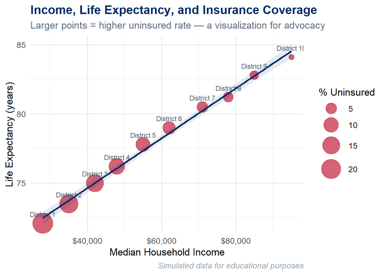
Let us create a visualization that exposes the relationship between income, health, and insurance coverage across neighborhoods in a hypothetical city. This is the kind of visualization that a community organizer, public health official, or city council member could use to advocate for change:
Code
set.seed(2024)# Simulated disparity data for a hypothetical citydisparity <-tibble(neighborhood =paste("District", 1:10),median_income =c(28, 35, 42, 48, 55, 62, 71, 78, 85, 95) *1000,life_expectancy =c(72.1, 73.5, 75.0, 76.2, 77.8, 79.0, 80.5, 81.2, 82.8, 84.1),pct_uninsured =c(22, 18, 15, 12, 9, 7, 5, 4, 3, 2))ggplot(disparity, aes(x = median_income, y = life_expectancy)) +geom_point(aes(size = pct_uninsured), color ="#C41E3A", alpha =0.7) +geom_smooth(method ="lm", se =TRUE, color ="#002967",fill ="#002967", alpha =0.1) +geom_text(aes(label = neighborhood), vjust =-1.3, size =3, color ="#475569") +scale_x_continuous(labels = scales::dollar_format()) +scale_size_continuous(range =c(3, 12), name ="% Uninsured") +labs(title ="Income, Life Expectancy, and Insurance Coverage",subtitle ="Larger points = higher uninsured rate — a visualization for advocacy",x ="Median Household Income",y ="Life Expectancy (years)",caption ="Simulated data for educational purposes" ) +theme_minimal(base_size =13) +theme(plot.title =element_text(face ="bold", color ="#002967"),plot.subtitle =element_text(color ="#64748b"),plot.caption =element_text(color ="#94a3b8", face ="italic") )
`geom_smooth()` using formula = 'y ~ x'
The story this chart tells is stark: where you live predicts how long you live. Districts with lower median incomes have lower life expectancies and higher rates of uninsured residents. The bubble size encoding makes the uninsured rate viscerally visible – the largest, most alarming circles belong to the poorest neighborhoods. The regression line with its confidence band confirms that this is not random scatter; it is a systematic pattern.
This is the power of data visualization for social good. A table of numbers might convey the same information, but it would not move anyone. The chart makes the injustice visible at a glance, and that visibility is the first step toward action.
9.7 3. Ethics in Data Visualization
With the power to shape perception comes the responsibility to do so honestly. Every visualization is an argument – it emphasizes certain patterns and downplays others. The choices you make about scales, colors, labels, and what data to include or exclude are all rhetorical choices. They can illuminate truth or obscure it.
9.7.1 Common Ethical Pitfalls
Cherry-picking data: Selecting only the time period, subset, or variables that support a predetermined narrative. A stock chart that starts at a market low will always show impressive growth. An honest chart shows the full context.
Misleading scales: Truncating the y-axis to exaggerate small differences, using non-zero baselines on bar charts, or employing dual y-axes with mismatched scales to create false correlations. These are among the most common forms of chart deception.
Ignoring uncertainty: Presenting point estimates without confidence intervals, error bars, or any indication of variability. Every estimate has uncertainty; hiding it makes your chart look more authoritative than the data warrants.
Decontextualizing data: Showing raw counts instead of per-capita rates (making large states look worse), comparing absolute numbers across populations of vastly different sizes, or removing seasonal adjustments from time series data.
Privacy concerns: Mapping data at such fine geographic resolution that individuals can be identified. Showing demographic breakdowns of small groups where members might recognize each other’s data points.
Algorithmic bias in automated visualizations: When visualization tools automatically choose scales, bins, or color mappings, they may introduce biases that the creator never intended.
Warning
A cautionary example: In 2020, the Georgia Department of Public Health published a bar chart of COVID-19 cases by county where the x-axis dates were not in chronological order. The visual impression was that cases were declining, when in fact they were not. Whether this was intentional deception or an honest mistake, the effect was the same: the chart lied. Always check your axes.
9.7.2 Principles for Ethical Visualization
Be truthful – Represent the data accurately. Do not distort scales, cherry-pick subsets, or hide inconvenient findings.
Be transparent – Show your data sources, methodology, and any transformations you applied. A reproducible R Markdown document is inherently more transparent than a static image.
Be inclusive – Consider diverse audiences. Use colorblind-friendly palettes. Provide alt text for screen readers. Test your charts with people who are not experts in your domain.
Be humble – Acknowledge uncertainty and limitations. Show confidence intervals. Note sample sizes. Admit what the data cannot tell you.
Be purposeful – Every visualization should serve a legitimate need. Ask yourself: Does this chart inform, or does it merely impress? Does it help the viewer understand, or does it manipulate?
Cairo’s five qualities of great visualizations: In The Truthful Art, Alberto Cairo argues that excellent visualizations are truthful, functional, beautiful, insightful, and enlightening. Notice that truthfulness comes first. Beauty without truth is propaganda.
9.8 4. Building Your Visualization Portfolio
Whether you are heading into an MBA career, a data analytics role, a consulting position, or graduate research, a visualization portfolio is one of the most compelling things you can show a potential employer or collaborator. Unlike a resume, which tells people what you can do, a portfolio shows them.
9.8.1 What to Include
Your portfolio should contain 5 to 8 of your best visualizations, each accompanied by:
The business or research question the visualization answers
A brief narrative explaining your design choices (why this chart type, why these colors, why this level of detail)
Technical details: what tools, data sources, and methods you used
What you learned or what surprised you in the data
Aim for range: include static charts, interactive visualizations, at least one map, and ideally a dashboard. If you explored Shiny (you saw a demo in Chapter 6, and your comprehensive project can optionally include a Shiny component), a reactive application would further distinguish your portfolio. Show that you can work with different data types (time series, geographic, categorical, high-dimensional) and different audiences (executives, analysts, the general public).
9.8.2 Where to Host
GitHub Pages – Free, version-controlled, and demonstrates your technical fluency
RPubs – One-click publishing from RStudio, ideal for R Markdown documents
Quarto Pub – The modern successor to RPubs, supporting Quarto documents
Personal website – Maximum control over presentation and branding
Posit Connect – Enterprise-grade hosting for Shiny apps and R Markdown reports
9.8.3 A Portfolio-Worthy Example
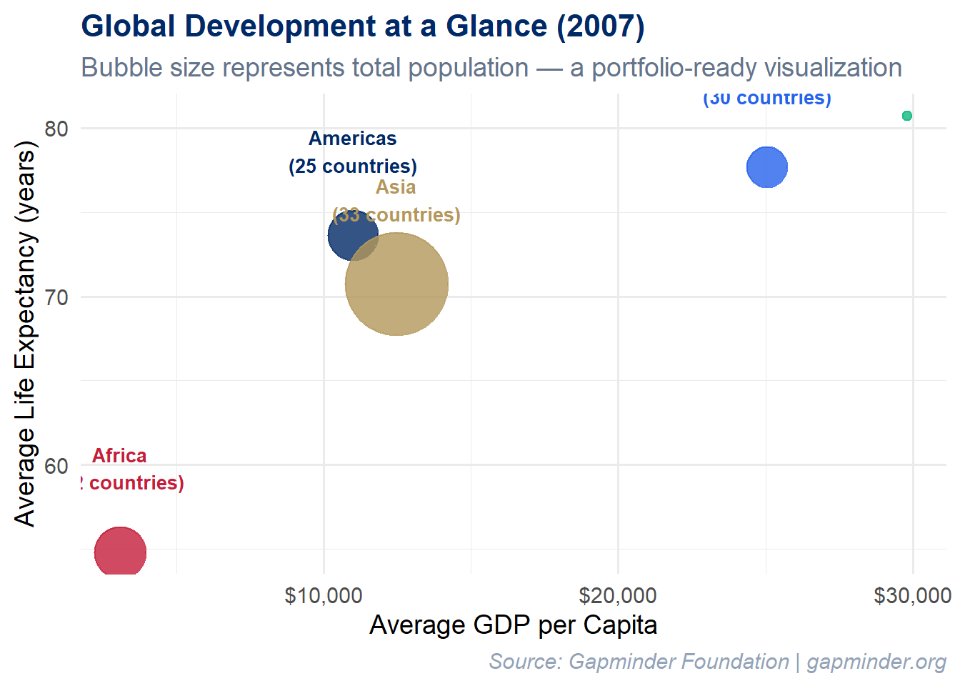
Here is the kind of polished, publication-ready visualization that belongs in a portfolio. It uses the Gapminder dataset to show the relationship between wealth and health across continents, with population encoded as bubble size:
Code
library(gapminder)
Warning: package 'gapminder' was built under R version 4.5.2
Code
set.seed(2024)gapminder %>%filter(year ==2007) %>%group_by(continent) %>%summarise(avg_life =mean(lifeExp),avg_gdp =mean(gdpPercap),total_pop =sum(as.numeric(pop)),n_countries =n(),.groups ="drop" ) %>%ggplot(aes(x = avg_gdp, y = avg_life, size = total_pop, color = continent)) +geom_point(alpha =0.8) +geom_text(aes(label =paste0(continent, "\n(", n_countries, " countries)")),vjust =-1.5, size =3.5, fontface ="bold", show.legend =FALSE) +scale_x_continuous(labels = scales::dollar_format()) +scale_size_area(max_size =25, guide ="none") +scale_color_manual(values =c("Africa"="#C41E3A","Americas"="#002967","Asia"="#B4975A","Europe"="#2563eb","Oceania"="#10b981" )) +labs(title ="Global Development at a Glance (2007)",subtitle ="Bubble size represents total population — a portfolio-ready visualization",x ="Average GDP per Capita",y ="Average Life Expectancy (years)",caption ="Source: Gapminder Foundation | gapminder.org" ) +theme_minimal(base_size =14) +theme(legend.position ="none",plot.title =element_text(face ="bold", color ="#002967", size =16),plot.subtitle =element_text(color ="#64748b"),plot.caption =element_text(color ="#94a3b8", face ="italic") )
What makes this portfolio-worthy? It is clean (minimal non-data ink), purposeful (every visual element encodes information), branded (consistent color scheme), and contextualized (clear title, subtitle, and source attribution). If you showed this in a job interview and could explain every design decision, you would make a strong impression.
9.9 Try It: Portfolio Showcase Template
You have just seen what a portfolio-worthy visualization looks like. Now experiment with building your own portfolio layout. The sandbox below lets you choose a visual theme, pick chart types, and draft your analysis and reflection — a live preview of what your capstone could look like.
🧪 Portfolio Showcase Template
If the app takes a few seconds to load on first visit, that is normal — the server is waking up.
Exploration Tasks:
Switch between the four portfolio themes — which one best fits the tone of your capstone project?
Try different chart types and notice how the theme colors adapt — does the chart remain readable in every theme?
Type a project title and a few sentences of analysis — see how the full portfolio layout takes shape.
Write a brief ethical reflection — even a single sentence helps you practice connecting data work to purpose.
What You Should Have Noticed: A portfolio is more than a collection of charts — it is a designed document with a consistent visual identity, clear narrative, and purposeful reflection. The theme, typography, and layout choices all communicate professionalism and intentionality. Use this template as a starting point for your capstone.
AI & This Concept When asking AI to help with your capstone portfolio, provide the rubric criteria explicitly: “Help me write a 2-sentence analysis of this scatter plot. The rubric values clear interpretation that tells a data story and draws insight.” AI produces better portfolio content when it knows the evaluation criteria.
9.10 5. Book Review – The Nine-Chapter Journey
Let us step back and appreciate how far you have come. Here is the arc of this book:
Chapter
Topic
Key Skill Acquired
1
Introduction to Data Viz & R
Seeing the importance of visualization (Anscombe, Datasaurus); R setup
2
Visual Perception & Design
How the eye processes data; Tufte’s principles, data-ink ratio, ethics
3
Grammar of Graphics & ggplot2
Building layered plots with data + aesthetics + geoms
4
Chart Types & Variations
Choosing the right chart: lollipop, ridgeline, treemap, heatmap
5
Data Wrangling Essentials
Tidy data, dplyr verbs, the pipe operator, pivoting
6
Interactive Visualizations
plotly, DT, heatmaply, a taste of Shiny
7
Geographic Visualization
Leaflet maps, choropleths, coordinate systems, sf
8
Dashboards & Storytelling
Business, social good, ethics, portfolio – putting it all to use
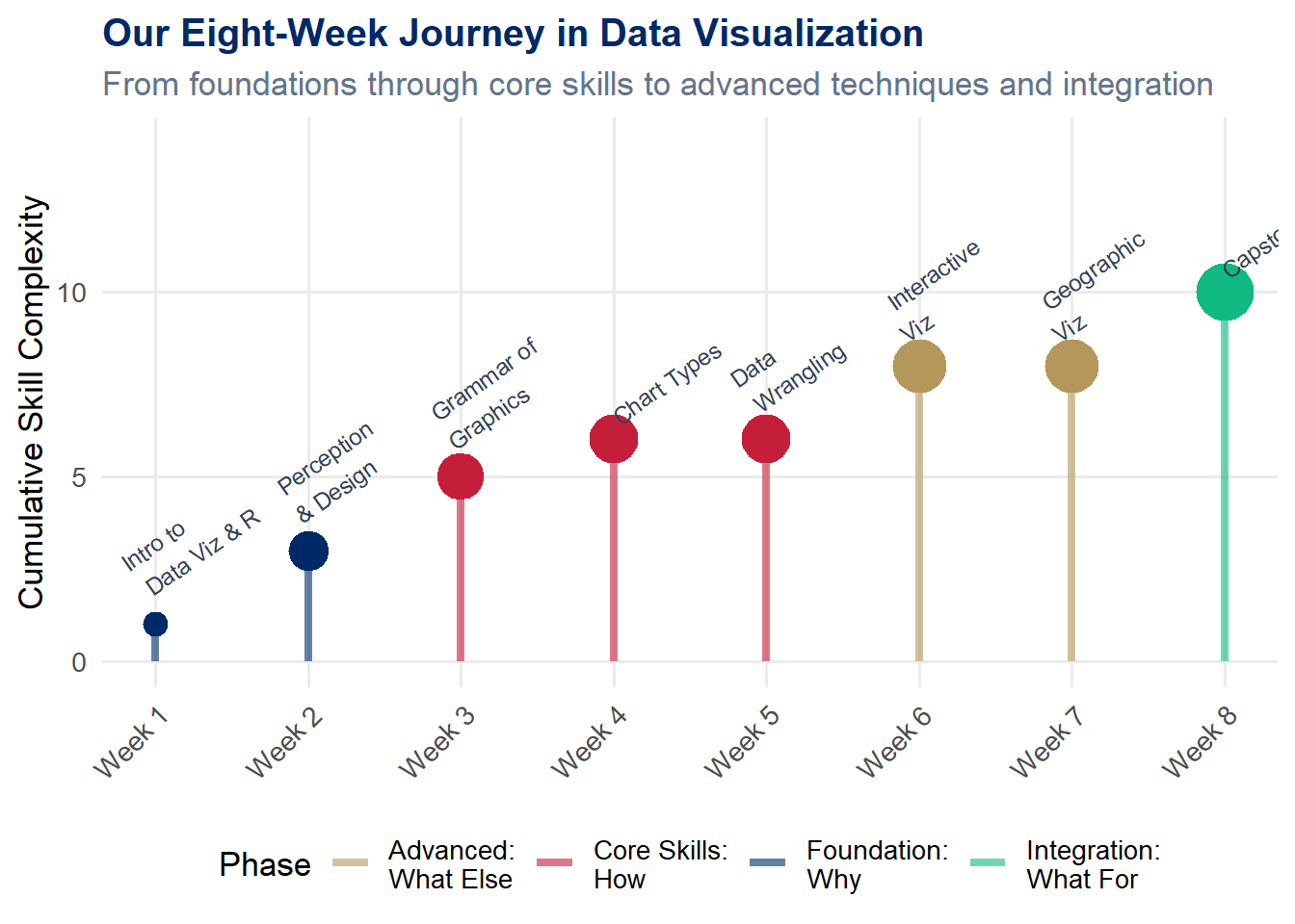
This progression was intentional. We started with why (Chapters 1–2), moved to how (Chapters 3–5), then explored what else is possible (Chapters 6–7), and now we close with what for (Chapters 8–9). The technical skills are the foundation, but the purpose is the structure you build on top.
Each dot in the chart above represents a chapter of learning. The color indicates the phase – foundations in navy, core skills in red, advanced techniques in gold, and this final integrative chapter in green. Notice how the complexity builds. You could not have built an interactive dashboard in Chapter 1, and you would not have understood the ethical stakes in Chapter 3. Every chapter was a necessary step on the path to where you stand now.
9.11 6. Putting It All Together – A Comprehensive Project
The best way to solidify everything you have learned is to build a comprehensive project that draws on techniques from across the entire book. Here is a framework for doing so.
9.11.1 Project Guidelines
Choose a dataset meaningful to you or your community. This could be data from your workplace, a social issue you care about, open government data, sports statistics, environmental data, or anything that excites your curiosity.
Create at least 4 visualizations using different techniques. Your project should include a range of chart types – for example, a bar chart, a scatter plot, a map, and a time series. Do not repeat the same chart type four times.
Include at least 1 interactive element. Use plotly, leaflet, or DT to give your viewer the ability to explore the data on their own terms.
Write narrative explaining your design choices. For each visualization, include 2–3 sentences explaining why you chose that chart type, what question it answers, and what design decisions you made (color, scale, labels).
Address ethical considerations. Include a dedicated section reflecting on the ethics of your visualizations. What might be misleading? What context is important? Who might be affected by how this data is presented?
Present your findings in a polished R Markdown document. The document should be well-organized with clear headings, readable prose, and professional-quality visualizations. Think of this as a document you could share with an employer.
Tip
Shiny is optional. You saw a Shiny demonstration in Chapter 6 and may have experimented with reactive applications on your own. You are welcome to include a Shiny component – for example, a small embedded app or a companion Shiny dashboard – but it is not required. If you do include Shiny, deploy it to shinyapps.io and provide the link in your document.
Tip
Pro tip: Start with the question, not the chart. Write down the 3–5 questions you want your visualizations to answer before you open RStudio. The best projects are driven by curiosity, not by a desire to use a particular technique.
We began this book in Chapter 1 with the idea that visualization helps us see more clearly. Anscombe’s quartet showed us that raw numbers can hide the truth, while a simple scatter plot reveals it. The Datasaurus Dozen proved that summary statistics are not enough – we need to look at our data.
Now, in this final chapter, we come full circle. Seeing clearly is not an end in itself. Clear sight is the beginning of thoughtful, reflective decision-making – the process of figuring out what we should do with what we have seen. And reflective decision-making leads to action – action in service of others, action for the greater good.
The skills you have built throughout this book – wrangling data, designing charts, building interactive applications – are powerful tools. The question is: What will you do with them? Use everything you have learned in service of something larger than yourself.
Note
From “seeing clearly” to “serving justly”: Visualization is not just a technical skill; it is a moral practice. Every chart you create frames reality for its viewers. You now have the power to illuminate truth, expose injustice, and help decision-makers choose wisely. That power carries responsibility. Use it well.
You have learned to see patterns where others see noise. You have learned to tell stories with data. You have learned that a well-designed chart can change minds, shift resources, and save lives. You have also learned that a poorly designed chart – or a dishonest one – can do real harm.
As you carry these skills into your careers, your communities, and your lives, remember this: the chart is never neutral. Every design choice is a value choice. Choose truth. Choose clarity. Choose compassion.
9.13 Challenge: Dashboard Jury
🎮 Dashboard Jury — You are the client. Rate this dashboard.
If the app takes a few seconds to load on first visit, that is normal — the server is waking up.
How to Play:
Enter your name and click Start Game
Each round displays a multi-panel dashboard — rate it on 5 criteria using sliders
Compare your ratings to the expert panel and see their justifications
After all 6 dashboards, reflect on where you and the experts disagreed most
Review your completion report (including your reflection)
9.14 8. Exercises
Chapter 8 Exercises
Exercise 1: Business Dashboard
Create a 4-panel business dashboard using patchwork for a business scenario of your choice. Your dashboard should:
Use a consistent color scheme throughout
Include at least three different chart types (line, bar, area, scatter, etc.)
Have a clear title and subtitle using plot_annotation()
Include meaningful labels, annotations, or reference lines
Be designed for a specific audience (e.g., a VP of Sales, a Chief Marketing Officer, a warehouse manager)
In a brief paragraph beneath your dashboard, describe: Who is the audience? What decisions does this dashboard support? What is the single most important takeaway?
Exercise 2: Visualization for Advocacy
Find a real social justice issue that matters to you, locate relevant data (from government open data portals, the Census Bureau, the World Bank, Gapminder, or other public sources), and create a visualization that could be used for advocacy. Your visualization should:
Use real (not simulated) data
Tell a clear story about inequality, injustice, or unmet need
Include a descriptive title, subtitle, and source attribution
Be designed to move a non-technical audience to understanding or action
Write a one-paragraph explanation of what issue you chose, why it matters, and how your visualization makes the case.
Exercise 3: Ethical Reflection
Find a real-world example of a visualization that was misleading (you may search online for “misleading charts,” “bad data visualization,” or similar terms). Write a 1-page (approximately 500-word) ethical reflection addressing:
What was misleading about the visualization? (Be specific about the design choice.)
Was the deception likely intentional or accidental?
What harm could result from viewers trusting this chart?
How would you redesign the chart to be truthful while still being compelling?
What principle from our ethics discussion (truthful, transparent, inclusive, humble, purposeful) was most clearly violated?
Exercise 4: Comprehensive Project
Build a comprehensive project as described in Section 6 above, producing a polished R Markdown document (knitted to HTML) containing:
At least 4 visualizations using different techniques
At least 1 interactive element
Design choice narrative for each visualization
An ethical reflection section
Clean, reproducible, well-commented code
This is your opportunity to synthesize everything you have learned into a single, impressive document. Make it something you would be proud to include in your portfolio.
9.15 Attributions
This book material draws on and is inspired by the work of many scholars and practitioners:
Cairo, A. – The Truthful Art (Peachpit Press, 2016) and How Charts Lie (W.W. Norton, 2019) – foundational texts on visualization ethics and effectiveness
Schwabish, J. – Better Data Visualizations (Columbia University Press, 2021) – practical guidance for improving chart design
D’Ignazio, C. & Klein, L.F. – Data Feminism (MIT Press, 2020) – a critical framework for thinking about power, justice, and data
Gapminder Foundation – gapminder.org – data and tools for a fact-based worldview
Wilke, C.O. – Fundamentals of Data Visualization (O’Reilly, 2019; freely available at clauswilke.com/dataviz)
Healy, K. – Data Visualization: A Practical Introduction (Princeton University Press, 2018; freely available at socviz.co)
Wickham, H. – ggplot2: Elegant Graphics for Data Analysis (Springer, 2016) – the definitive reference for the grammar of graphics in R
Bryan, J. – gapminder R package, providing an excerpt of the Gapminder data for teaching
Pedersen, T.L. – patchwork R package for composing multi-panel plots
Vivek H. Patil – foundational design and materials for data visualization