From static charts to explorable data experiences with htmlwidgets – plus a taste of Shiny
7.1 Learning Objectives
By the end of this chapter, you will be able to:
Understand the htmlwidgets framework and how it bridges R and JavaScript
Convert static ggplot2 plots to interactive visualizations using plotly
Create interactive, searchable, and sortable data tables with DT
Build interactive heatmaps with dendrograms using heatmaply
Articulate when interactivity adds genuine value and when a static chart is the better choice
Describe what Shiny is and how it differs from htmlwidgets
Interactive Visualization Demo
7.2 The htmlwidgets Ecosystem
Until now, every visualization we have built has been static – a fixed image rendered into our HTML document. Static charts are powerful, but they have a fundamental limitation: the designer must decide in advance what the viewer will see. If a scatterplot has 500 points and a viewer wants to know which observation is that outlier in the upper-left corner, they are out of luck. If a table has 200 rows and the viewer wants to sort by a particular column, they cannot.
Interactive visualizations solve this problem. They let the viewer explore the data on their own terms – hovering to see details, zooming into regions of interest, filtering to subsets, sorting and searching. This shift from designer-controlled to viewer-controlled exploration is one of the most important developments in modern data visualization.
The htmlwidgets framework makes this accessible to R users without requiring any JavaScript knowledge. The idea is simple and elegant:
You write R code using familiar R syntax
The htmlwidgets package translates your R objects into JavaScript libraries (like Plotly.js, DataTables, Leaflet.js)
The result is a self-contained HTML widget that renders interactively in R Markdown documents, Shiny apps, and the RStudio viewer
The key packages in the htmlwidgets ecosystem include:
Package
Purpose
JavaScript Library
plotly
Interactive charts (scatter, bar, line, etc.)
Plotly.js
DT
Interactive data tables
DataTables
leaflet
Interactive maps
Leaflet.js
heatmaply
Interactive heatmaps with dendrograms
Plotly.js
dygraphs
Interactive time series
Dygraphs
highcharter
Highcharts-style interactive charts
Highcharts
visNetwork
Interactive network graphs
vis.js
Tip
Getting started: Install the packages we will use in this chapter by running:
These only need to be installed once. After that, you load them with library() as usual.
In this chapter, we focus on three of the most broadly useful packages: plotly for interactive charts, DT for interactive tables, and heatmaply for interactive heatmaps. At the end, we will also take a brief look at Shiny – the full application framework that takes interactivity to the next level.
7.3 plotly – Interactive Charts from ggplot2
The plotly package is the workhorse of interactive visualization in R. Its most powerful feature is the ggplotly() function, which takes any ggplot2 object and converts it into an interactive Plotly chart. Hovering reveals data values, the toolbar allows zooming and panning, and the legend toggles series on and off.
Let us start with a scatterplot. We build a standard ggplot2 chart and then pass it through ggplotly():
Code
library(tidyverse)
── Attaching core tidyverse packages ──────────────────────── tidyverse 2.0.0 ──
✔ dplyr     1.1.4     ✔ readr     2.1.5
✔ forcats   1.0.0     ✔ stringr   1.5.1
✔ ggplot2   4.0.0     ✔ tibble    3.3.0
✔ lubridate 1.9.4     ✔ tidyr     1.3.1
✔ purrr     1.1.0
── Conflicts ────────────────────────────────────────── tidyverse_conflicts() ──
✖ dplyr::filter() masks stats::filter()
✖ dplyr::lag()    masks stats::lag()
ℹ Use the conflicted package (<http://conflicted.r-lib.org/>) to force all conflicts to become errors
Code
library(plotly)
Attaching package: 'plotly'

The following object is masked from 'package:ggplot2':

    last_plot

The following object is masked from 'package:stats':

    filter

The following object is masked from 'package:graphics':

    layout
Code
p <-ggplot(mpg, aes(x = displ, y = hwy, color = class,text =paste("Model:", model))) +geom_point(size =2, alpha =0.7) +scale_color_brewer(palette ="Set2") +labs(title ="Engine Displacement vs. Highway MPG",x ="Engine Displacement (L)", y ="Highway MPG") +theme_minimal(base_size =13)ggplotly(p, tooltip =c("text", "x", "y"))
Hover over any point to see the car model, engine size, and highway mileage. Click a class name in the legend to toggle that group on or off. Use the toolbar in the upper right to zoom, pan, or reset the view.
Notice the text aesthetic in the aes() call. This is a plotly-specific trick: we create a custom text string using paste(), and then pass tooltip = c("text", "x", "y") to ggplotly() to control exactly what appears when the viewer hovers. This level of customization is what makes interactive charts so much more informative than static ones.
7.3.1 Interactive Bar Charts
Bar charts also benefit from interactivity, especially when you want to show exact counts on hover:
Code
bar_data <- mpg %>%count(class) %>%mutate(class =fct_reorder(class, n))p_bar <-ggplot(bar_data, aes(x = n, y = class, fill = class,text =paste(class, ":", n, "vehicles"))) +geom_col() +scale_fill_brewer(palette ="Dark2") +labs(title ="Vehicle Count by Class", x ="Count", y =NULL) +theme_minimal(base_size =13) +theme(legend.position ="none")ggplotly(p_bar, tooltip ="text")
Hover over any bar to see the exact count. The fct_reorder() call from the forcats package (loaded with tidyverse) orders the bars by count, making the chart easier to read – a design principle we learned from Tufte.
7.3.2 Interactive Time Series
Time series data is where interactivity truly shines. Static time series charts can show overall trends, but hovering lets viewers pinpoint exact values at specific dates:
Try zooming into the 2008-2010 period by clicking and dragging across that region. You can see the sharp spike in unemployment during the Great Recession. Double-click to reset the zoom. This kind of exploration is impossible with a static chart.
The ggplotly() workflow: The beauty of ggplotly() is that you can develop your chart using standard ggplot2 syntax – getting the aesthetics, scales, and theme exactly right – and then add interactivity as a final step. If you decide interactivity is not needed, simply remove the ggplotly() wrapper and you have your static chart back.
7.4 The plotly Native API
While ggplotly() is the fastest path to interactivity, the plotly package also has its own native API through the plot_ly() function. This gives you finer control over hover templates, animations, and chart types that do not have direct ggplot2 equivalents.
The following example recreates the famous Gapminder bubble chart. Each bubble represents a country, sized by population and colored by continent. The hover template uses plotly’s formatting syntax for precise control:
Code
library(gapminder)
Warning: package 'gapminder' was built under R version 4.5.2
Warning: `line.width` does not currently support multiple values.
Warning: `line.width` does not currently support multiple values.
Warning: `line.width` does not currently support multiple values.
Warning: `line.width` does not currently support multiple values.
Warning: `line.width` does not currently support multiple values.
Hover over the bubbles to identify individual countries. Notice how the log scale on the x-axis spreads out the lower-income countries, making the relationship between wealth and health visible across the full range.
The <extra></extra> tag in the hover template suppresses the default trace name that plotly adds to the hover box. The %{x:,.0f} and %{y:.1f} are d3 format strings that control number formatting – commas for thousands and one decimal place, respectively.
Tip
When to use plot_ly() vs. ggplotly(): Use ggplotly() when you already have a ggplot2 chart or when you want the familiar grammar of graphics workflow. Use plot_ly() when you need features that ggplotly does not support well, such as custom hover templates, 3D charts, or animations. For most classroom and professional work, ggplotly() is sufficient.
7.5 Try It: Interactive Visualization Explorer
You have just seen how plotly transforms static ggplot2 charts into interactive experiences. Now try it yourself. The sandbox below lets you toggle between static and interactive versions of the same plot, customize tooltips, and see the difference firsthand.
🧪 ggplotly Toggle Explorer — Static vs. Interactive
If the app takes a few seconds to load on first visit, that is normal — the server is waking up.
Exploration Tasks:
Start with the static view. What information can you extract just by looking?
Switch to the interactive view — hover over individual points. What additional details does the tooltip reveal?
Try zooming into a cluster of points. Does interactivity help you distinguish overlapping data?
Customize the tooltip to show different variables. Which tooltip configuration tells the most useful story?
What You Should Have Noticed: Interactivity adds a “details on demand” layer that static charts cannot provide. Hover tooltips reveal individual data points without cluttering the overall view. Zoom lets you explore dense regions. But interactivity is not always better — for a presentation or printed report, a well-designed static chart may communicate more effectively.
AI & This Concept When asking AI to make a chart interactive, be specific about what the interactivity should reveal. “Add tooltips showing country name and GDP” is much better than “make it interactive.” Also specify the output format — ggplotly() for quick conversion, or plot_ly() for full control.
7.6 DT – Interactive Data Tables
Not all data communication happens through charts. Sometimes a well-formatted, searchable, sortable table is the most effective way to present information. The DT package wraps the jQuery DataTables library, giving you interactive tables with filtering, pagination, sorting, and search – all from a single R function call.
Search: Type a manufacturer name in the global search box (upper right)
Filter: Use the filter boxes at the top of each column to narrow down the data
Sort: Click any column header to sort ascending or descending
Navigate: Use the pagination controls to move between pages
The formatStyle() function adds in-cell bar charts – the blue bars show relative highway MPG and the red bars show relative city MPG. This technique, sometimes called “data bars,” combines the precision of a table with the visual comparison power of a chart.
Tip
DT formatting options: The DT package supports extensive formatting: formatCurrency(), formatPercentage(), formatRound(), formatDate(), and formatStyle() with conditional coloring. These let you build publication-quality tables that highlight the most important patterns.
7.7 heatmaply – Interactive Heatmaps
Heatmaps are one of the most effective ways to display patterns in multivariate data. A heatmap encodes values as colors in a matrix, making it easy to spot clusters, correlations, and outliers. The heatmaply package extends this by adding interactivity (hover for exact values) and hierarchical clustering with dendrograms.
Code
library(heatmaply)
Warning: package 'heatmaply' was built under R version 4.5.2
Loading required package: viridis
Loading required package: viridisLite
======================
Welcome to heatmaply version 1.6.0

Type citation('heatmaply') for how to cite the package.
Type ?heatmaply for the main documentation.

The github page is: https://github.com/talgalili/heatmaply/
Please submit your suggestions and bug-reports at: https://github.com/talgalili/heatmaply/issues
You may ask questions at stackoverflow, use the r and heatmaply tags:
     https://stackoverflow.com/questions/tagged/heatmaply
======================
Warning: Using `size` aesthetic for lines was deprecated in ggplot2 3.4.0.
ℹ Please use `linewidth` instead.
ℹ The deprecated feature was likely used in the dendextend package.
  Please report the issue at <https://github.com/talgalili/dendextend/issues>.
Hover over any cell to see the exact scaled value for that car and variable. The dendrograms on the left and top show hierarchical clustering – cars with similar profiles are grouped together, and variables that behave similarly are grouped together.
The k_row = 3 and k_col = 2 arguments cut the dendrograms into 3 row clusters and 2 column clusters, highlighted by the colored branches. You can immediately see, for instance, that high-horsepower, heavy cars (like the Maserati Bora and Ford Pantera L) cluster together on one end, while fuel-efficient, lightweight cars (like the Toyota Corolla and Honda Civic) cluster on the opposite end.
Why scale the data? The scale() function standardizes each column to have mean 0 and standard deviation 1. Without scaling, variables measured on different scales (e.g., horsepower in hundreds vs. quarter-mile time in seconds) would be incomparable in a heatmap. Scaling puts all variables on the same footing.
7.7.1 Correlation Heatmap
A particularly useful application of heatmaply is visualizing correlation matrices:
Hover over any cell to see the exact correlation coefficient. The dark navy-to-white-to-red color scale makes it easy to distinguish strong negative correlations (navy) from strong positive correlations (red), with white indicating near-zero correlation.
Several patterns jump out: mpg is strongly negatively correlated with cyl, disp, hp, and wt (heavier, more powerful cars get worse mileage). cyl, disp, and wt are strongly positively correlated with each other (larger engines go in heavier cars). These clusters of correlated variables are exactly what the dendrogram captures.
7.8 When to Use Interactivity
Interactive visualizations are powerful, but they are not always the right choice. Adding interactivity has costs: larger file sizes, dependencies on JavaScript libraries, potential accessibility issues, and the risk of overwhelming viewers with options they do not need.
Ben Shneiderman, a pioneer of information visualization, articulated the visual information-seeking mantra:
“Overview first, zoom and filter, then details on demand.”
This mantra provides a useful framework for deciding when interactivity adds value:
7.8.1 Use Interactivity When:
Exploring data: You or your audience need to discover patterns, not just confirm them
Many data points: Scatterplots with hundreds of points benefit from hover-to-identify
Details on demand: The overview is clear, but viewers need to drill down to specific values
Self-service dashboards: Different viewers have different questions about the same data
Complex multivariate data: Heatmaps and parallel coordinates benefit from hover details
Time series with long histories: Viewers need to zoom into specific time periods
7.8.2 Prefer Static Charts When:
Printed reports: Paper and PDF cannot render JavaScript widgets
Simple messages: If the chart makes one clear point, interactivity adds nothing
Small datasets: A table of 10 rows does not need search and pagination
Presentations you control: When you are narrating, you choose what the audience sees
Reproducibility is critical: Static images are more portable and archival
Accessibility: Screen readers handle static charts with alt text better than interactive widgets
Tip
A good test: Ask yourself, “What would a viewer do with interactivity that they cannot do with the static version?” If you cannot answer that question concretely, the static chart is probably better. Interactivity should serve a purpose, not just look impressive.
7.9 Putting It All Together
Let us build one more example that combines several of the techniques we have learned. This interactive scatterplot uses the gapminder dataset filtered to the most recent year, with careful hover text that tells a story about each country:
Code
gap_2007 <- gapminder %>%filter(year ==2007) %>%mutate(pop_millions =round(pop /1e6, 1),gdp_billions =round(gdpPercap * pop /1e9, 1),hover_label =paste0("<b>", country, "</b> (", continent, ")<br>","Life Expectancy: ", round(lifeExp, 1), " years<br>","GDP per Capita: $", formatC(round(gdpPercap), format ="d", big.mark =","), "<br>","Population: ", pop_millions, " million<br>","Total GDP: $", gdp_billions, " billion" ) )p_combined <-ggplot(gap_2007, aes(x = gdpPercap, y = lifeExp,size = pop_millions, color = continent,text = hover_label)) +geom_point(alpha =0.6) +scale_x_log10(labels = scales::dollar_format()) +scale_size_continuous(range =c(2, 15), guide ="none") +scale_color_manual(values =c("Africa"="#C41E3A","Americas"="#002967","Asia"="#B4975A","Europe"="#4A7C59","Oceania"="#6B4C9A" )) +labs(title ="Global Health and Wealth in 2007",subtitle ="Each bubble represents a country, sized by population",x ="GDP per Capita (log scale)",y ="Life Expectancy (years)",color ="Continent" ) +theme_minimal(base_size =13) +theme(legend.position ="bottom")ggplotly(p_combined, tooltip ="text") %>%layout(legend =list(orientation ="h", y =-0.15))
This chart uses several accent colors: dark navy for the Americas, red for Africa, and gold for Asia. Hover over any bubble to see the full story for that country. Click a continent name in the legend to isolate just those countries. Zoom into the lower-left cluster to explore the poorest nations.
7.10 A Taste of Shiny
Everything we have built so far in this chapter – plotly charts, DT tables, heatmaply heatmaps – runs entirely in the browser. The R code produces a self-contained HTML widget, and once it is rendered, no R session is needed. The interactivity is limited to what the JavaScript library provides: hovering, zooming, sorting, filtering within the existing data.
Shiny takes interactivity to an entirely different level. A Shiny application is a full web application powered by a live R session running on a server. When a user moves a slider, selects a dropdown option, or checks a box, that input is sent back to the R server, which re-executes R code and sends updated outputs back to the browser. This means you can do things that are impossible with htmlwidgets alone: change which variables are plotted, filter to different subsets of data, fit statistical models on the fly, and even load entirely new datasets based on user choices.
Shiny was created by Joe Cheng at RStudio (now Posit) and has grown into one of the most widely used frameworks for data-driven web applications in the R ecosystem. Thousands of Shiny apps are deployed across academia, government, and industry for everything from clinical trial dashboards to environmental monitoring tools.
Shiny vs. htmlwidgets – what is the difference? We have already seen plotly for hover-and-zoom interactivity added to individual charts. Shiny is fundamentally different – it gives you a full application framework where users can filter data, switch variables, adjust parameters, and navigate between multiple views. Think of plotly as adding interactivity to a chart, and Shiny as building an entire interactive experience around your data.
Building Shiny apps is beyond the scope of this chapter – it requires understanding reactive programming, server-client architecture, and deployment workflows that deserve their own dedicated study. But it is valuable to see what Shiny code looks like and understand the basic structure, so that you know what is possible and can pursue it on your own if it excites you.
7.10.1 The Minimal Shiny App
Every Shiny app has exactly two components:
UI (User Interface): Defines what the user sees – the layout, the input widgets (dropdowns, sliders, checkboxes), and the placeholders for outputs (plots, tables, text).
Server: Contains the R logic – how inputs are transformed into outputs. This is where your ggplot2, dplyr, and other R code lives.
The UI and server communicate through a reactive system. When a user changes an input widget, the server automatically re-runs the relevant code and updates the corresponding output. You never have to write code that says “when the user clicks this, do that” – Shiny handles the wiring for you.
Here is the simplest possible Shiny app. Read through the code and the annotations – you do not need to run this, but understanding the structure will deepen your appreciation for how interactive tools are built:
Code
library(shiny)# --- UI: what the user sees ---ui <-fluidPage(titlePanel("My First Shiny App"),sidebarLayout(sidebarPanel(# Input: a dropdown menu for selecting a variableselectInput("variable", "Choose a variable:",choices =c("Highway MPG"="hwy","City MPG"="cty","Engine Size"="displ")),# Input: a slider for the number of histogram binssliderInput("bins", "Number of bins:",min =5, max =50, value =20) ),mainPanel(# Output: the histogram will be rendered hereplotOutput("histogram") ) ))# --- Server: the R logic ---server <-function(input, output) {# When the user changes the dropdown or slider, this code re-runs automatically output$histogram <-renderPlot({library(tidyverse)ggplot(mpg, aes(x = .data[[input$variable]])) +geom_histogram(bins = input$bins, fill ="#002967", color ="white") +labs(title =paste("Distribution of", input$variable),x = input$variable, y ="Count") +theme_minimal(base_size =14) })}# --- Launch the app ---shinyApp(ui = ui, server = server)
Let us walk through what happens when this app runs:
The UI creates a page with a sidebar containing a dropdown and a slider, and a main panel with a placeholder for a plot.
The server defines how output$histogram is rendered – it builds a ggplot using whichever variable the user selected and however many bins the slider specifies.
When the user changes the dropdown or moves the slider, Shiny automatically re-executes the renderPlot() code and updates the histogram.
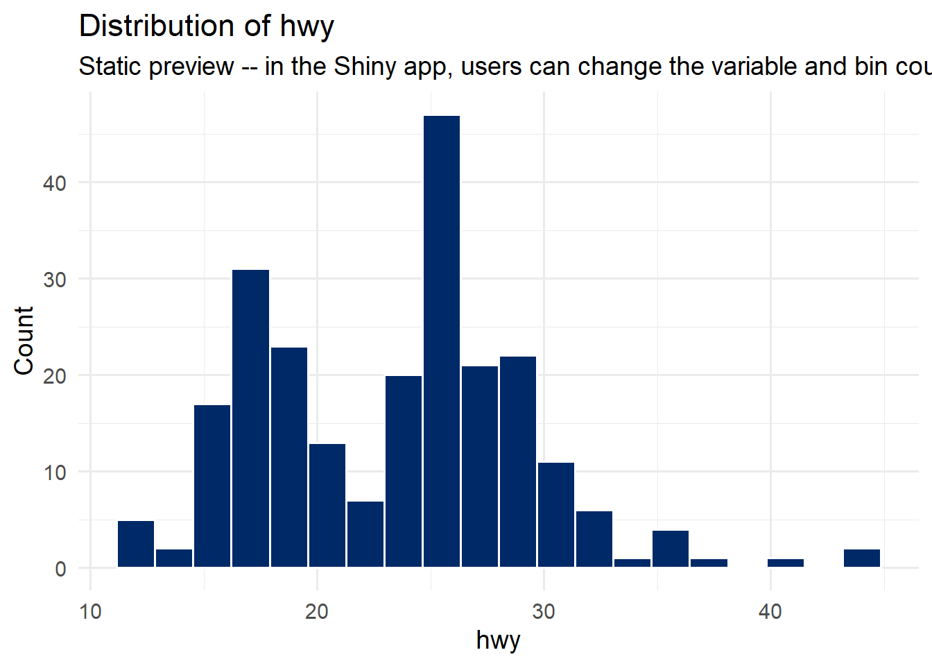
Here is a static preview of what that app would produce with its default settings (variable = “hwy”, bins = 20):
Code
# Static preview of what the Shiny app would display with default inputsggplot(mpg, aes(x = hwy)) +geom_histogram(bins =20, fill ="#002967", color ="white") +labs(title ="Distribution of hwy",subtitle ="Static preview -- in the Shiny app, users can change the variable and bin count",x ="hwy", y ="Count") +theme_minimal(base_size =14)
In the real Shiny app, the user could switch the dropdown to “City MPG” and the histogram would instantly redraw to show the distribution of cty instead. They could drag the slider to 40 bins and watch the bars get narrower in real time. That kind of live, server-powered reactivity is what distinguishes Shiny from the htmlwidgets we have been building.
7.10.2 A More Complete Example: MPG Data Explorer
Here is a more realistic Shiny app that lets users explore the mpg dataset with multiple filters and three different views: a scatter plot, a density distribution, and a summary table. Again, read through the code to understand the pattern – you do not need to build or run this yourself:
Code
library(shiny)library(tidyverse)library(plotly)library(DT)# --- UI ---ui <-fluidPage(titlePanel("MPG Data Explorer"),sidebarLayout(sidebarPanel(h4("Filters"),# Dropdown to select a specific manufacturer or allselectInput("manufacturer", "Manufacturer:",choices =c("All", sort(unique(mpg$manufacturer))),selected ="All"),# Checkboxes for vehicle class (all selected by default)checkboxGroupInput("classes", "Vehicle Classes:",choices =unique(mpg$class),selected =unique(mpg$class)),# Slider for year rangesliderInput("year", "Year:",min =1999, max =2008,value =c(1999, 2008),step =9, sep =""),hr(),helpText("Data from the ggplot2 mpg dataset.","Select filters above to explore the data.") ),mainPanel(# Three tabs for different views of the datatabsetPanel(tabPanel("Scatter Plot",br(),plotlyOutput("scatter", height ="450px")),tabPanel("Distribution",br(),plotOutput("distribution", height ="450px")),tabPanel("Summary Table",br(),DTOutput("summary_table")) ) ) ))# --- Server ---server <-function(input, output) {# Reactive expression: filtered data shared by all three outputs.# This computes once and is reused by scatter, distribution, and table. filtered <-reactive({ data <- mpg %>%filter(class %in% input$classes)if (input$manufacturer !="All") { data <- data %>%filter(manufacturer == input$manufacturer) } data })# Tab 1: Interactive scatter plot with plotly output$scatter <-renderPlotly({ p <-ggplot(filtered(),aes(x = displ, y = hwy, color = class,text =paste(manufacturer, model))) +geom_point(size =2, alpha =0.7) +scale_color_brewer(palette ="Dark2") +labs(x ="Engine Displacement (L)",y ="Highway MPG",color ="Class") +theme_minimal(base_size =13)ggplotly(p, tooltip ="text") })# Tab 2: Density plot of highway MPG by class output$distribution <-renderPlot({ggplot(filtered(), aes(x = hwy, fill = class)) +geom_density(alpha =0.5) +scale_fill_brewer(palette ="Dark2") +labs(title ="Highway MPG Distribution by Vehicle Class",x ="Highway MPG", y ="Density", fill ="Class") +theme_minimal(base_size =14) })# Tab 3: Summary table with interactive features output$summary_table <-renderDT({filtered() %>%group_by(manufacturer, class) %>%summarise(n =n(),avg_hwy =round(mean(hwy), 1),avg_cty =round(mean(cty), 1),avg_displ =round(mean(displ), 1),.groups ="drop" ) %>%datatable(rownames =FALSE,filter ="top",colnames =c("Manufacturer", "Class", "Count","Avg Hwy MPG", "Avg City MPG", "Avg Displacement"),options =list(pageLength =10) ) })}# Run the applicationshinyApp(ui, server)
Notice the key patterns:
reactive() computes the filtered data once and shares it across all three outputs. When the user changes a filter, Shiny re-runs the reactive expression, and all outputs that depend on it update automatically.
renderPlotly(), renderPlot(), and renderDT() are paired with their corresponding UI placeholders (plotlyOutput(), plotOutput(), DTOutput()).
The names must match exactly – output$scatter in the server corresponds to plotlyOutput("scatter") in the UI.
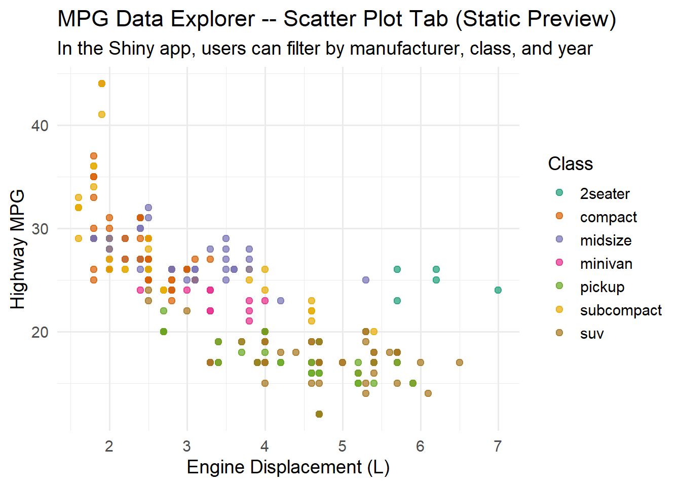
Here is a static preview of the scatter plot this app would produce with all filters at their default values:
Code
# Static preview of the scatter plot tab from the MPG Explorer appggplot(mpg, aes(x = displ, y = hwy, color = class)) +geom_point(size =2, alpha =0.7) +scale_color_brewer(palette ="Dark2") +labs(title ="MPG Data Explorer -- Scatter Plot Tab (Static Preview)",subtitle ="In the Shiny app, users can filter by manufacturer, class, and year",x ="Engine Displacement (L)",y ="Highway MPG",color ="Class") +theme_minimal(base_size =14)
Tip
Want to learn more about Shiny? If this section sparked your curiosity, the best next step is Hadley Wickham’s free online book Mastering Shiny. It walks you through everything from your first app to production deployment, with clear explanations and realistic examples. Building Shiny apps is a natural extension of the ggplot2 and dplyr skills you have already developed in this book.
7.11 Common Errors and Troubleshooting
“Error: could not find function ‘ggplotly’” This means the plotly package is not loaded. Run install.packages("plotly") if you have not installed it yet, then add library(plotly) to the top of your R Markdown document. Remember: install.packages() is a one-time operation, but library() must appear in every document that uses the package.
Interactive chart shows as blank Make sure you have the htmlwidgets package installed (install.packages("htmlwidgets")). If you are working in R Markdown, try knitting the whole document rather than running the chunk in isolation – some widgets need the full HTML document context to render properly. Also check that you are viewing the output in a web browser or RStudio’s Viewer pane, not in a PDF or Word document.
DT table does not appear Make sure you are calling datatable() from the DT package, not just printing the data frame. A bare mpg_summary will produce a plain text table; you need DT::datatable(mpg_summary) to get the interactive version. Also verify the DT package is loaded with library(DT).
heatmaply is very slow heatmaply computes hierarchical clustering, which can be slow on large datasets. Reduce the dataset size before passing it to heatmaply() – use select() to limit columns and sample_n() or slice_head() to limit rows. For most exploratory work, 50-100 rows and 6-10 columns render quickly.
“Error: Column ‘text’ doesn’t exist” The text aesthetic only works inside aes() when using ggplotly(). Make sure your text = paste(...) is inside the aes() call, not outside it. For example: aes(x = displ, y = hwy, text = paste("Model:", model)) is correct, but geom_point(text = paste("Model:", model)) outside of aes() will fail.
Note
Ethical Reflection: Respecting the Viewer through Data Exploration
Respecting the humanity behind data extends to how we design data experiences. A static chart is a one-size-fits-all communication: the designer decides what you see, and every viewer gets the same fixed image. An interactive visualization, by contrast, respects the individuality of each viewer. It says, “Here is the data – explore it at your own pace, follow your own questions, and discover what matters to you.”
This is not interactivity for its own sake. It is a form of intellectual hospitality. Just as a good teacher adapts to the needs of each student, a well-designed interactive visualization adapts to the curiosity of each viewer.
At the same time, thoughtful, reflective decision-making reminds us that more is not always better. Do not add interactivity because you can. Add it because it serves understanding. A simple, clear static chart that makes its point instantly is often more respectful of the viewer’s time and attention than a flashy interactive dashboard that demands exploration without rewarding it.
The call to use our skills in service of others also has implications here. Interactive dashboards and data tables can democratize access to data. When you build a well-designed interactive tool, you empower others to ask their own questions and find their own answers. This is a powerful act of service – putting data in the hands of those who need it, in a form they can use. Tools like Shiny take this even further, transforming you from a chart-maker into a tool-builder – someone who creates instruments of inquiry that others can use long after you have finished your analysis.
7.12 Challenge: Static or Interactive?
🎮 Static or Interactive? — Not everything needs a tooltip
If the app takes a few seconds to load on first visit, that is normal — the server is waking up.
How to Play:
Enter your name and click Start Game
Each round presents a real-world scenario with audience, medium, purpose, and data complexity
Choose Static or Interactive, then select your reasoning from the options
Two scenarios are deliberately ambiguous — both answers can earn full credit with the right reasoning!
Complete all 10 rounds, then review your completion report
7.13 Exercises
Chapter 6 Exercises
Exercise 1: From Static to Interactive Scatter Plot
Convert a ggplot2 scatter plot to an interactive plotly chart. Fill in the blanks below to create an interactive version of the mpg dataset with custom hover text showing the car manufacturer, model, and fuel economy.
Code
library(tidyverse)library(plotly)p <-ggplot(mpg, aes(x = displ, y = hwy, color = class,text =paste("Car:", ___, ___,"<br>Highway:", ___, "mpg"))) +geom_point(size =2, alpha =0.7) +scale_color_brewer(palette ="Set2") +labs(title ="Engine Size vs. Highway MPG",x ="Engine Displacement (L)", y ="Highway MPG") +theme_minimal(base_size =13)ggplotly(p, tooltip ="___")
Hints: The paste() function combines text strings. Use column names like manufacturer and model for the car info, and hwy for highway MPG. The tooltip argument should match the aesthetic name you want to display.
Exercise 2: Interactive Data Table with Formatting
Build an interactive DT table from the gapminder dataset (2007 only). Fill in the blanks to add column filters, format population with commas, and apply conditional color bars to the life expectancy column.
Hints: Filter to year 2007. Use filter = "top" for column-level filters. formatRound() with digits = 0 adds commas to population. Format gdpPercap as currency. The styleColorBar() needs the range of the column you are styling.
Exercise 3: Correlation Heatmap
Choose a dataset with at least 5 numeric variables (you may use mtcars, iris, or diamonds). Compute the correlation matrix and visualize it using heatmaply_cor(). Fill in the blanks to create a heatmap with a meaningful color palette.
In a brief paragraph below your code, identify and interpret the two strongest positive correlations and the two strongest negative correlations in your heatmap.
Hints: Replace the first blank with your chosen dataset name (e.g., mtcars). For the color palette, use two contrasting colors on either end – dark navy "#002967" and accent red "#C41E3A" work well.
Exercise 4: Storytelling with Hover Text
Using the gapminder dataset, create an interactive plotly chart where the hover text tells a meaningful story about each data point. Fill in the blanks to create rich, multi-line hover labels.
Write a one-paragraph reflection on how the hover text changes the viewer’s experience compared to a static version of the same chart.
Hints: Use column names country, continent, and lifeExp for the hover label. Map text = hover_label in the aes() call, and set tooltip = "text" in ggplotly().
7.14 Attributions
This book material draws on and is inspired by the work of many scholars and practitioners:
Sievert, C. – Interactive Web-Based Data Visualization with R (CRC Press, 2020; freely available at plotly-r.com)
htmlwidgets.org – framework documentation and gallery of R-to-JavaScript bindings
Shneiderman, B. – “The Eyes Have It: A Task by Data Type Taxonomy for Information Visualizations” (1996) – the visual information-seeking mantra
Rstudio/Posit – htmlwidgets showcase and DT package documentation
Galili, T. – heatmaply package and interactive heatmap documentation
Wickham, H. – ggplot2: Elegant Graphics for Data Analysis (Springer, 2016)
Bryan, J. – gapminder R package, providing an excerpt of the Gapminder data
Chang, W., Cheng, J., Allaire, J., Sievert, C., Schloerke, B., Xie, Y., Allen, J., McPherson, J., Dipert, A., & Borges, B. – Shiny: Web Application Framework for R. https://shiny.posit.co/