Code
if (file.exists("images/02/sensory_bandwidths.jpg")) knitr::include_graphics("images/02/sensory_bandwidths.jpg")By the end of this chapter, you will be able to:
“Error: could not find function ‘display.brewer.pal’” This means the RColorBrewer package is not loaded. Add library(RColorBrewer) at the top of your script or chunk.
“Error in library(patchwork) : there is no package called ‘patchwork’” You need to install the package first. Run install.packages("patchwork") in the console (not inside a code chunk), then try library(patchwork) again.
Plots look squished or overlapping Try adjusting fig.width and fig.height in your chunk options. For side-by-side plots using patchwork, fig.width=10, fig.height=5 is a good starting point. Example: ```{r}
Colors look wrong or produce an error Make sure you are using quotes around hex color codes: "#002967" not #002967. Without quotes, R interprets the # as a comment and ignores the rest.
Of all our senses, vision has by far the highest bandwidth. We take in more information through our eyes than through hearing, touch, taste, and smell combined. This is why visualization is such a powerful tool for understanding data – it leverages the sense we are best equipped to use.
if (file.exists("images/02/sensory_bandwidths.jpg")) knitr::include_graphics("images/02/sensory_bandwidths.jpg")But vision is not a simple camera. The brain processes visual information in two distinct stages:
The distinction matters enormously for visualization design. If you encode important information using preattentive attributes, your viewer will grasp it instantly. If you require attentive processing for the key message, your viewer must work hard – and may miss it entirely.
if (file.exists("images/02/preattentive.png")) knitr::include_graphics("images/02/preattentive.png")Here is a classic demonstration. In the first image below, the number 5 is hidden among other digits in uniform grey. In the second, the 5s are highlighted in a contrasting color. Notice how effortlessly you detect them once color provides a preattentive cue.
if (file.exists("images/02/num5grey.jpg")) knitr::include_graphics("images/02/num5grey.jpg")if (file.exists("images/02/num5greyblack.jpg")) knitr::include_graphics("images/02/num5greyblack.jpg")Researchers have identified a set of visual properties that our brains process preattentively. These include:
if (file.exists("images/02/Preattentive_3.JPG")) knitr::include_graphics("images/02/Preattentive_3.JPG")All of these are processed in under 250 milliseconds – before conscious attention kicks in. This is why a single red dot among grey dots “pops out” instantly, but finding a specific letter in a block of text requires careful scanning.
Design implication: When you want to draw attention to a specific data point or category, encode it with a preattentive attribute – a distinct color, a larger size, or a different shape. Do not rely on labels or legends alone for the most important comparisons.
You have just read about preattentive attributes in theory. Now experience them firsthand. The sandbox below lets you switch between color, size, and shape cues, adjust the number of distractor points, and see how well each attribute “pops out” under different conditions.
Preattentive Processing Explorer — Which Attribute Pops Out?
If the app takes a few seconds to load on first visit, that is normal — the server is waking up.
Exploration Tasks:
What You Should Have Noticed: Color is typically the strongest preattentive cue — the target pops out almost instantly regardless of how many distractors surround it. Shape is weaker, especially with many points. Size is moderate. Redundant coding (combining two channels) is the most robust, which is why it is recommended for colorblind-accessible designs.
AI & This Concept When prompting AI to build a chart, don’t let it choose the encoding by default. Specify which preattentive attribute you want to use and why. AI tools tend to over-rely on color — use this sandbox to decide for yourself which attribute works best for your data.
Let us demonstrate this principle step by step. First, we create a scatter plot where all points look the same:
library(tidyverse)── Attaching core tidyverse packages ──────────────────────── tidyverse 2.0.0 ──
✔ dplyr 1.1.4 ✔ readr 2.1.5
✔ forcats 1.0.0 ✔ stringr 1.5.1
✔ ggplot2 4.0.0 ✔ tibble 3.3.0
✔ lubridate 1.9.4 ✔ tidyr 1.3.1
✔ purrr 1.1.0
── Conflicts ────────────────────────────────────────── tidyverse_conflicts() ──
✖ dplyr::filter() masks stats::filter()
✖ dplyr::lag() masks stats::lag()
ℹ Use the conflicted package (<http://conflicted.r-lib.org/>) to force all conflicts to become errorslibrary(patchwork)
set.seed(42)
df_points <- tibble(
x = runif(50),
y = runif(50),
group = c(rep("background", 49), "target")
)Now we plot two versions – one with no cue, one with color:
p_no_cue <- ggplot(df_points, aes(x, y)) +
 geom_point(size = 4, color = "#94a3b8") +
 labs(title = "No preattentive cue",
 subtitle = "Find the different point") +
 theme_minimal(base_size = 13)

p_color_cue <- ggplot(df_points, aes(x, y, color = group)) +
 geom_point(size = 4) +
 scale_color_manual(values = c("background" = "#94a3b8", "target" = "#C41E3A")) +
 labs(title = "Color as preattentive cue",
 subtitle = "The target pops out instantly") +
 theme_minimal(base_size = 13) +
 theme(legend.position = "none")

p_no_cue + p_color_cue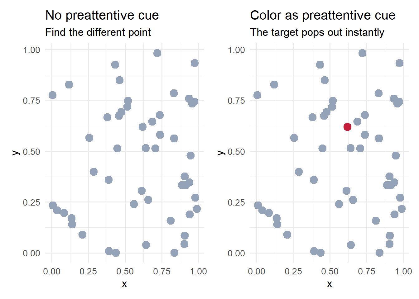
In the left panel, every point is identical – finding the “target” is impossible without additional information. In the right panel, the single red point (accent red, #C41E3A) is detected immediately. This is preattentive processing at work.
We can extend this demonstration to show how size also serves as a preattentive cue, and how combining cues (redundant coding) is even more effective:
p_size_cue <- ggplot(df_points, aes(x, y, size = group)) +
 geom_point(color = "#002967") +
 scale_size_manual(values = c("background" = 3, "target" = 8)) +
 labs(title = "Size as preattentive cue",
 subtitle = "Larger size draws immediate attention") +
 theme_minimal(base_size = 13) +
 theme(legend.position = "none")

p_redundant <- ggplot(df_points, aes(x, y, color = group, size = group)) +
 geom_point() +
 scale_color_manual(values = c("background" = "#94a3b8", "target" = "#C41E3A")) +
 scale_size_manual(values = c("background" = 3, "target" = 8)) +
 labs(title = "Color + size (redundant coding)",
 subtitle = "Multiple cues reinforce each other") +
 theme_minimal(base_size = 13) +
 theme(legend.position = "none")

p_size_cue + p_redundant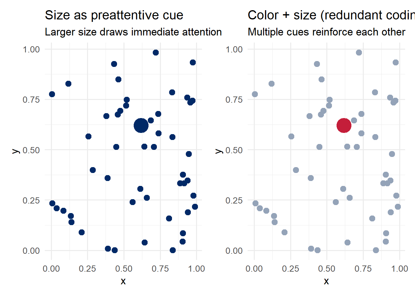
Notice how combining color and size – redundant coding – makes the target even more salient. This is a valuable technique when you need to ensure a data point is noticed.
In the early 20th century, German psychologists developed the Gestalt principles – a set of rules describing how the brain organizes visual elements into coherent groups. These principles operate automatically and have direct implications for chart design.
if (file.exists("images/02/gestaltcomplete6.png")) knitr::include_graphics("images/02/gestaltcomplete6.png")The key Gestalt principles for visualization are:
Putting Gestalt to work: When designing a visualization, ask yourself: “What groupings do I want the viewer to perceive?” Then use proximity, similarity, enclosure, or connection to create those groupings. If the viewer is seeing groups you did not intend, one of these principles is likely working against you.
Let us see how proximity and similarity work in a real chart. We will use the mpg dataset to create a grouped bar chart where Gestalt principles organize the visual information:
mpg_summary <- mpg %>%
 filter(class %in% c("compact", "midsize", "suv")) %>%
 group_by(class, drv) %>%
 summarise(mean_hwy = mean(hwy), .groups = "drop")

ggplot(mpg_summary, aes(x = class, y = mean_hwy, fill = drv)) +
 geom_col(position = position_dodge(width = 0.8), width = 0.7) +
 scale_fill_manual(
 values = c("4" = "#002967", "f" = "#C41E3A", "r" = "#B4975A"),
 labels = c("4" = "4-Wheel", "f" = "Front", "r" = "Rear")
 ) +
 labs(title = "Gestalt Principles at Work",
 subtitle = "Proximity groups bars by class; similarity (color) groups by drive type",
 x = "Vehicle Class", y = "Mean Highway MPG", fill = "Drive Type") +
 theme_minimal(base_size = 13)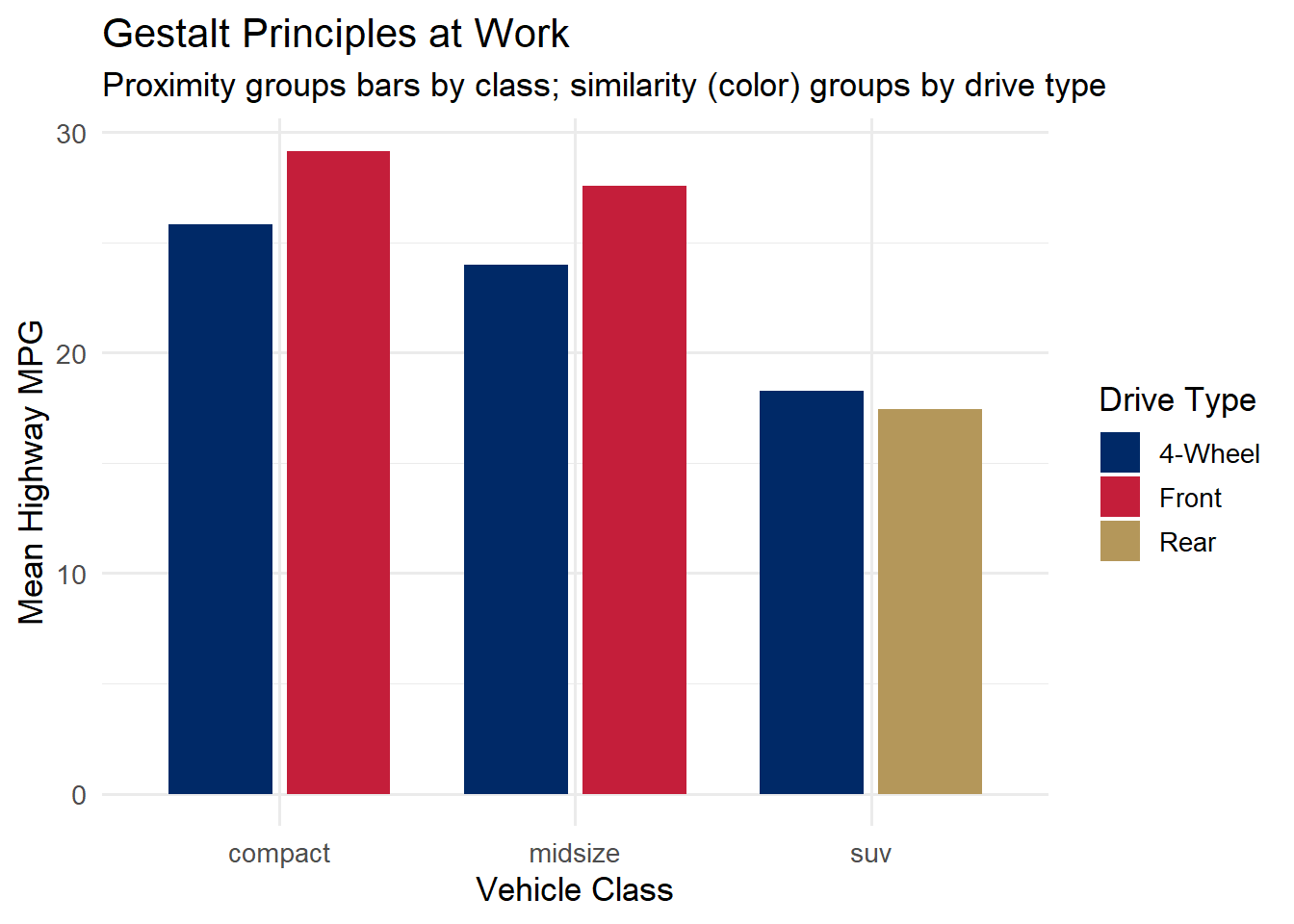
In this chart, proximity groups the bars within each vehicle class (compact, midsize, SUV), while similarity (color) lets you compare drive types across classes. The accent colors – dark navy (#002967), accent red (#C41E3A), and gold (#B4975A) – provide distinct, memorable hues.
Not all visual encodings are created equal. In a landmark 1984 paper, William Cleveland and Robert McGill conducted experiments to determine which visual properties people judge most accurately. Their findings established a perceptual hierarchy that remains foundational to visualization design.
if (file.exists("images/02/cleveland_mcgill_cairo.jpg")) knitr::include_graphics("images/02/cleveland_mcgill_cairo.jpg")From most accurate to least accurate:
This hierarchy explains many best practices:
if (file.exists("images/02/barbubbleheatmap.jpg")) knitr::include_graphics("images/02/barbubbleheatmap.jpg")Let us compare a bar chart and a pie chart showing the same data – vehicle class distribution in the mpg dataset:
class_counts <- mpg %>%
 count(class) %>%
 mutate(class = fct_reorder(class, n))

p_bar <- ggplot(class_counts, aes(x = class, y = n)) +
 geom_col(fill = "#002967", width = 0.7) +
 geom_text(aes(label = n), hjust = -0.2, size = 3.5, color = "#333333") +
 coord_flip() +
 labs(title = "Bar Chart (length encoding)",
 subtitle = "Easy to compare precise values",
 x = NULL, y = "Count") +
 theme_minimal(base_size = 13) +
 expand_limits(y = max(class_counts$n) * 1.1)

p_pie <- ggplot(class_counts, aes(x = "", y = n, fill = class)) +
 geom_col(width = 1) +
 coord_polar(theta = "y") +
 scale_fill_brewer(palette = "Set2") +
 labs(title = "Pie Chart (angle encoding)",
 subtitle = "Hard to compare similar slices",
 fill = "Class") +
 theme_void(base_size = 13)

p_bar + p_pie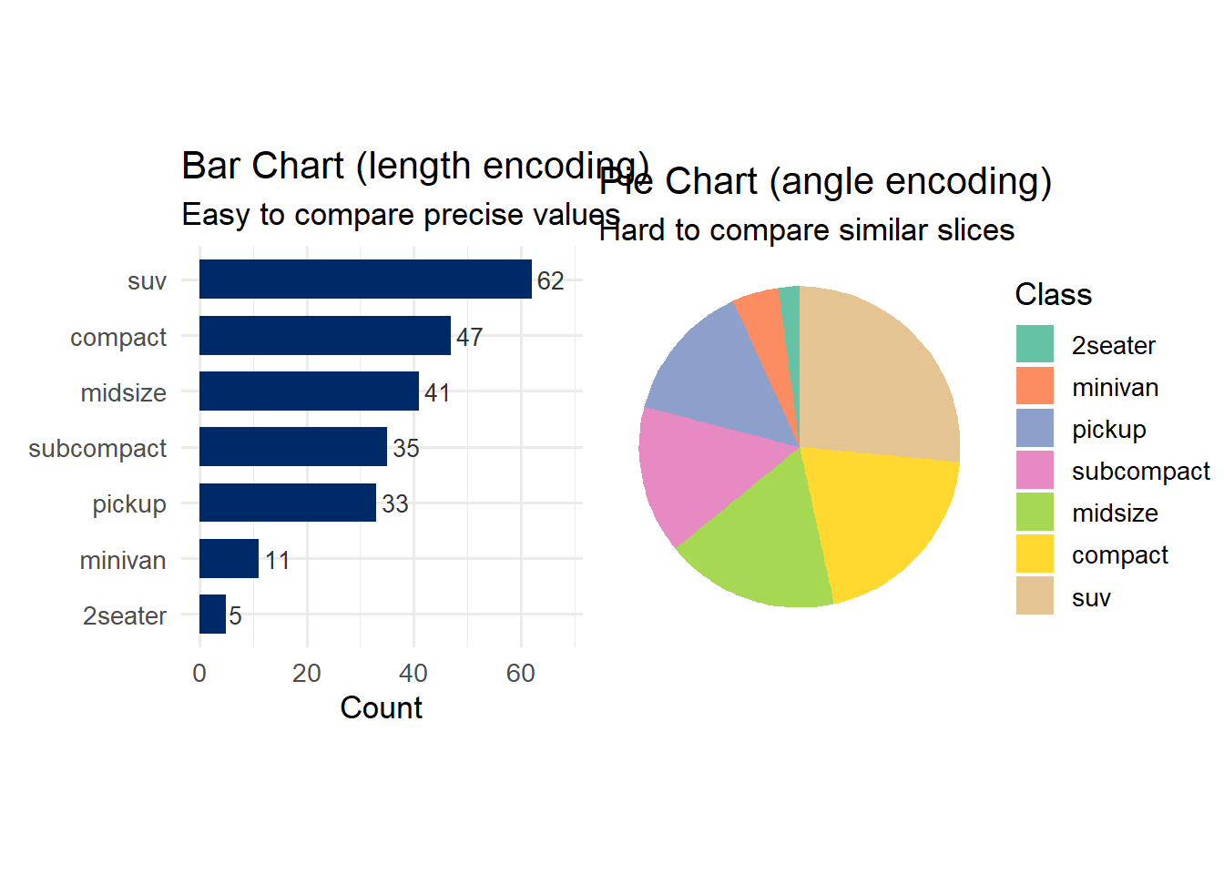
Which chart makes it easier to compare the number of compact vs. midsize vehicles? The bar chart wins decisively because length (rank 3) is far more accurately perceived than angle (rank 4).
Color is one of the most powerful and most misused tools in data visualization. To use it effectively, we need to understand its three components.
if (file.exists("images/02/munsellhsl.gif")) knitr::include_graphics("images/02/munsellhsl.gif")Different types of data call for different types of color palettes:
Sequential palettes: A single hue that varies in lightness. Use for ordered, continuous data (e.g., temperature, population density). Light = low values; dark = high values.
Diverging palettes: Two contrasting hues with a neutral midpoint. Use for data with a meaningful center (e.g., deviations from average, profit/loss).
Qualitative palettes: Distinct hues at similar saturation and lightness. Use for categorical data with no natural ordering (e.g., country, department).
library(RColorBrewer)
par(mfrow = c(1, 3), mar = c(1, 1, 3, 1))
display.brewer.pal(7, "Blues")
title("Sequential: Blues", line = 1)
display.brewer.pal(7, "RdYlBu")
title("Diverging: RdYlBu", line = 1)
display.brewer.pal(7, "Set2")
title("Qualitative: Set2", line = 1)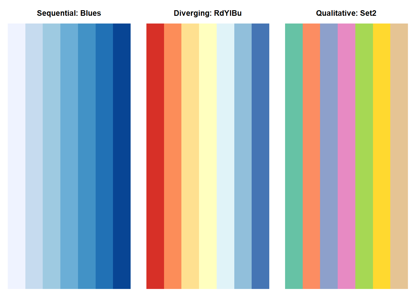
Approximately 8% of men and 0.5% of women have some form of color vision deficiency, most commonly red-green colorblindness. Any visualization that relies solely on the difference between red and green will be unreadable for roughly 1 in 12 male viewers.
Practical recommendations:
The viridis palettes are specifically designed to be perceptually uniform, colorblind-friendly, and readable in greyscale. They are an excellent default choice.
library(viridis)Loading required package: viridisLiteggplot(faithfuld, aes(waiting, eruptions, fill = density)) +
geom_tile() +
scale_fill_viridis_c(option = "magma") +
labs(title = "Viridis 'magma' palette",
subtitle = "Perceptually uniform and colorblind-friendly",
x = "Waiting Time (min)", y = "Eruption Duration (min)") +
theme_minimal(base_size = 13)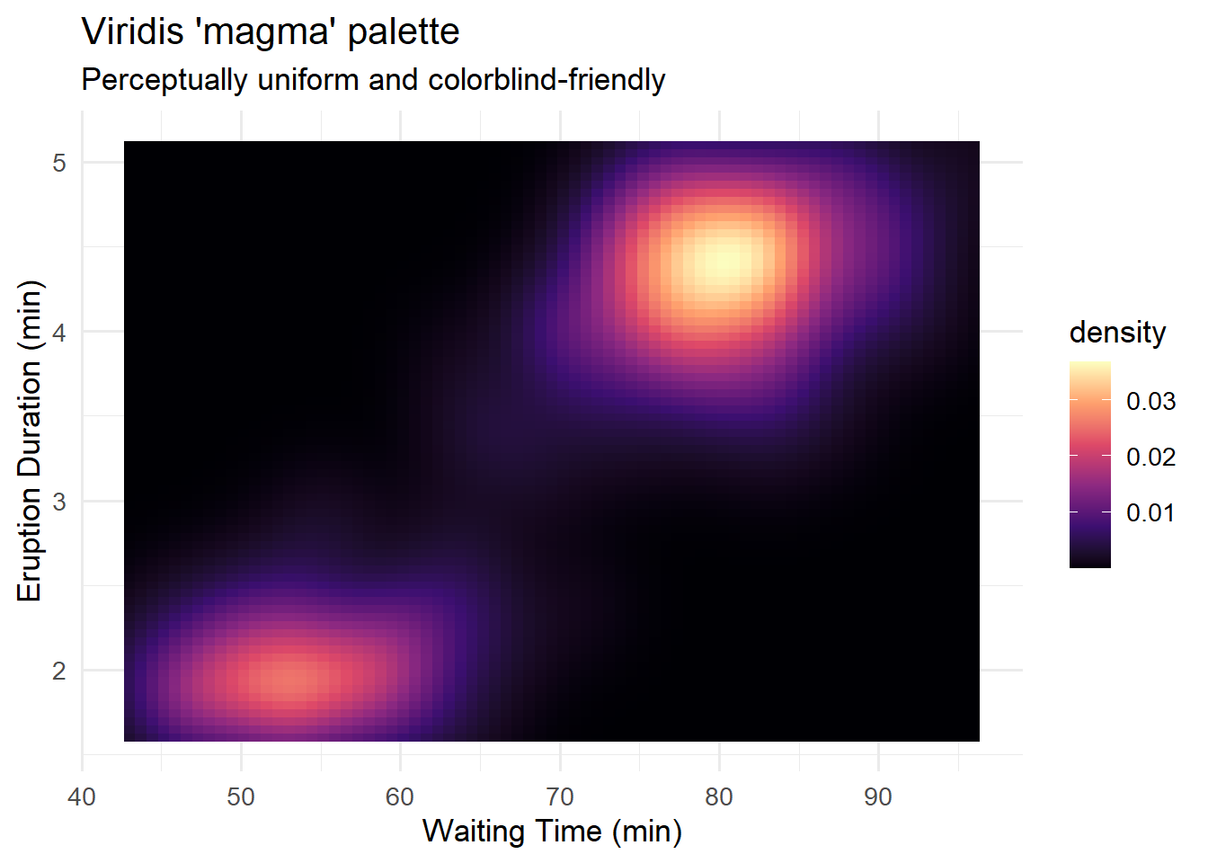
if (file.exists("images/02/context.png")) knitr::include_graphics("images/02/context.png")Rule of thumb for color: Use color purposefully. If a color does not encode data or serve a grouping function, consider whether it is adding unnecessary visual noise. Default to a muted palette and reserve vivid colors for the elements you want to emphasize.
Our visual working memory is remarkably limited. Research shows we can hold approximately 3 to 4 items in visual working memory at any given time. This has profound consequences for chart design.
if (file.exists("images/02/memory.gif")) knitr::include_graphics("images/02/memory.gif")If your chart has a legend with 8 categories mapped to 8 colors, the viewer must constantly shuttle between the legend and the data. This is slow, error-prone, and exhausting. Better approaches include:
library(ggrepel)

econ_data <- economics_long %>%
 filter(variable %in% c("pop", "unemploy", "uempmed")) %>%
 group_by(variable) %>%
 mutate(value_scaled = (value - min(value)) / (max(value) - min(value))) %>%
 ungroup()

label_data <- econ_data %>%
 group_by(variable) %>%
 filter(date == max(date))

ggplot(econ_data, aes(x = date, y = value_scaled, color = variable)) +
 geom_line(linewidth = 1) +
 geom_text_repel(
 data = label_data,
 aes(label = variable),
 nudge_x = 300, direction = "y", hjust = 0,
 segment.color = "grey70", size = 4
 ) +
 scale_color_manual(values = c("pop" = "#002967", "unemploy" = "#C41E3A", "uempmed" = "#B4975A")) +
 labs(title = "Direct Labeling Reduces Cognitive Load",
 subtitle = "Labels on the lines eliminate the need to look up a legend",
 x = NULL, y = "Scaled Value (0-1)") +
 theme_minimal(base_size = 13) +
 theme(legend.position = "none") +
 coord_cartesian(clip = "off") +
 theme(plot.margin = margin(5, 40, 5, 5))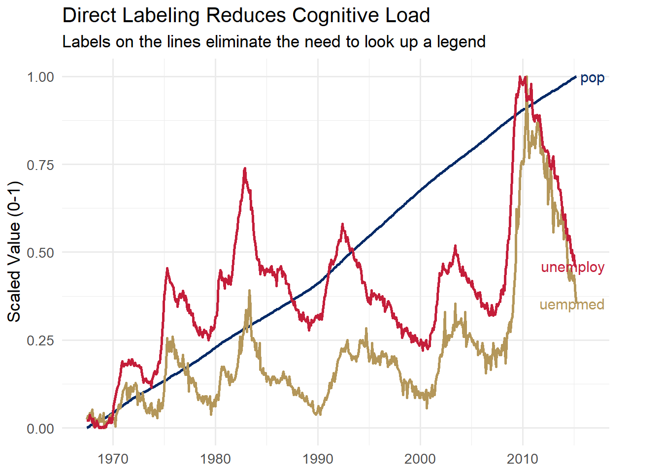
By placing labels directly on the lines, the viewer never needs to consult a legend. This is faster, less effortful, and reduces the demands on visual working memory.
Now that we understand how the brain processes visual information, let us turn to the design principles that great visualization practitioners have developed over the past two centuries. These principles translate perceptual science into practical guidelines.
The craft of data visualization has deep roots. Three landmark examples illustrate why design principles matter – and why some of the best advice is over two centuries old.
William Playfair (1786) invented the bar chart, line chart, and pie chart in his book The Commercial and Political Atlas. At a time when tables of numbers were the norm, Playfair’s insight was radical: a well-drawn picture could convey trends and comparisons far more quickly than rows of figures. Even by modern standards, his charts are readable and elegant.
if (file.exists("images/03/playfairbartimeseries.png")) knitr::include_graphics("images/03/playfairbartimeseries.png")John Snow (1854) challenged the prevailing “bad air” theory of cholera by plotting deaths on a map of London’s Soho district. The resulting visualization – one of the most famous in the history of science – revealed a striking cluster of deaths around the Broad Street water pump, pointing to contaminated water as the source. The pump handle was removed, and the outbreak subsided. This is visualization as a tool for saving lives.
if (file.exists("images/03/snow-cholera.gif")) knitr::include_graphics("images/03/snow-cholera.gif")Charles Joseph Minard (1869) created what Edward Tufte called “the best statistical graphic ever drawn.” His depiction of Napoleon’s 1812 Russian campaign encodes six variables in a single image: the size of the army, its location (latitude and longitude), direction of movement, temperature during the retreat, and dates of key events. The shrinking band tells the story of catastrophic loss more powerfully than any table of casualty figures could.
if (file.exists("images/03/Minardfrench.png")) knitr::include_graphics("images/03/Minardfrench.png")The thread connecting Playfair, Snow, and Minard to modern practitioners is a commitment to honesty, clarity, and efficiency in visual communication. These are the design principles we now turn to.
Edward Tufte is arguably the most influential thinker in data visualization design. His core concept is the data-ink ratio:
\[\text{Data-ink ratio} = \frac{\text{Data-ink}}{\text{Total ink used in the graphic}}\]
The principle is simple: maximize the share of ink (or pixels) devoted to displaying actual data. Everything else – unnecessary gridlines, heavy borders, decorative shading, redundant labels, 3D effects – is “non-data-ink” that should be eliminated or minimized. Tufte calls excessive non-data-ink chartjunk.
This does not mean charts should be ugly or austere. It means every visual element should earn its place by communicating something useful. If an element can be removed without losing information, it probably should be.
Let us see this in practice step by step. First we create a simple dataset:
library(tidyverse)
library(patchwork)

df_budget <- tibble(
 category = c("Product A", "Product B", "Product C", "Product D", "Product E"),
 value = c(45, 72, 38, 61, 53)
)Now we create a bar chart heavy with chartjunk – unnecessary gridlines, a filled background, and no direct labels:
p_cluttered <- ggplot(df_budget, aes(x = category, y = value)) +
 geom_bar(stat = "identity", fill = "#002967", width = 0.5) +
 theme_gray(base_size = 13) +
 theme(panel.grid.major.x = element_line(),
 panel.grid.minor = element_line()) +
 labs(title = "Before: Low data-ink ratio",
 x = "Category", y = "Value")

p_cluttered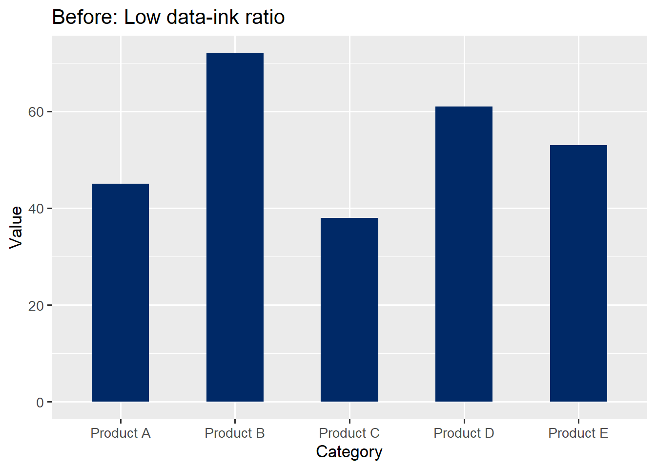
Now we strip away the chartjunk and add direct labels. Compare the two:
p_clean <- ggplot(df_budget, aes(x = category, y = value)) +
 geom_bar(stat = "identity", fill = "#002967", width = 0.5) +
 geom_text(aes(label = value), vjust = -0.5, size = 4, color = "#002967") +
 theme_minimal(base_size = 13) +
 theme(panel.grid.major.x = element_blank(),
 panel.grid.minor = element_blank(),
 axis.title = element_blank()) +
 labs(title = "After: High data-ink ratio")

p_cluttered + p_clean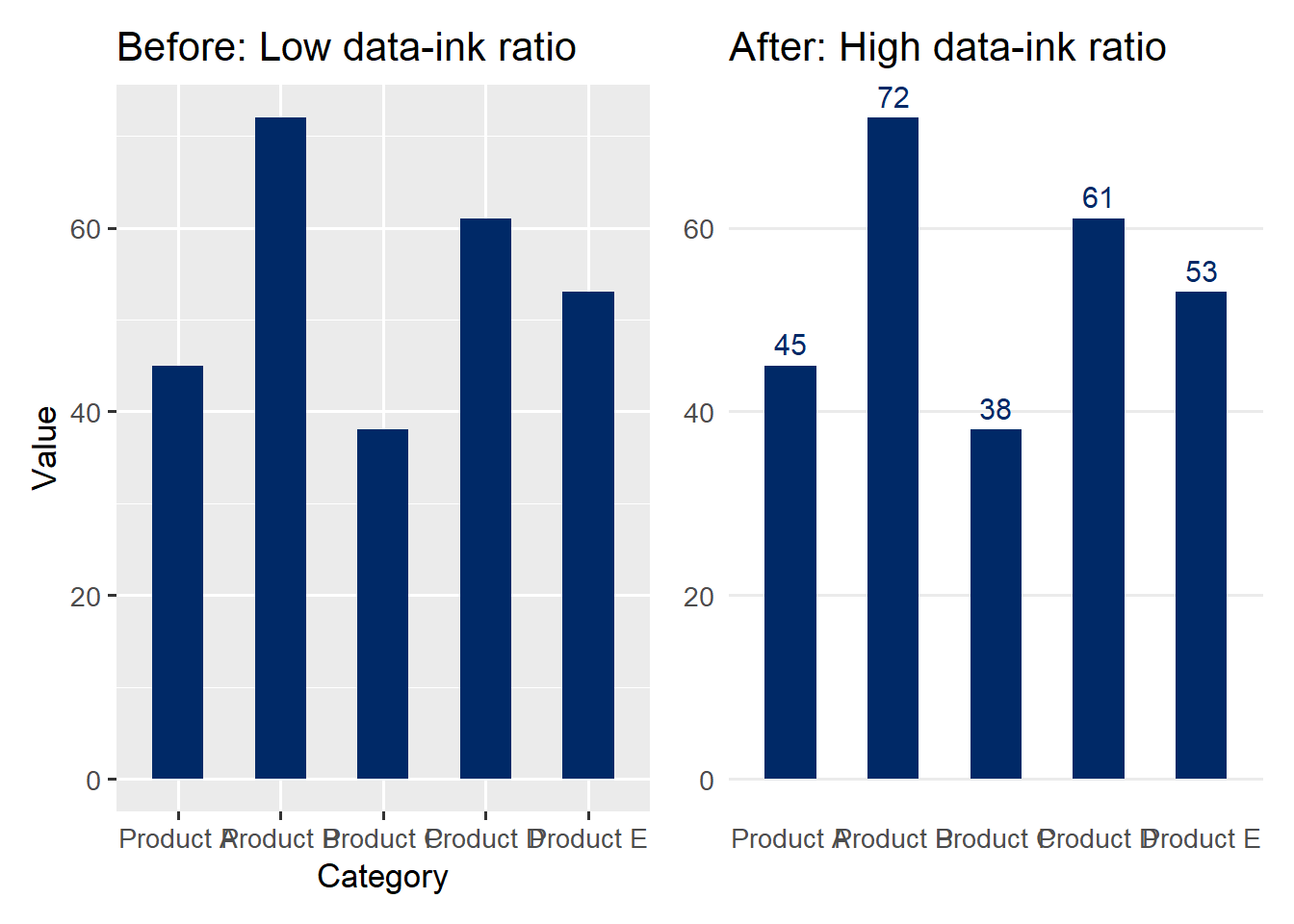
The “after” version communicates the same data more effectively. The gridlines are gone because the direct labels make them unnecessary. The axis title is removed because the category labels are self-explanatory. Every remaining element serves a purpose.
Practical rule of thumb: After creating a chart, ask yourself: “Can I remove this element without losing information?” If the answer is yes, remove it. Repeat until the answer is no for every remaining element.
The lie factor measures the degree to which a graphic distorts the underlying data:
\[\text{Lie factor} = \frac{\text{Size of effect shown in the graphic}}{\text{Size of effect in the data}}\]
A lie factor of 1.0 means the graphic faithfully represents the data. Tufte argues that lie factors above 1.05 or below 0.95 represent significant distortions.
When graphical representations of quantities use area or volume rather than length, distortion often follows:
if (file.exists("images/03/lieshrinkingdoctor.png")) knitr::include_graphics("images/03/lieshrinkingdoctor.png")if (file.exists("images/03/lieshrinkingdollar.png")) knitr::include_graphics("images/03/lieshrinkingdollar.png")One of the most common forms of deception is truncating the y-axis of a bar chart. Because bars encode quantity through their length (from zero to the data value), starting the axis at a non-zero value can make small differences appear enormous.
Let us see this with R code. First, the data:
df_sales <- tibble(
 quarter = c("Q1", "Q2", "Q3", "Q4"),
 revenue = c(98, 101, 103, 105)
)
Now the side-by-side comparison:
p_misleading <- ggplot(df_sales, aes(x = quarter, y = revenue)) +
 geom_col(fill = "#C41E3A") +
 coord_cartesian(ylim = c(96, 106)) +
 labs(title = "Misleading: Truncated axis",
 subtitle = "Looks like revenue tripled!",
 y = "Revenue ($M)") +
 theme_minimal(base_size = 13)

p_honest <- ggplot(df_sales, aes(x = quarter, y = revenue)) +
 geom_col(fill = "#002967") +
 coord_cartesian(ylim = c(0, 110)) +
 labs(title = "Honest: Full axis",
 subtitle = "Revenue grew modestly (~7%)",
 y = "Revenue ($M)") +
 theme_minimal(base_size = 13)

p_misleading + p_honest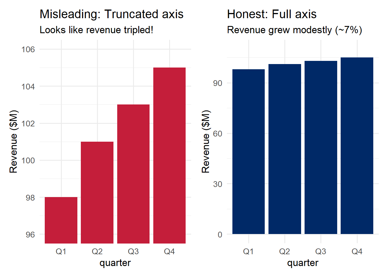
The left panel makes it look like revenue tripled from Q1 to Q4. The right panel reveals the truth: revenue grew by about 7%. Same data, radically different impressions.
Important nuance: Truncated axes are not always deceptive. For line charts showing change over time, a non-zero baseline can be appropriate because the visual encoding is position/slope, not length. The rule is: bar charts must start at zero; line charts can sometimes justify a non-zero baseline – but always label your axes clearly.
if (file.exists("images/03/liefactorhighway.png")) knitr::include_graphics("images/03/liefactorhighway.png")A slopegraph is a chart designed to show change between two (or occasionally more) time points for multiple categories. It consists of two vertical axes connected by lines, where the slope and direction of each line immediately convey whether a category increased, decreased, or remained stable.
if (file.exists("images/03/slopegraph.png")) knitr::include_graphics("images/03/slopegraph.png")Slopegraphs are a beautifully minimalist design. They use direct labeling (no legend needed), and the visual encoding – slope – is one of the most intuitive for the human eye. They are especially effective for:
Beyond Tufte’s specific principles, several broader guidelines help produce clear, effective visualizations:
Label directly. Whenever possible, label data elements directly on the chart rather than relying on a separate legend. Legends force the viewer to look back and forth between the plot and the key, increasing cognitive load.
Use color purposefully. Color should encode meaning, not serve as decoration. Reserve color for distinguishing groups, highlighting a key finding, or encoding a variable. Avoid “rainbow” color schemes that have no natural ordering.
Order data meaningfully. Default alphabetical ordering is rarely the best choice. Order bars by value. Order time series chronologically. The order of data in a chart is a design decision, and it should serve the viewer’s understanding.
Reduce cognitive load. Every unnecessary element adds to the viewer’s cognitive burden. Gridlines, borders, background shading, tick marks, redundant axis labels – each demands a small amount of attention. Individually they are trivial, but collectively they can obscure the data.
if (file.exists("images/03/gelmanvouchermap.png")) knitr::include_graphics("images/03/gelmanvouchermap.png")Ethical Reflection: Seeing Clearly and Designing Honestly
Thoughtful, reflective decision-making demands perceiving reality as it truly is, free from distortion and self-deception. This chapter’s material reveals how easily our perception can be manipulated. A 3D pie chart exploits our poor ability to judge volume. A rainbow color scale obscures the true magnitude of differences. A truncated axis exaggerates a modest change into a dramatic one.
The pursuit of excellence means stripping away the unnecessary so that truth can emerge clearly. It means choosing honest scales, faithful representations, and designs that serve the viewer rather than the designer’s agenda.
Respecting the humanity behind data calls us to consider our audience’s needs: Can a colorblind viewer read this chart? Does this encoding accurately represent the underlying data? Am I making the truth easier to see, or harder?
A lie factor greater than 1 is, in a very real sense, a lie told with data. As you develop your visualization skills, commit to a simple standard: let the data speak truthfully, and design your charts to amplify that truth, not distort it.
When designing or evaluating a visualization, run through this checklist:
| Principle | Question to Ask |
|---|---|
| Preattentive attributes | Does the most important information pop out immediately? |
| Gestalt grouping | Are visual groups aligned with data groups? |
| Cleveland & McGill | Am I using the most accurate encoding for the key comparison? |
| Color palette | Is my palette appropriate for the data type (sequential, diverging, qualitative)? |
| Colorblindness | Would a colorblind viewer get the same message? |
| Working memory | Can the viewer understand the chart without constantly consulting a legend? |
| Data-ink ratio | Can I remove any element without losing information? |
| Lie factor | Does the visual impression match the magnitude of the data? |
| Axis integrity | Do bar charts start at zero? Are scales labeled clearly? |
Redesign a chart in real time. Pick a flawed visualization, apply the perception and design principles from this chapter, and see the before-and-after side by side.
Open in full screen | No account required.
Design Detective — Spot the deception before it fools your audience
If the app takes a few seconds to load on first visit, that is normal — the server is waking up.
How to Play:
Chapter 2 Exercises
Exercise 1: Preattentive Attributes and the Perceptual Hierarchy
Using the diamonds dataset, create two charts of the distribution of diamond cut quality – a bar chart and a pie chart. Fill in the blanks in the code below, then write 2-3 sentences comparing which chart makes it easier to compare categories and why, referencing Cleveland & McGill’s hierarchy.
library(tidyverse)
library(patchwork)

cut_counts <- diamonds %>% count(cut)

# Bar chart -- fill in the missing aesthetic and geom
p_bar <- ggplot(cut_counts, aes(x = fct_reorder(cut, n), y = ___)) +
 geom_col(fill = "#002967") +
 coord_flip() +
 labs(title = "Bar Chart: Diamond Cut Quality",
 x = NULL, y = "Count") +
 theme_minimal(base_size = 13)

# Pie chart -- fill in the missing coord function
p_pie <- ggplot(cut_counts, aes(x = "", y = n, fill = cut)) +
 geom_col(width = 1) +
 ___(theta = "y") +
 scale_fill_brewer(palette = "Set2") +
 labs(title = "Pie Chart: Diamond Cut Quality", fill = "Cut") +
 theme_void(base_size = 13)

p_bar + p_pie
Exercise 2: Colorblind-Friendly Redesign
The plot below uses a red-green color scheme that is not accessible to colorblind viewers. Fill in the blanks to redesign it using the viridis palette and redundant shape coding.
library(tidyverse)

# Original: NOT colorblind-friendly
ggplot(mpg, aes(x = displ, y = hwy, color = drv)) +
 geom_point(size = 3) +
 scale_color_manual(values = c("4" = "red", "f" = "green", "r" = "blue")) +
 labs(title = "Original: Poor color choice",
 x = "Engine Displacement (L)", y = "Highway MPG", color = "Drive") +
 theme_minimal()

# Redesign: fill in the blanks for colorblind-friendly version
ggplot(mpg, aes(x = displ, y = hwy, color = drv, shape = ___)) +
 geom_point(size = 3) +
 scale_color_viridis_d(option = "___") +
 labs(title = "Redesign: Colorblind-Friendly with Redundant Coding",
 x = "Engine Displacement (L)", y = "Highway MPG",
 color = "Drive", shape = "Drive") +
 theme_minimal()
After creating your redesign, test it using the Coblis colorblind simulator by uploading a screenshot of your plot. Write 1-2 sentences about what you observe.
Exercise 3: Data-Ink Ratio Makeover
The following code produces a chart overloaded with chartjunk. Fill in the blanks in the redesigned version to maximize the data-ink ratio while keeping the chart readable.
library(tidyverse)
library(patchwork)

df_dept <- tibble(
 department = c("Marketing", "Engineering", "Sales", "HR", "Finance"),
 budget = c(320, 580, 410, 190, 275)
)

# Original: full of chartjunk
p_junk <- ggplot(df_dept, aes(x = department, y = budget, fill = department)) +
 geom_bar(stat = "identity", color = "black", linewidth = 1.5) +
 theme_dark() +
 theme(panel.grid = element_line(color = "white", linewidth = 0.8),
 legend.position = "right") +
 labs(title = "Before: Department Budgets",
 x = "Department", y = "Budget (thousands $)", fill = "Department")

# Redesign: fill in the blanks to clean it up
p_tufte <- ggplot(df_dept, aes(x = fct_reorder(department, budget), y = budget)) +
 geom_col(fill = "___", width = 0.6) +
 geom_text(aes(label = budget), hjust = -0.2, size = 4, color = "#002967") +
 coord_flip() +
 theme_minimal(base_size = 13) +
 theme(panel.grid.major.___ = element_blank(),
 panel.grid.minor = element_blank(),
 axis.title = ___()) +
 labs(title = "After: Department Budgets")

p_junk + p_tufte
Write a brief paragraph explaining what you changed and why each change improves the data-ink ratio.
Exercise 4: Deceptive Graph Analysis
Find a deceptive or misleading graph published in a real-world source (news article, social media, corporate report, or political campaign material). Include the image or a link in your R Markdown document. Then answer the following:
A good place to find examples is the WTF Visualizations archive.
Exercise 5: Further Reading
Read the following and write three key takeaways from each in your R Markdown document:
Focus on: What principles from this chapter do the authors emphasize? Where do they offer different perspectives? How do Tufte’s ideas about data-ink relate to what Wilke and Healy recommend?
This book material draws on and is inspired by the work of many scholars and practitioners: