Code
if (file.exists("images/07/latlongcutaway.jpg")) knitr::include_graphics("images/07/latlongcutaway.jpg")By the end of this chapter, you will be able to:
Note on map data: All of the map data used in this chapter comes from built-in R packages (maps, mapproj) and built-in datasets (state.x77, state.name, state.center). You do not need to download any external shapefiles or GeoJSON files. Pre-built map data is provided so you can focus on the visualization techniques rather than data acquisition. Just make sure you have the required packages installed (see the Common Errors box below).
Common Errors You May Encounter in This Chapter
Error: there is no package called 'maps'
Error in library(maps) : there is no package called 'maps'Fix: Run install.packages(c("maps", "mapproj")) in your console. These packages provide the map_data() function and projection support.
Error: could not find function "map_data"
Error in map_data("state") : could not find function 'map_data'Fix: Make sure you have loaded the maps package with library(maps). The map_data() function lives in ggplot2 but requires the maps package to be installed and loaded.
Leaflet map appears blank or shows wrong location
Fix: Check that your latitude and longitude values are not swapped. Latitude measures north/south (roughly -90 to 90) and longitude measures east/west (roughly -180 to 180). For : lat = 47.67 (north), lng = -117.40 (west). If your map shows the middle of the ocean, the values are likely reversed.
Error: could not find function "coord_map"
Error in coord_map("albers", lat0 = 39, lat1 = 45) :
 could not find function 'coord_map'
Fix: The coord_map() function requires the mapproj package. Run install.packages("mapproj") and then library(mapproj).
Choropleth has missing states (gray patches)
Fix: The map_data("state") function uses lowercase state names in the region column. If your data has state names like "New York" or "NEW YORK", the join will fail for those states. Use tolower() to convert your state names to lowercase before joining: mutate(state = tolower(state)).
Error: unused argument (lat0 = ...)
Error in coord_map("albers", lat0 = 39, lat1 = 45) :
 unused argument (lat0 = 39)
Fix: This means the mapproj package is not installed or not loaded. Run install.packages("mapproj") and restart your R session, then load it with library(mapproj).
Maps are one of the oldest and most powerful forms of data visualization. Long before scatterplots or bar charts existed, humans were drawing maps to understand the world around them – to navigate, to claim territory, to plan cities. What makes maps unique as a visualization tool is that they encode data within a spatial context that viewers already understand. Everyone knows what a map is. Everyone has an intuitive sense of geography. When you overlay data onto a map, you are leveraging that deep spatial intuition to communicate patterns that might be invisible in a table or a standard chart.
The most famous example in the history of data visualization is arguably a map. In 1854, London was in the grip of a devastating cholera outbreak. The prevailing theory was that cholera spread through “miasma” – bad air. John Snow, a physician, was skeptical. He plotted the addresses of cholera deaths on a street map of Soho and discovered that the cases clustered tightly around a single water pump on Broad Street. This geographic visualization was instrumental in identifying contaminated water as the source of the disease. Epidemiology was, in a very real sense, born from a map.
Today, geographic visualization is everywhere:
Maps are persuasive. Because they feel familiar and intuitive, maps carry a special persuasive power. This means they can also mislead. A poorly designed map – with inappropriate color scales, misleading projections, or cherry-picked data – can distort the viewer’s understanding of reality. As with all visualization, honesty and care are essential.
Before we can place data on a map, we need to understand how locations on Earth are specified. The system most of us are familiar with is latitude and longitude – a grid of imaginary lines that wrap around the planet.
if (file.exists("images/07/latlongcutaway.jpg")) knitr::include_graphics("images/07/latlongcutaway.jpg")Latitude measures how far north or south a location is from the equator. The equator is at 0 degrees, the North Pole is at 90 degrees north, and the South Pole is at 90 degrees south. Lines of latitude run east-west and are sometimes called parallels because they are parallel to one another.
if (file.exists("images/07/latitudes.jpg")) knitr::include_graphics("images/07/latitudes.jpg")Longitude measures how far east or west a location is from the Prime Meridian, which passes through Greenwich, England. The Prime Meridian is at 0 degrees, and longitude ranges from -180 degrees (west) to +180 degrees (east). Lines of longitude run north-south and are called meridians. Unlike parallels, meridians converge at the poles.
if (file.exists("images/07/meridians.jpg")) knitr::include_graphics("images/07/meridians.jpg")For example, in , is located at approximately 47.67 degrees north latitude, 117.40 degrees west longitude – or in decimal notation, (47.6672, -117.4024). The negative sign on the longitude indicates west of the Prime Meridian.
Here is a fundamental challenge of cartography: the Earth is a sphere (technically an oblate spheroid), but maps are flat. Transforming a three-dimensional surface into a two-dimensional plane inevitably introduces distortion. The mathematical formulas that perform this transformation are called projections, and every projection makes trade-offs.
No projection can preserve all four properties simultaneously:
Some common projections include:
| Projection | Preserves | Distorts | Common Use |
|---|---|---|---|
| Mercator | Shape and direction | Area (polar regions appear enormous) | Navigation, web maps (Google Maps) |
| Robinson | Compromise – nothing perfectly | Less extreme distortion overall | General-purpose world maps |
| Albers Equal Area | Area | Shape at the edges | U.S. thematic maps (choropleths) |
The Mercator Problem: The Mercator projection, which is the default on most web mapping platforms, dramatically inflates the size of regions near the poles. On a Mercator map, Greenland appears to be roughly the same size as Africa. In reality, Africa is about 14 times larger. When creating thematic maps (like choropleths), consider using an equal-area projection so that visual area corresponds to actual area.
Leaflet is one of the most popular open-source JavaScript libraries for interactive maps, and the leaflet R package provides an elegant interface to it. Leaflet maps are interactive by default: users can pan, zoom, click on markers, and explore the data directly. This makes them ideal for HTML documents and dashboards.
Let us start with a simple example: placing a marker on the campus.
library(tidyverse)── Attaching core tidyverse packages ──────────────────────── tidyverse 2.0.0 ──
✔ dplyr 1.1.4 ✔ readr 2.1.5
✔ forcats 1.0.0 ✔ stringr 1.5.1
✔ ggplot2 4.0.0 ✔ tibble 3.3.0
✔ lubridate 1.9.4 ✔ tidyr 1.3.1
✔ purrr 1.1.0
── Conflicts ────────────────────────────────────────── tidyverse_conflicts() ──
✖ dplyr::filter() masks stats::filter()
✖ dplyr::lag() masks stats::lag()
ℹ Use the conflicted package (<http://conflicted.r-lib.org/>) to force all conflicts to become errorslibrary(leaflet)
library(maps)
Attaching package: 'maps'

The following object is masked from 'package:purrr':

maplibrary(mapproj)Warning: package 'mapproj' was built under R version 4.5.2library(sf)Linking to GEOS 3.13.1, GDAL 3.11.0, PROJ 9.6.0; sf_use_s2() is TRUElibrary(scales)
Attaching package: 'scales'

The following object is masked from 'package:purrr':

    discard

The following object is masked from 'package:readr':

col_factorlibrary(patchwork)leaflet() %>%
setView(lng = -117.4024, lat = 47.6672, zoom = 15) %>%
addTiles() %>%
addMarkers(lng = -117.4024, lat = 47.6672,
popup = "<b></b><br><br><em></em>")Let us break down the code:
leaflet() creates a new map widgetsetView() centers the map on a specific latitude and longitude at a given zoom leveladdTiles() adds the default tile layer – the base map imagery. By default, this is OpenStreetMapaddMarkers() places a clickable marker at the specified coordinates, with an HTML popupThe %>% pipe makes this read naturally: create a map, then set the view, then add tiles, then add markers.
The visual appearance of a Leaflet map is largely determined by its tile provider – the service that supplies the base map imagery. Different providers offer different styles, from detailed street maps to minimalist grayscale designs to satellite imagery.
leaflet() %>%
 setView(lng = -117.4180, lat = 47.6580, zoom = 13) %>%
 addProviderTiles(providers$CartoDB.Positron) %>%
 addCircleMarkers(
 lng = c(-117.4024, -117.4191, -117.4096),
 lat = c(47.6672, 47.6615, 47.6589),
 radius = 8,
 color = "#002967",
 fillColor = "#C41E3A",
 fillOpacity = 0.7,
 popup = c("", "Riverfront Park", "Spokane Convention Center")
 )
This example uses CartoDB.Positron, a clean, light-gray base map that is excellent for data overlays because it does not compete visually with your data points. We also switched from addMarkers() to addCircleMarkers(), which gives us control over the color, size, and opacity of each point.
Here are some commonly used tile providers:
| Provider | Style | Best For |
|---|---|---|
OpenStreetMap |
Detailed street map | General-purpose exploration |
CartoDB.Positron |
Light gray, minimal | Data overlay maps |
CartoDB.DarkMatter |
Dark background, minimal | Data overlay with bright colors |
Esri.WorldImagery |
Satellite imagery | Physical geography, land use |
Stamen.Watercolor |
Artistic watercolor style | Aesthetic presentations |
Tip: When your map is primarily about the data (markers, choropleths, heatmaps), use a muted base map like CartoDB.Positron or CartoDB.DarkMatter. A busy base map with lots of labels and colors will compete with your data for the viewer’s attention.
One of Leaflet’s strengths is the ability to layer multiple types of information on a single map. You can combine markers, circles, polygons, lines, and popups to tell a rich spatial story.
# Spokane landmarks
spokane_places <- tibble(
 name = c("", "Riverfront Park", "Manito Park",
 "Spokane Falls", "Northwest Museum of Arts & Culture"),
 lat = c(47.6672, 47.6615, 47.6362, 47.6601, 47.6608),
 lng = c(-117.4024, -117.4191, -117.4094, -117.4260, -117.4667),
 type = c("University", "Park", "Park", "Landmark", "Museum"),
 description = c(
 "Home of the Bulldogs — founded 1887",
 "92-acre park along the Spokane River",
 "Beautiful gardens in the South Hill",
 "The heart of downtown Spokane",
 "Exploring the art and culture of the Inland Northwest"
 )
)

# Color palette by type
type_colors <- c(University = "#002967", Park = "#2d8a4e",
 Landmark = "#C41E3A", Museum = "#B4975A")

leaflet(spokane_places) %>%
 addProviderTiles(providers$CartoDB.Positron) %>%
 addCircleMarkers(
 ~lng, ~lat,
 radius = 10,
 color = ~type_colors[type],
 fillColor = ~type_colors[type],
 fillOpacity = 0.8,
 stroke = TRUE,
 weight = 2,
 popup = ~paste0("<b>", name, "</b><br>",
 "<em>", type, "</em><br>",
 description)
 ) %>%
 addLegend(
 position = "bottomright",
 colors = type_colors,
 labels = names(type_colors),
 title = "Place Type"
 )
Input to asJSON(keep_vec_names=TRUE) is a named vector. In a future version of jsonlite, this option will not be supported, and named vectors will be translated into arrays instead of objects. If you want JSON object output, please use a named list instead. See ?toJSON.
Input to asJSON(keep_vec_names=TRUE) is a named vector. In a future version of jsonlite, this option will not be supported, and named vectors will be translated into arrays instead of objects. If you want JSON object output, please use a named list instead. See ?toJSON.This map demonstrates several important features: using a data frame to drive the markers (with the ~ formula syntax), coloring markers by a categorical variable, adding a legend, and building rich HTML popups.
A choropleth is a map in which geographic regions are shaded or colored according to a data variable. Choropleths are one of the most common forms of geographic visualization – you have certainly seen them in election coverage, where states are colored red or blue, or in demographic maps showing income, education, or health outcomes by county.
In ggplot2, we can create choropleths by combining map_data() (which provides polygon coordinates for geographic boundaries) with geom_polygon().
# Use built-in state data
state_data <- tibble(
 state = tolower(state.name),
 region = state.region,
 population = state.x77[, "Population"] * 1000,
 income = state.x77[, "Income"],
 life_exp = state.x77[, "Life Exp"],
 illiteracy = state.x77[, "Illiteracy"]
)

us_map <- map_data("state")

us_map %>%
 left_join(state_data, by = c("region" = "state")) %>%
 ggplot(aes(x = long, y = lat, group = group, fill = income)) +
 geom_polygon(color = "white", linewidth = 0.2) +
 scale_fill_viridis_c(option = "plasma", labels = scales::dollar_format()) +
 coord_map("albers", lat0 = 39, lat1 = 45) +
 labs(title = "Per Capita Income by State",
 subtitle = "Data from the 1970s U.S. state facts dataset",
 fill = "Income ($)",
 caption = "Source: state.x77 dataset") +
 theme_void(base_size = 13) +
 theme(
 plot.title = element_text(face = "bold", color = "#002967", size = 16),
 plot.subtitle = element_text(color = "#666666", size = 12),
 legend.position = "bottom",
 legend.key.width = unit(2, "cm")
 )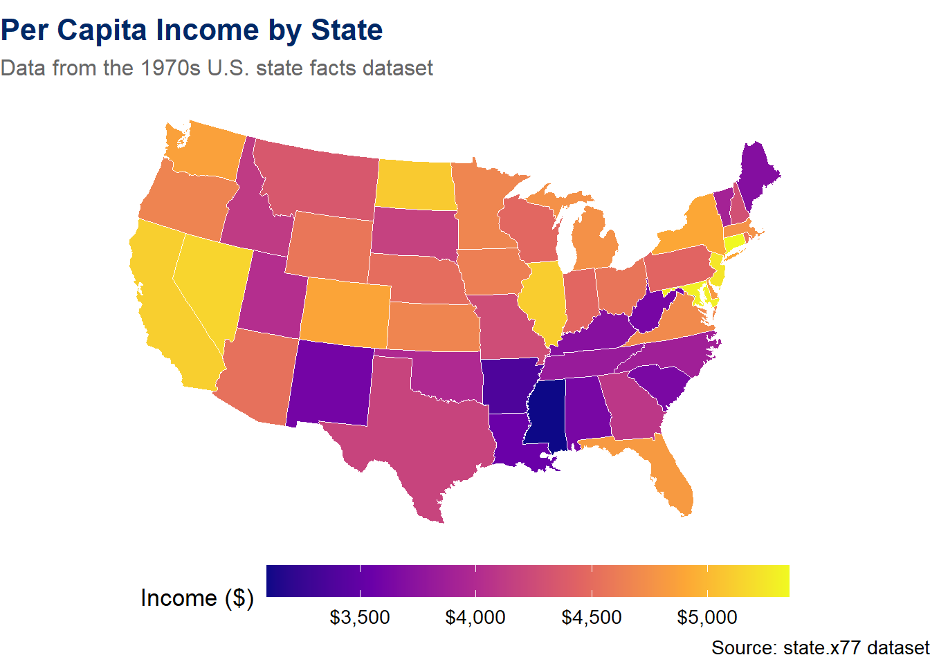
Let us walk through the key elements:
map_data("state") retrieves polygon coordinates for all U.S. states. Each state is represented by a series of (longitude, latitude) points that define its boundary.left_join() merges our data (income by state) with the polygon coordinates. The region column in map_data() contains lowercase state names.geom_polygon() draws filled polygons. The group aesthetic is essential – it tells ggplot2 which points belong to the same state.scale_fill_viridis_c(option = "plasma") applies a perceptually uniform, colorblind-friendly color scale.coord_map("albers", lat0 = 39, lat1 = 45) uses the Albers Equal Area projection, which is standard for thematic maps of the contiguous United States.theme_void() removes all axes, grid lines, and backgrounds, leaving only the map itself.You have just seen how geographic data can be mapped to colors across regions. Now explore it interactively. The sandbox below lets you choose different variables, color palettes, and projections to see how each choice affects the map’s story.
US Choropleth Map Explorer — Color, Palette, Projection
If the app takes a few seconds to load on first visit, that is normal — the server is waking up.
Exploration Tasks:
What You Should Have Noticed: The choice of variable, palette, and projection all affect the story a map tells. Sequential palettes work best for data with a natural ordering (low-to-high), while diverging palettes highlight deviations from a center. Map projections unavoidably distort either shape, area, or distance — choosing the right one depends on your audience and purpose.
AI & This Concept When asking AI to create a choropleth, specify three things: (1) the geographic level (state, county, country), (2) the variable to map, and (3) whether the palette should be sequential, diverging, or qualitative. AI tools often default to rainbow palettes that obscure patterns — always request a perceptually uniform palette like viridis.
Let us create another choropleth to practice. This time we will visualize life expectancy and use a different color palette:
us_map %>%
 left_join(state_data, by = c("region" = "state")) %>%
 ggplot(aes(x = long, y = lat, group = group, fill = life_exp)) +
 geom_polygon(color = "white", linewidth = 0.2) +
 scale_fill_distiller(palette = "RdYlGn", direction = 1,
 name = "Life Expectancy\n(years)") +
 coord_map("albers", lat0 = 39, lat1 = 45) +
 labs(title = "Life Expectancy by State",
 subtitle = "Higher life expectancy in the northern and western states",
 caption = "Source: state.x77 dataset (1970s data)") +
 theme_void(base_size = 13) +
 theme(
 plot.title = element_text(face = "bold", color = "#002967", size = 16),
 plot.subtitle = element_text(color = "#666666", size = 12),
 legend.position = "bottom",
 legend.key.width = unit(2, "cm")
 )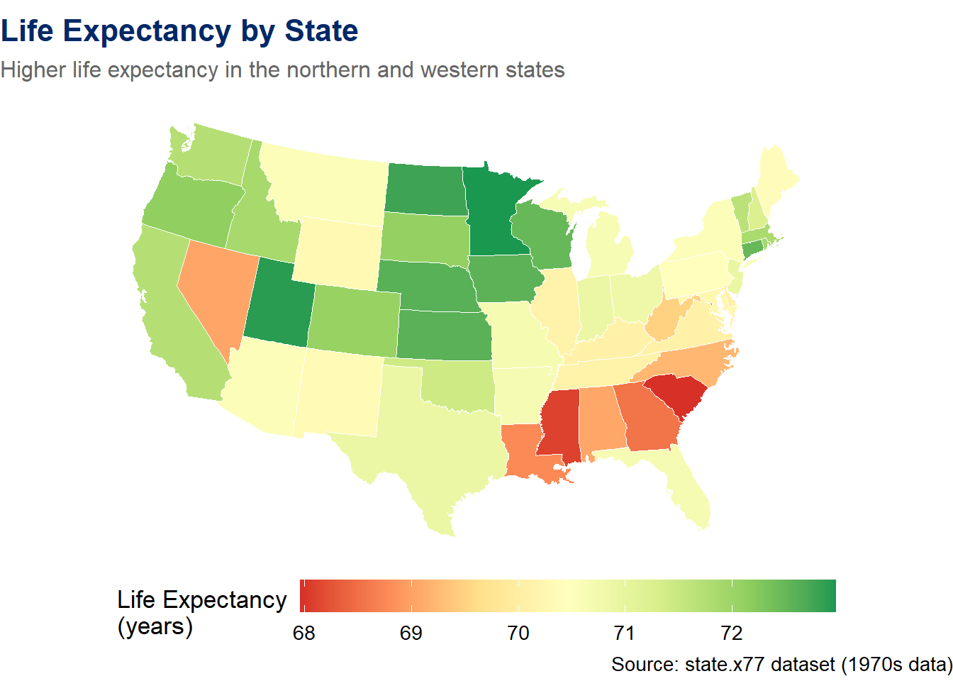
Notice how the geographic pattern immediately jumps out: states in the deep South tend to have lower life expectancy, while states in the Midwest and Mountain West tend to have higher values. This geographic pattern would be much harder to see in a table of numbers.
Static choropleths are great for print and reports, but interactive choropleths let users hover over states, read popups, and explore the data directly. We can create a true interactive choropleth by converting the maps package boundaries into an sf object and using Leaflet’s addPolygons().
# Convert maps package boundaries to sf (no external files needed)
states_sf <- st_as_sf(maps::map("state", plot = FALSE, fill = TRUE))

# Prepare state data with lowercase names to match
state_info <- tibble(
 ID = tolower(state.name),
 income = state.x77[, "Income"],
 life_exp = state.x77[, "Life Exp"],
 population = state.x77[, "Population"] * 1000,
 illiteracy = state.x77[, "Illiteracy"]
)

# Join data to the sf boundaries
states_merged <- states_sf %>%
 left_join(state_info, by = "ID")

# Create a color palette
pal <- colorNumeric("viridis", domain = states_merged$income)

# Build the interactive choropleth
leaflet(states_merged) %>%
 addProviderTiles(providers$CartoDB.Positron) %>%
 addPolygons(
 fillColor = ~pal(income),
 fillOpacity = 0.7,
 color = "white",
 weight = 1,
 popup = ~paste0(
 "<b>", tools::toTitleCase(ID), "</b><br>",
 "Income: ", scales::dollar(income), "<br>",
 "Life Exp: ", round(life_exp, 1), " years<br>",
 "Population: ", scales::comma(population)
 ),
 highlight = highlightOptions(
 weight = 3,
 color = "#002967",
 fillOpacity = 0.9,
 bringToFront = TRUE
 )
 ) %>%
 addLegend(
 position = "bottomright",
 pal = pal,
 values = ~income,
 title = "Per Capita Income",
 labFormat = labelFormat(prefix = "$")
 )
Warning: sf layer has inconsistent datum (+proj=longlat +ellps=clrk66 +no_defs).
Need '+proj=longlat +datum=WGS84'Let us break down what makes this different from our static choropleths:
st_as_sf(maps::map(...)) converts the built-in maps package boundaries into an sf (simple features) object — no external shapefiles neededcolorNumeric() creates a continuous color mapping function that Leaflet can useaddPolygons() draws the actual state boundaries as filled, clickable polygonshighlight = highlightOptions(...) makes states light up when you hover over them — this provides immediate visual feedbackaddLegend() adds an interactive legend that maps colors to income valuesHover over any state to see it highlighted, and click to see detailed information in the popup. This is a much richer experience than a static map — the viewer can explore at their own pace.
Sometimes you want to encode a size variable on a map — for example, showing that California has a much larger population than Wyoming. Proportional circle markers are ideal for this:
# State centers with population data (all 50 states)
state_centers <- tibble(
 state = state.name,
 lat = state.center$y,
 lng = state.center$x,
 pop = state.x77[, "Population"] * 1000,
 income = state.x77[, "Income"],
 life_exp = state.x77[, "Life Exp"]
)

leaflet(state_centers) %>%
 addProviderTiles(providers$CartoDB.Positron) %>%
 addCircleMarkers(
 ~lng, ~lat,
 radius = ~sqrt(pop) / 80,
 color = "#002967",
 fillColor = "#C41E3A",
 fillOpacity = 0.5,
 stroke = TRUE,
 weight = 1,
 popup = ~paste0(
 "<b>", state, "</b><br>",
 "Population: ", scales::comma(pop), "<br>",
 "Income: ", scales::dollar(income), "<br>",
 "Life Exp: ", round(life_exp, 1), " years"
 )
 )
Input to asJSON(keep_vec_names=TRUE) is a named vector. In a future version of jsonlite, this option will not be supported, and named vectors will be translated into arrays instead of objects. If you want JSON object output, please use a named list instead. See ?toJSON.The circle sizes are proportional to the square root of population (using sqrt() so that the area of each circle scales linearly with the data). Click on any circle to see detailed information in the popup. Notice how the large circles for California, New York, and Texas immediately draw the eye — this is the power of encoding data in size.
The sf (simple features) package is the modern standard for working with spatial data in R. It represents geographic data as data frames with a special geometry column, which means you can use all of your familiar tidyverse tools – filter(), mutate(), group_by(), summarise() – on spatial data.
The sf package integrates beautifully with ggplot2 through the geom_sf() function, which automatically handles coordinate reference systems and projections.
library(sf)

# Reading a shapefile
states_sf <- st_read("path/to/states.shp")

# Inspect the data — it looks like a regular data frame with a geometry column
glimpse(states_sf)

# Plot with ggplot2 — geom_sf() knows how to handle the geometry
ggplot(states_sf) +
 geom_sf(aes(fill = population)) +
 scale_fill_viridis_c() +
 theme_void()

# Spatial operations — sf makes these straightforward
states_sf %>%
 filter(region == "West") %>%
 mutate(pop_density = population / area) %>%
 ggplot() +
 geom_sf(aes(fill = pop_density)) +
 scale_fill_viridis_c(option = "magma") +
 labs(title = "Population Density in Western States") +
 theme_void()
This sf section extends what you already saw. Earlier, we used st_as_sf() to convert the built-in maps package data for our interactive choropleth. The code above shows how sf works more generally with external shapefiles — it will not run as-is because it requires downloading external data. The purpose is to give you a mental model of how modern spatial data analysis works in R so that you are prepared to use it in future projects.
Key sf concepts:
st_read() reads spatial data from shapefiles, GeoJSON, GeoPackage, and many other formatsgeom_sf() is the ggplot2 geometry for spatial data – it automatically handles projections and coordinate systemsst_transform() converts between coordinate reference systems (e.g., from WGS84 to Albers Equal Area)st_join() performs spatial joins – linking data based on geographic overlap rather than shared keysTip: If you want to experiment with sf without downloading shapefiles, the rnaturalearth package provides world and country boundaries as sf objects. Install it with install.packages("rnaturalearth") and use ne_countries(returnclass = "sf") to get a world map ready for geom_sf().
Geographic visualization carries its own set of design challenges. Here are the key principles to keep in mind:
As we discussed earlier, every projection distorts something. For thematic maps of the United States, the Albers Equal Area projection is standard because it preserves area – ensuring that larger states are not visually over- or under-represented. For world maps, Robinson or Equal Earth are good general-purpose choices. Avoid the Mercator projection for thematic maps, as its area distortion can be deeply misleading.
Rainbow color scales (also called “jet” colormap) are one of the most common design mistakes in geographic visualization. They are problematic because:
Instead, use viridis or ColorBrewer palettes, which are designed to be perceptually uniform and colorblind-friendly.
Maps can become cluttered very quickly. Unlike a bar chart where you might label every bar, a map with labels on every region can be unreadable. Use labels only for the most important features, and consider interactive popups (as in Leaflet) as an alternative to static labels.
Edward Tufte’s principle of maximizing the data-to-ink ratio applies strongly to maps. Remove unnecessary borders, grid lines, and decorations. Use theme_void() in ggplot2 to strip away non-data elements. Let the geographic shapes and colors speak for themselves.
# Compare good vs. poor color scale choices
map_joined <- us_map %>%
 left_join(state_data, by = c("region" = "state"))

p_good <- ggplot(map_joined, aes(x = long, y = lat, group = group, fill = income)) +
 geom_polygon(color = "white", linewidth = 0.2) +
 scale_fill_viridis_c(option = "viridis", labels = dollar_format()) +
 coord_map("albers", lat0 = 39, lat1 = 45) +
 labs(title = "Viridis (perceptually uniform)",
 fill = "Income") +
 theme_void(base_size = 11) +
 theme(plot.title = element_text(face = "bold", color = "#002967"),
 legend.position = "bottom",
 legend.key.width = unit(1.5, "cm"))

p_poor <- ggplot(map_joined, aes(x = long, y = lat, group = group, fill = income)) +
 geom_polygon(color = "white", linewidth = 0.2) +
 scale_fill_gradientn(colours = rainbow(7), labels = dollar_format()) +
 coord_map("albers", lat0 = 39, lat1 = 45) +
 labs(title = "Rainbow (avoid this!)",
 fill = "Income") +
 theme_void(base_size = 11) +
 theme(plot.title = element_text(face = "bold", color = "#C41E3A"),
 legend.position = "bottom",
 legend.key.width = unit(1.5, "cm"))

p_good + p_poor +
 plot_annotation(
 title = "Color Scale Matters: Viridis vs. Rainbow",
 subtitle = "The same data, two very different impressions",
 theme = theme(
 plot.title = element_text(face = "bold", color = "#002967", size = 15),
 plot.subtitle = element_text(color = "#666666")
 )
 )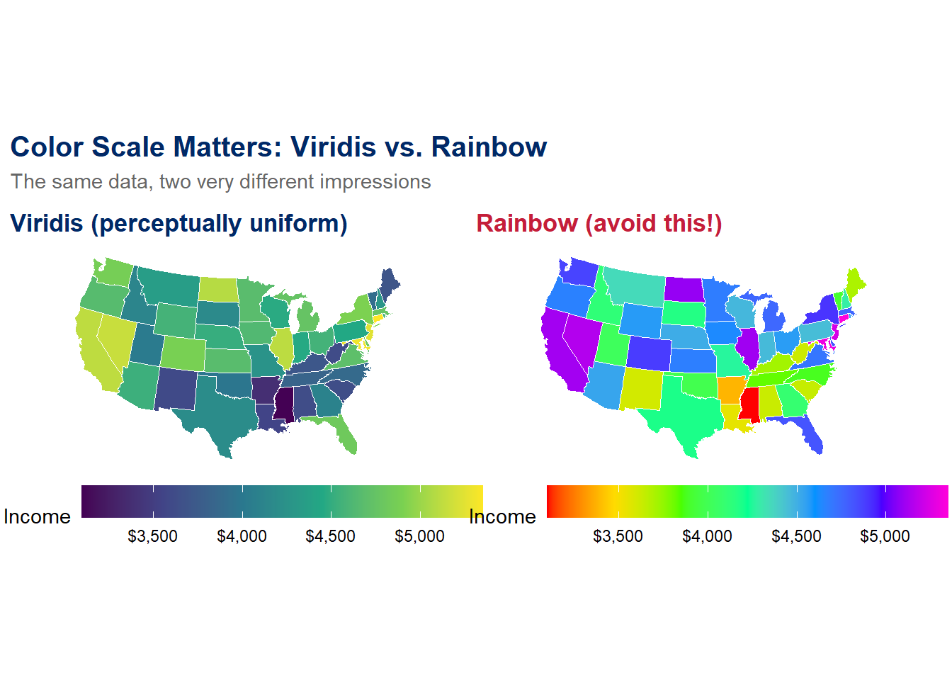
The viridis palette (left) provides a clear, ordered progression from low to high values. The rainbow palette (right) creates visual chaos – bright yellow bands jump out, green and cyan blur together, and the viewer has no intuitive sense of ordering. Always choose the viridis side.
Ethical Reflection: Maps, Justice, and Respecting the Humanity behind Data
Maps have the power to reveal geographic injustice in ways that no table of numbers can match. Consider the history of redlining in American cities – government-sanctioned maps that designated Black neighborhoods as “hazardous” for investment, systematically denying residents access to mortgages, insurance, and economic opportunity. These maps shaped cities for generations, and their effects persist today in patterns of wealth, health, and education.
When we create geographic visualizations, we should ask: Whose stories are being told, and whose are being erased? A map of “food deserts” – areas without access to affordable, nutritious food – reveals communities in need. A map of healthcare access can highlight rural areas left behind. A map of environmental pollution can show which communities bear a disproportionate burden.
Respecting the humanity behind data reminds us that every point on a map represents real people in real places. When we plot a marker or shade a region, we are representing lived experiences. Using our skills in service of others challenges us to use geographic visualization not just as a technical exercise, but as a tool for justice – to illuminate inequity, to advocate for the vulnerable, and to ensure that no community is invisible.
These fill-in-the-blank exercises let you practice the core geographic visualization techniques from this chapter. Replace the ___ blanks with the correct code, then knit your document to check your work.
Template Exercise 1: Build a Leaflet Map with Custom Markers
Create a Leaflet map centered on a U.S. city of your choice with at least three markers. Use addCircleMarkers() with custom colors and popups.
# Step 1: Create a tibble with your locations
my_places <- tibble(
 name = c("Place 1", "Place 2", "Place 3"),
 lat = c(___, ___, ___),
 lng = c(___, ___, ___)
)

# Step 2: Build the Leaflet map
leaflet(___) %>%
 addProviderTiles(providers$___) %>%
 addCircleMarkers(
 ~lng, ~lat,
 radius = 8,
 color = "___",
 fillColor = "___",
 fillOpacity = 0.7,
 popup = ~name
 )
Hints:
CartoDB.Positron or CartoDB.DarkMatter for a clean look.lat = north/south, lng = east/west.Template Exercise 2: Create a Choropleth Map
Build a U.S. choropleth map showing the illiteracy rate by state using the built-in state.x77 dataset.
# Step 1: Prepare the state data
state_info <- tibble(
 state = tolower(state.name),
 illiteracy = state.x77[, "___"]
)

# Step 2: Get the map polygons
us_map_data <- map_data("___")

# Step 3: Join and plot
us_map_data %>%
 left_join(state_info, by = c("region" = "___")) %>%
 ggplot(aes(x = long, y = lat, group = group, fill = ___)) +
 geom_polygon(color = "white", linewidth = 0.2) +
 scale_fill_viridis_c(option = "___") +
 coord_map("albers", lat0 = 39, lat1 = 45) +
 labs(title = "Illiteracy Rate by State",
 subtitle = "Data from the 1970s state.x77 dataset",
 fill = "Illiteracy (%)",
 caption = "Source: state.x77") +
 theme_void(base_size = 13) +
 theme(
 plot.title = element_text(face = "bold", color = "#002967", size = 16),
 legend.position = "bottom",
 legend.key.width = unit(2, "cm")
 )
Hints:
state.x77 is "Illiteracy" (capital I)."state" as the map data source and "state" as the join key."viridis", "plasma", "inferno", or "magma".Template Exercise 3: Leaflet Map with Proportional Markers
Create a Leaflet map that shows all 50 U.S. states with circle markers sized by population and colored in the book’s accent colors.
# Step 1: Prepare all 50 states
all_states <- tibble(
 state = ___,
 lat = state.center$___,
 lng = state.center$___,
 pop = state.x77[, "___"] * 1000,
 income = state.x77[, "Income"]
)

# Step 2: Build interactive map
leaflet(___) %>%
 addProviderTiles(providers$CartoDB.Positron) %>%
 addCircleMarkers(
 ~lng, ~lat,
 radius = ~sqrt(___) / 100,
 color = "#002967",
 fillColor = "#___",
 fillOpacity = 0.5,
 stroke = TRUE,
 weight = 1,
 popup = ~paste0(
 "<b>", state, "</b><br>",
 "Population: ", scales::comma(pop), "<br>",
 "Income: ", scales::dollar(income)
 )
 )
Hints:
state.name for all 50 state names.$y for latitude and $x for longitude."Population" column in state.x77 is in thousands, so multiply by 1000.C41E3A for the fill color.Template Exercise 4: Side-by-Side Choropleth Comparison
Create two choropleth maps side by side using patchwork: one showing income and one showing life expectancy, both using the Albers Equal Area projection.
# Step 1: Prepare data (reuse state_data and us_map from earlier, or recreate)
state_info <- tibble(
 state = tolower(state.name),
 income = state.x77[, "___"],
 life_exp = state.x77[, "___"]
)

us_polygons <- map_data("state")

map_joined <- us_polygons %>%
 left_join(state_info, by = c("region" = "state"))

# Step 2: Income map
p_income <- ggplot(map_joined, aes(x = long, y = lat, group = group, fill = ___)) +
 geom_polygon(color = "white", linewidth = 0.2) +
 scale_fill_viridis_c(option = "plasma", labels = dollar_format()) +
 coord_map("albers", lat0 = 39, lat1 = 45) +
 labs(title = "Per Capita Income", fill = "Income") +
 theme_void(base_size = 11) +
 theme(plot.title = element_text(face = "bold", color = "#002967"),
 legend.position = "bottom",
 legend.key.width = unit(1.5, "cm"))

# Step 3: Life expectancy map
p_life <- ggplot(map_joined, aes(x = long, y = lat, group = group, fill = ___)) +
 geom_polygon(color = "white", linewidth = 0.2) +
 scale_fill_distiller(palette = "___", direction = 1) +
 coord_map("albers", lat0 = 39, lat1 = 45) +
 labs(title = "Life Expectancy", fill = "Years") +
 theme_void(base_size = 11) +
 theme(plot.title = element_text(face = "bold", color = "#002967"),
 legend.position = "bottom",
 legend.key.width = unit(1.5, "cm"))

# Step 4: Combine with patchwork
___ + ___ +
 plot_annotation(
 title = "Income and Life Expectancy Across U.S. States",
 subtitle = "Do wealthier states have longer life expectancies?",
 theme = theme(
 plot.title = element_text(face = "bold", color = "#002967", size = 15),
 plot.subtitle = element_text(color = "#666666")
 )
 )
Hints:
state.x77 are "Income" and "Life Exp" (with a space).income for the first fill and life_exp for the second fill."RdYlGn" or "YlGnBu" for the life expectancy color palette.p_income + p_life.Map ER — Fix the broken map before it misleads the public
If the app takes a few seconds to load on first visit, that is normal — the server is waking up.
How to Play:
Chapter 7 Exercises
Exercise 1: Your Personal Map
Create a Leaflet map with at least 5 markers representing locations that are meaningful to you – your hometown, places you have lived, schools you have attended, favorite travel destinations, or places you dream of visiting. For each marker, include a popup with the place name and a brief sentence about why it is meaningful. Use addCircleMarkers() with at least two different colors to distinguish categories (e.g., “places I’ve lived” vs. “places I’ve visited”). Add an appropriate tile provider and a legend.
Exercise 2: Alternative Choropleth
Using the state.x77 dataset and map_data("state"), build a static U.S. choropleth map showing a variable other than income or life expectancy. Choose one of the following: illiteracy rate, murder rate, high school graduation rate, or frost days. Use a color scale that is appropriate for the data (sequential for a variable with a natural low-to-high ordering, diverging if you center it on the national average). Include a descriptive title, subtitle, and caption. Use the Albers Equal Area projection.
Exercise 3: Tile Provider Exploration
Create three versions of the same Leaflet map (showing and at least two nearby landmarks) using three different tile providers. Choose from: OpenStreetMap, CartoDB.Positron, CartoDB.DarkMatter, Esri.WorldImagery, and Stamen.Watercolor. In a paragraph below the maps, describe how the visual feel changes with each provider. Which one would you choose for a data-heavy map, and why?
Exercise 4: Reading – Wilke Chapter 15
Read Chapter 15 (“Visualizing Geospatial Data”) of Claus O. Wilke’s Fundamentals of Data Visualization (freely available at clauswilke.com/dataviz). In your R Markdown document, write a reflection (3–5 sentences) on the following question: What is one design principle from the chapter that you had not previously considered, and how will it change the way you approach geographic visualization?
This book material draws on and is inspired by the work of many scholars and practitioners: