Code
if (file.exists("images/01/funvis.jpg")) knitr::include_graphics("images/01/funvis.jpg")By the end of this chapter, you will be able to:
Data visualization is far more than making pretty pictures. It is one of the most powerful tools we have for making sense of information. But what exactly counts as a “visualization”?
Robert Kosara offers a useful three-part definition. For something to qualify as a visualization, it must be:
This definition helps us distinguish true data visualization from decoration or illustration. A chart that distorts the underlying data may be an image, but it fails the third criterion. An artistic rendering that is not grounded in data fails the first.
if (file.exists("images/01/funvis.jpg")) knitr::include_graphics("images/01/funvis.jpg")Visualization serves many purposes. It can explore data, revealing patterns we did not expect. It can explain findings to an audience. And it can convince – making a persuasive case grounded in evidence.
if (file.exists("images/01/convincing.png")) knitr::include_graphics("images/01/convincing.png")Ethical Reflection: Seeing Truthfully
Honest inquiry demands seeing the world as it truly is – not as we wish it to be. Data visualization, at its best, serves this same goal. When we create honest, clear graphics, we practice a form of truthful seeing. When we distort or mislead with data, we obscure truth. As you learn visualization, consider: How can the charts I create help others see the world more clearly and act more justly?
In 1973, statistician Francis Anscombe constructed four small datasets that would become one of the most famous examples in all of statistics. Each dataset has nearly identical summary statistics – the same means, standard deviations, and correlations. Yet when you plot them, they tell completely different stories.
This is the fundamental lesson: summary statistics alone can be deeply misleading. You must always visualize your data.
Let us examine this directly. We will work through this step by step so you can run each chunk on its own and knit after each one.
First, we load the tidyverse package, which gives us access to ggplot2, dplyr, tidyr, and other tools we will use throughout this book.
library(tidyverse)── Attaching core tidyverse packages ──────────────────────── tidyverse 2.0.0 ──
✔ dplyr 1.1.4 ✔ readr 2.1.5
✔ forcats 1.0.0 ✔ stringr 1.5.1
✔ ggplot2 4.0.0 ✔ tibble 3.3.0
✔ lubridate 1.9.4 ✔ tidyr 1.3.1
✔ purrr 1.1.0
── Conflicts ────────────────────────────────────────── tidyverse_conflicts() ──
✖ dplyr::filter() masks stats::filter()
✖ dplyr::lag() masks stats::lag()
ℹ Use the conflicted package (<http://conflicted.r-lib.org/>) to force all conflicts to become errorsThe built-in anscombe dataset stores the four sets in wide format. We reshape it into tidy (long) format so that each row represents one observation with its set label.
anscombe_tidy <- anscombe %>%
 pivot_longer(everything(),
 names_to = c(".value", "set"),
 names_pattern = "(.)(.)")
Take a quick look at the first few rows to see what the tidy data looks like:
head(anscombe_tidy, 12)# A tibble: 12 × 3
set x y
<chr> <dbl> <dbl>
1 1 10 8.04
2 2 10 9.14
3 3 10 7.46
4 4 8 6.58
5 1 8 6.95
6 2 8 8.14
7 3 8 6.77
8 4 8 5.76
9 1 13 7.58
10 2 13 8.74
11 3 13 12.7
12 4 8 7.71Now we compute the summary statistics for each of the four sets. Watch how similar they are:
anscombe_tidy %>%
 group_by(set) %>%
 summarise(
 mean_x = mean(x),
 mean_y = mean(y),
 sd_x = sd(x),
 sd_y = sd(y),
 cor_xy = cor(x, y)
 )
# A tibble: 4 × 6
set mean_x mean_y sd_x sd_y cor_xy
<chr> <dbl> <dbl> <dbl> <dbl> <dbl>
1 1 9 7.50 3.32 2.03 0.816
2 2 9 7.50 3.32 2.03 0.816
3 3 9 7.5 3.32 2.03 0.816
4 4 9 7.50 3.32 2.03 0.817The numbers are strikingly similar across all four sets. If you only looked at these statistics, you would conclude the four datasets are essentially the same.
Now let us see what the data actually look like:
ggplot(anscombe_tidy, aes(x = x, y = y)) +
 geom_point(color = "#002967", size = 3, alpha = 0.8) +
 geom_smooth(method = "lm", se = FALSE, color = "#C41E3A") +
 facet_wrap(~set, ncol = 2) +
 labs(title = "Anscombe's Quartet",
 subtitle = "Same statistics, completely different stories") +
 theme_minimal(base_size = 14)
`geom_smooth()` using formula = 'y ~ x'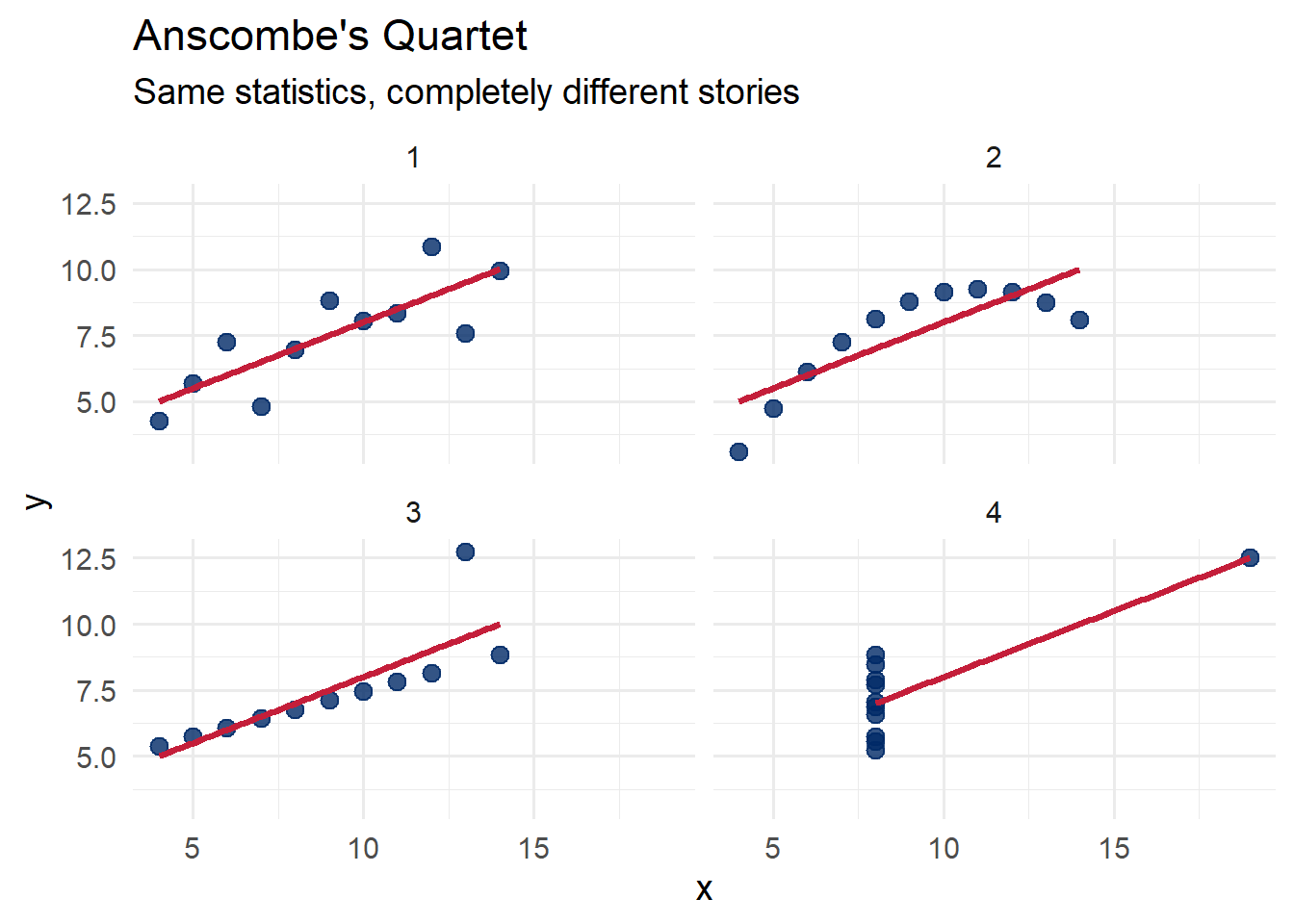
Set 1 shows a straightforward linear relationship. Set 2 reveals a curved pattern that a linear model misses entirely. Set 3 has a perfect linear relationship broken by a single outlier. Set 4 shows that one extreme point can create the illusion of a relationship where none exists.
The lesson is clear: always plot your data.
Attribution: Anscombe, F.J. (1973). “Graphs in Statistical Analysis.” The American Statistician, 27(1), 17–21.
If Anscombe’s Quartet made the case with four datasets, the Datasaurus Dozen drives it home with thirteen. Created by Matejka and Fitzmaurice in 2017, these datasets all share the same summary statistics to two decimal places – yet their shapes range from a star to a circle to a dinosaur.
if (file.exists("images/01/DinoSequential.gif")) knitr::include_graphics("images/01/DinoSequential.gif")We can use the datasauRus package to plot all thirteen datasets at once:
library(datasauRus)Warning: package 'datasauRus' was built under R version 4.5.2ggplot(datasaurus_dozen, aes(x = x, y = y)) +
geom_point(alpha = 0.6, color = "#002967", size = 0.8) +
facet_wrap(~dataset, ncol = 4) +
labs(title = "The Datasaurus Dozen",
subtitle = "Never trust summary statistics alone",
caption = "Source: datasauRus package (Matejka & Fitzmaurice, 2017)") +
theme_minimal(base_size = 14)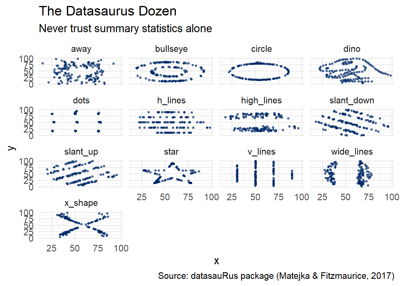
Every single one of these panels has the same mean of x, mean of y, standard deviation of x, standard deviation of y, and correlation between x and y. The message is unmistakable: visualization is not optional.
You have just seen that summary statistics can be deeply misleading. Now experience it yourself. The interactive sandbox below lets you flip through all 13 Datasaurus datasets, watching the numbers stay frozen while the shapes transform.
Datasaurus Explorer — Same Stats, Different Shapes
If the app takes a few seconds to load on first visit, that is normal — the server is waking up.
Exploration Tasks:
What You Should Have Noticed: Every dataset has the same mean, standard deviation, and correlation — to two decimal places. This is precisely why visualization is not optional. Summary statistics compress data into a few numbers, and that compression can hide wildly different patterns. Always plot your data first.
AI & This Concept Before accepting any AI-generated analysis at face value, always ask it to plot the data first. Summary statistics alone hide the real story — and AI tools summarize by default. The sandbox above shows exactly why this matters.
R is a programming language and environment designed for statistical computing and graphics. It was created in the early 1990s by Ross Ihaka and Robert Gentleman at the University of Auckland, New Zealand, as an open-source implementation of the S language.
if (file.exists("images/01/Rlogo.png")) knitr::include_graphics("images/01/Rlogo.png")Since then, R has grown into one of the most widely used tools for data analysis and visualization in the world. The Comprehensive R Archive Network (CRAN) hosts thousands of contributed packages – a nice preview of the ecosystem you will learn to navigate in this book.
You do not need to be a programmer. Many readers of this book have no prior coding experience, and that is perfectly fine. R has a learning curve, but the payoff is enormous. We will learn just enough R to create effective visualizations – and you may find that you enjoy it more than you expected.
To get started, you need two pieces of software:
Install R first, then RStudio. Once both are installed, open RStudio and run the following code in the console to install the packages we will use throughout this book:
install.packages(c(
 "tidyverse", # data manipulation and ggplot2
 "datasauRus", # Datasaurus Dozen datasets
 "rmarkdown", # R Markdown documents
 "knitr", # document rendering
 "scales", # scale functions for visualization
 "viridis", # colorblind-friendly palettes
 "RColorBrewer", # color palettes
 "patchwork", # combining multiple plots
 "plotly", # interactive visualizations
 "gapminder", # global development data
 "palmerpenguins", # penguin measurement data
 "sf", # spatial data
 "leaflet", # interactive maps
 "DT", # interactive tables
 "gganimate", # animated plots
 "ggthemes", # additional ggplot2 themes
 "ggrepel", # non-overlapping text labels
 "treemapify", # treemap geom for ggplot2
 "GGally" # ggplot2 extensions
))
About RStudio: RStudio is not a separate programming language – it is an interface for working with R. Think of R as the engine and RStudio as the dashboard. When you open RStudio, you will see four panes: the Source editor (top-left), the Console (bottom-left), the Environment (top-right), and the Files/Plots/Help viewer (bottom-right). We will become very familiar with this layout over the course of this book.
Common Chapter 1 Errors and How to Fix Them
If you run into problems with this chapter, check here first. These are the most common issues encountered when getting started.
1. “Error in library(tidyverse) : there is no package called ‘tidyverse’”
This means the package has not been installed yet. R does not come with tidyverse pre-installed. Run the install command first:
install.packages("tidyverse")You only need to install a package once. After that, you load it with library(tidyverse) each time you start a new session.
2. “could not find function ‘ggplot’”
This means you forgot to load the tidyverse at the top of your script or R Markdown document. Add library(tidyverse) to your setup chunk and run it before your plotting code. Every R Markdown document should have a setup chunk near the top that loads the packages you need.
3. The Knit button is greyed out or produces an error
Check that your file is saved with the .Rmd extension, not .R. R scripts (.R files) cannot be knitted – only R Markdown files (.Rmd) can. In RStudio, go to File > Save As and make sure the filename ends in .Rmd.
4. “object ‘x’ not found”
This usually means one of two things: (a) you have a typo in a variable name, or (b) you did not run an earlier code chunk that creates the variable. In R Markdown, chunks run in order from top to bottom when you knit. Make sure every chunk that creates a variable appears before any chunk that uses it. Also check for capitalization – R is case-sensitive, so myData and mydata are different objects.
5. Pandoc error when knitting
If you see an error mentioning “pandoc” or “LaTeX,” your RStudio installation may be out of date. Go to posit.co/download/rstudio-desktop/ and install the latest version of RStudio, which bundles a current version of Pandoc. If you are trying to knit to PDF, install the tinytex package by running install.packages("tinytex") followed by tinytex::install_tinytex(). For the purposes of this book, knitting to HTML is sufficient.
R Markdown is a document format that lets you combine narrative text, code, and output (including graphics) in a single file. When you “knit” an R Markdown document, R executes all the code chunks and weaves the results together with your text into a finished document – an HTML page, a PDF, a Word document, or even a presentation.
An R Markdown file (.Rmd) has three main components:
The YAML header appears at the very top of the file, enclosed in triple dashes (---). It controls document-level settings such as the title, author, date, and output format.
The body of the document uses Markdown syntax for formatting. You can create headings with #, bold text with double asterisks, italics with single asterisks, lists, links, and more.
R code is embedded in fenced code chunks that begin with ```{r} and end with ```. You can control each chunk’s behavior using options like echo (show/hide the code), eval (run or skip execution), fig.width, and fig.height.
Here is a minimal R Markdown template to get you started:
# This is what a basic .Rmd file looks like:
#
# ---
# title: "My First Visualization"
# author: "Your Name"
# date: "2026-01-15"
# output: html_document
# ---
#
# ## Introduction
#
# This is my first R Markdown document.
#
# ```{r}
# library(tidyverse)
# ```
#
# ## A Simple Plot
#
# ```{r}
# ggplot(mpg, aes(x = displ, y = hwy, color = class)) +
# geom_point(size = 2) +
# labs(title = "Engine Displacement vs. Highway MPG",
# x = "Engine Displacement (L)",
# y = "Highway MPG",
# color = "Vehicle Class") +
# theme_minimal()
# ```
#
# ## Conclusion
#
# Visualization reveals patterns that numbers alone cannot.Tip: Use the Knit button in RStudio (or the keyboard shortcut Ctrl+Shift+K) to render your R Markdown document. Start by knitting frequently – it is much easier to catch errors when you have only added a small amount of new content.
Before jumping into the exercises, let us build one more plot together from scratch. This will reinforce the core pattern of ggplot2: data + aesthetic mapping + geometry.
We will use the mpg dataset that comes with ggplot2. It contains fuel economy data for 38 popular car models.
library(tidyverse)The ggplot() function initializes a plot. We map displ (engine displacement) to the x-axis and hwy (highway miles per gallon) to the y-axis. Then we add geom_point() to draw the points.
ggplot(mpg, aes(x = displ, y = hwy)) +
 geom_point()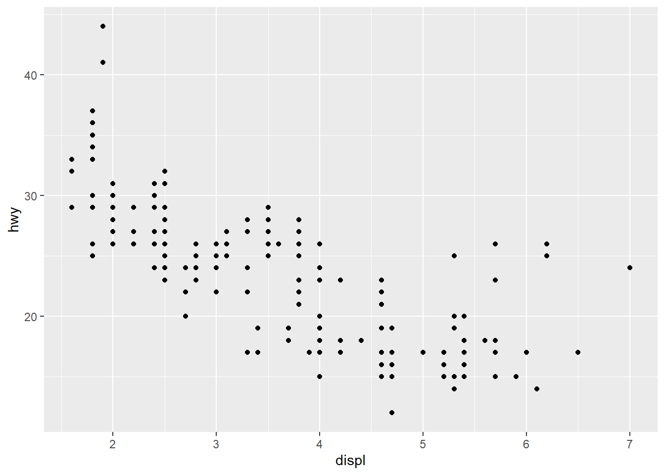
Now we map the class variable to color, increase the point size, and add informative labels.
ggplot(mpg, aes(x = displ, y = hwy, color = class)) +
  geom_point(size = 2) +
  labs(title = "Engine Displacement vs. Highway MPG",
       x = "Engine Displacement (L)",
       y = "Highway MPG",
       color = "Vehicle Class") +
  theme_minimal()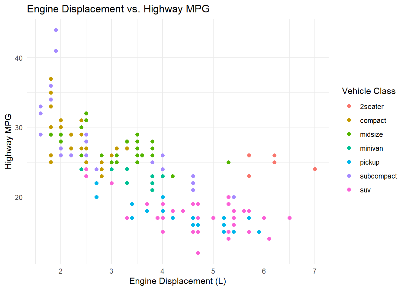
Chapter 1 Exercises
Exercise 1: Install R and RStudio
Download and install R from CRAN and RStudio from Posit. Open RStudio and verify that the console displays the R version. Run the install.packages() command from the Setting Up section above to install the required packages. Take a screenshot of your RStudio console showing the R version and paste it into your R Markdown document.
Exercise 2: Create and Knit Your First R Markdown Document
In RStudio, go to File > New File > R Markdown. Give it a title like “Chapter 1 Practice” and your name as the author. Click OK, then click the Knit button to render the default template. Examine the output and note how the code chunks, text, and results are woven together. Then delete the default content below the YAML header and replace it with the following. Fill in the blanks (___) and knit again:
## About Me

My name is ___ and I am studying ___ at .

## A Quick Plot

```{r}
library(tidyverse)
ggplot(mpg, aes(x = ___, y = ___)) +
  geom_point(color = "#002967") +
  labs(title = "My First ggplot",
       x = "___",
       y = "___") +
  theme_minimal()
```

## What I Learned

One thing I learned from the Chapter 1 materials is ___.Hint for the blanks: Pick any two numeric columns from the mpg dataset. You can see all available columns by running glimpse(mpg) in the console. Good choices include displ, hwy, cty, and year. Make sure your axis labels match the variables you chose.
Exercise 3: Reproduce and Modify Anscombe’s Quartet
Copy the Anscombe code from this chapter into a new R Markdown document. Knit it to make sure it works. Then modify the plot in the following ways – fill in the blanks:
library(tidyverse)

anscombe_tidy <- anscombe %>%
 pivot_longer(everything(),
 names_to = c(".value", "set"),
 names_pattern = "(.)(.)")

# Modify the plot: change the point color, add a different title,
# and use a different theme
ggplot(anscombe_tidy, aes(x = x, y = y)) +
 geom_point(color = "___", size = ___, alpha = 0.8) +
 geom_smooth(method = "lm", se = FALSE, color = "___") +
 facet_wrap(~set, ncol = 2) +
 labs(title = "___",
 subtitle = "___") +
theme___(base_size = 14)Hint: For colors, try any valid color name like "steelblue", "darkred", or "forestgreen". For the theme, try theme_classic(), theme_light(), or theme_bw(). Run ?theme_minimal in the console to see a list of built-in themes.
Exercise 4: Explore a New Dataset
The palmerpenguins package includes measurements of three penguin species. Use the template below to create a scatter plot. Fill in the blanks to map the correct variables and add labels:
library(tidyverse)
library(palmerpenguins)

# First, take a look at the data
glimpse(penguins)

# Now create a scatter plot of bill length vs. bill depth,
# colored by species
ggplot(penguins, aes(x = ___, y = ___, color = ___)) +
 geom_point(size = 2, alpha = 0.7) +
 labs(
 title = "Palmer Penguins: Bill Dimensions",
 x = "___",
 y = "___",
 color = "___"
 ) +
theme_minimal(base_size = 14)Hint: The bill measurement columns are bill_length_mm and bill_depth_mm. The species column is species. Your axis labels should describe what the variable measures, including units.
After creating the plot, write 2-3 sentences in your R Markdown document describing what patterns you see. Do the three species cluster differently?
Exercise 5: Read Healy Chapter 1
Read Chapter 1 (“Look at Data”) of Kieran Healy’s Data Visualization: A Practical Introduction. As you read, write down three key takeaways in your R Markdown document. What surprised you? What confirmed something you already suspected?
This book material draws on and is inspired by the work of many scholars and practitioners: