Tidy data, the pipe operator, and the core dplyr verbs you need for every visualization
6.1 Learning Objectives
By the end of this chapter, you will be able to:
Define tidy data and explain why it matters for ggplot2
Use the pipe operator %>% to chain operations into readable pipelines
Apply the six core dplyr verbs: filter(), select(), mutate(), summarise(), group_by(), and arrange()
Reshape wide data to long format with pivot_longer()
Use fct_reorder() to control the order of categories in your charts
Build a complete wrangle-then-plot pipeline from start to finish
Tidy Data Explorer
A note about this chapter. This is the most technical chapter of the book. Data wrangling is the bridge between having data and being able to visualize it. If you have never written code that transforms data before, this chapter may feel challenging – and that is completely normal. Go slowly, run every code chunk one at a time, and focus on understanding what each step does before moving to the next. You do not need to memorize every function. You need to understand the pattern so you can look things up when you need them.
Tip
Pre-Wrangled Data in Chapters 6–8
If data wrangling feels overwhelming in this chapter, here is the most important thing to know: Chapters 6, 7, and 8 will provide pre-wrangled datasets ready for visualization. You will not need to wrangle raw data from scratch to complete those exercises.
This chapter teaches you the foundations so you understand what is happening when data gets transformed. But struggling here will not cascade into failure on later chapters. Keep going, do your best, and know that the safety net is in place.
6.2 1. Tidy Data
The single most important concept in this chapter is tidy data. The term comes from Hadley Wickham’s influential 2014 paper in the Journal of Statistical Software, and it provides the foundation for everything we do in the tidyverse.
Tidy data follows three simple rules:
Each variable forms a column
Each observation forms a row
Each type of observational unit forms a table
These rules sound straightforward, but most data you encounter in the real world violates at least one of them. Spreadsheets designed for human reading often spread variables across column headers, merge cells for visual clarity, or mix multiple observational units in a single table.
6.2.1 Why Does This Matter for ggplot2?
Remember from Chapter 4 that ggplot2 maps variables to aesthetics. If your variable is spread across multiple columns (like 2020, 2021, 2022 as separate columns), you cannot map it to a single aesthetic like x = year. Tidy data makes the mapping from data to visual properties direct and explicit.
Here is a concrete example. Look at this “messy” (wide-format) population data:
Code
library(tidyverse)
── Attaching core tidyverse packages ──────────────────────── tidyverse 2.0.0 ──
✔ dplyr     1.1.4     ✔ readr     2.1.5
✔ forcats   1.0.0     ✔ stringr   1.5.1
✔ ggplot2   4.0.0     ✔ tibble    3.3.0
✔ lubridate 1.9.4     ✔ tidyr     1.3.1
✔ purrr     1.1.0
── Conflicts ────────────────────────────────────────── tidyverse_conflicts() ──
✖ dplyr::filter() masks stats::filter()
✖ dplyr::lag()    masks stats::lag()
ℹ Use the conflicted package (<http://conflicted.r-lib.org/>) to force all conflicts to become errors
Code
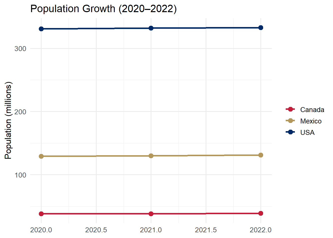
# Messy (wide) data — years are spread across columnsmessy <-tibble(country =c("USA", "Canada", "Mexico"),`2020`=c(331, 38, 129),`2021`=c(332, 38, 130),`2022`=c(333, 39, 131))messy
# A tibble: 3 × 4
  country `2020` `2021` `2022`
  <chr>    <dbl>  <dbl>  <dbl>
1 USA        331    332    333
2 Canada      38     38     39
3 Mexico     129    130    131
This looks fine to a human eye. But try mapping it to ggplot2 – what would you put on the x-axis? There is no year column. The years are trapped inside column names, not inside column values.
Now let us tidy it:
Code
# Tidy (long) data — each row is one country-year observationtidy <- messy %>%pivot_longer(cols =`2020`:`2022`,names_to ="year",values_to ="population_millions")tidy
# A tibble: 9 × 3
  country year  population_millions
  <chr>   <chr>               <dbl>
1 USA     2020                  331
2 USA     2021                  332
3 USA     2022                  333
4 Canada  2020                   38
5 Canada  2021                   38
6 Canada  2022                   39
7 Mexico  2020                  129
8 Mexico  2021                  130
9 Mexico  2022                  131
The messy data had 3 rows and 4 columns. The tidy data has 9 rows and 3 columns. Every combination of country and year is its own row, and year and population_millions are proper columns we can map to aesthetics.
Now we can plot it directly:
Code
tidy %>%mutate(year =as.integer(year)) %>%ggplot(aes(x = year, y = population_millions, color = country)) +geom_line(linewidth =1.2) +geom_point(size =3) +scale_color_manual(values =c("USA"="#002967","Canada"="#C41E3A","Mexico"="#B4975A")) +labs(title ="Population Growth (2020\u20132022)",y ="Population (millions)", x =NULL, color =NULL) +theme_minimal(base_size =13)
Tip
Rule of thumb: If you want to map something to color, fill, or facet but the categories are stuck in column names rather than in a column of their own, you need pivot_longer().
6.3 2. The Pipe Operator %>%
The pipe operator %>% is the connective tissue of tidyverse code. Read it as “and then.” It takes the output of the expression on its left and passes it as the first argument to the function on its right.
Without the pipe, code reads inside-out. With the pipe, code reads top-to-bottom like a recipe:
Code
# Without pipe: nested, hard to read — you must read inside-outarrange(summarise(group_by(filter(mpg, year ==2008), class), avg =mean(hwy)), desc(avg))
# With pipe: clear, readable — you read top to bottommpg %>%filter(year ==2008) %>%group_by(class) %>%summarise(avg =mean(hwy), .groups ="drop") %>%arrange(desc(avg))
Both produce the exact same result. But the piped version tells a story: start with mpg, then filter to 2008, then group by class, then calculate the average highway mpg, then arrange from highest to lowest.
Think of it like giving directions:
Without pipe: “Go to the end of the street that is two blocks after the left turn you make after exiting the highway at exit 4.”
With pipe: “Take exit 4. Turn left. Go two blocks. It is at the end of the street.”
Same destination. Very different readability.
Base R pipe |> vs. magrittr pipe %>%: R 4.1+ introduced a native pipe operator |>. It works similarly for most use cases. In this book we use %>% because it is what you will encounter in most existing tidyverse code and tutorials. Both are fine. If you see |> in online examples, know that it does essentially the same thing.
6.4 3. The dplyr Verbs
The dplyr package provides a small set of verbs – functions that each do one thing well. Think of them as the building blocks of data transformation. When you chain them together with pipes, you can express sophisticated data transformations in clear, readable code.
There are six verbs you need to know. Each one operates on a data frame and returns a new data frame.
Verb
What it does
Think of it as…
filter()
Keeps rows that match a condition
“Show me only the rows where…”
select()
Keeps (or removes) specific columns
“I only need these columns…”
mutate()
Creates new columns or modifies existing ones
“Calculate a new variable…”
summarise()
Collapses many rows into a summary
“Give me the average/count/max…”
group_by()
Sets up groups for summarise
“Do this separately for each…”
arrange()
Sorts rows
“Put these in order by…”
6.4.1 filter()
filter() selects rows based on conditions. Only rows where the condition evaluates to TRUE are kept. Everything else is removed.
Code
# Keep only Toyota vehicles from 2008mpg %>%filter(manufacturer =="toyota", year ==2008) %>%select(model, year, cty, hwy)
Notice two things: we use == (double equals) to test for equality, not = (single equals). And when we list multiple conditions separated by commas, it means “AND” – both conditions must be true.
Here are the most common operators you will use inside filter():
Operator
Meaning
Example
==
equals
filter(year == 2008)
!=
not equal
filter(class != "suv")
>, <, >=, <=
comparisons
filter(hwy > 30)
%in%
value is in a set
filter(class %in% c("suv", "pickup"))
&
and
filter(year == 2008 & hwy > 25)
|
or
filter(class == "suv" | class == "pickup")
is.na()
is missing
filter(is.na(hwy))
!is.na()
is not missing
filter(!is.na(hwy))
6.4.2 select()
select() chooses columns. It is your tool for narrowing a wide dataset down to just the variables you need. This makes your data easier to work with and your output easier to read.
Code
# Keep only specific columnsmpg %>%select(manufacturer, model, year, hwy, cty) %>%head(8)
# A tibble: 8 × 5
  manufacturer model       year   hwy   cty
  <chr>        <chr>      <int> <int> <int>
1 audi         a4          1999    29    18
2 audi         a4          1999    29    21
3 audi         a4          2008    31    20
4 audi         a4          2008    30    21
5 audi         a4          1999    26    16
6 audi         a4          1999    26    18
7 audi         a4          2008    27    18
8 audi         a4 quattro  1999    26    18
You can also use helper functions inside select():
starts_with("h") – all columns whose names start with “h”
ends_with("y") – all columns whose names end with “y”
contains("mpg") – all columns whose names contain “mpg”
-column_name – remove a column (keep everything else)
6.4.3 mutate()
mutate() creates new columns or modifies existing ones. The original columns are preserved; new columns are appended to the right side of the data frame.
Code
# Calculate average MPG and estimated annual fuel costmpg %>%mutate(avg_mpg = (cty + hwy) /2,fuel_cost_annual = (15000/ avg_mpg) *3.50# 15k miles at $3.50/gal ) %>%select(manufacturer, model, avg_mpg, fuel_cost_annual) %>%head(8)
# A tibble: 8 × 4
  manufacturer model      avg_mpg fuel_cost_annual
  <chr>        <chr>        <dbl>            <dbl>
1 audi         a4            23.5            2234.
2 audi         a4            25              2100
3 audi         a4            25.5            2059.
4 audi         a4            25.5            2059.
5 audi         a4            21              2500
6 audi         a4            22              2386.
7 audi         a4            22.5            2333.
8 audi         a4 quattro    22              2386.
Think of mutate() as adding a new column to a spreadsheet where the value in each cell is calculated from other columns in the same row.
6.4.4 summarise() + group_by()
summarise() (you can also spell it summarize()) collapses many rows into summary statistics. On its own, it gives you a single-row summary of the entire dataset. But when you pair it with group_by(), it computes summaries within each group.
First, let us see summarise() without grouping:
Code
# One summary for the entire datasetmpg %>%summarise(avg_hwy =mean(hwy),max_hwy =max(hwy),total_cars =n() )
Notice the .groups = "drop" argument. This tells R to remove the grouping after summarizing, which prevents surprising behavior in downstream operations. Always include it.
Common summary functions you can use inside summarise():
Function
What it calculates
mean(x)
Average
median(x)
Median
sd(x)
Standard deviation
min(x), max(x)
Minimum, maximum
n()
Count of rows
sum(x)
Total
6.4.5 arrange()
arrange() sorts rows. By default it sorts in ascending order (smallest to largest). Wrap a column in desc() to sort in descending order (largest to smallest).
Code
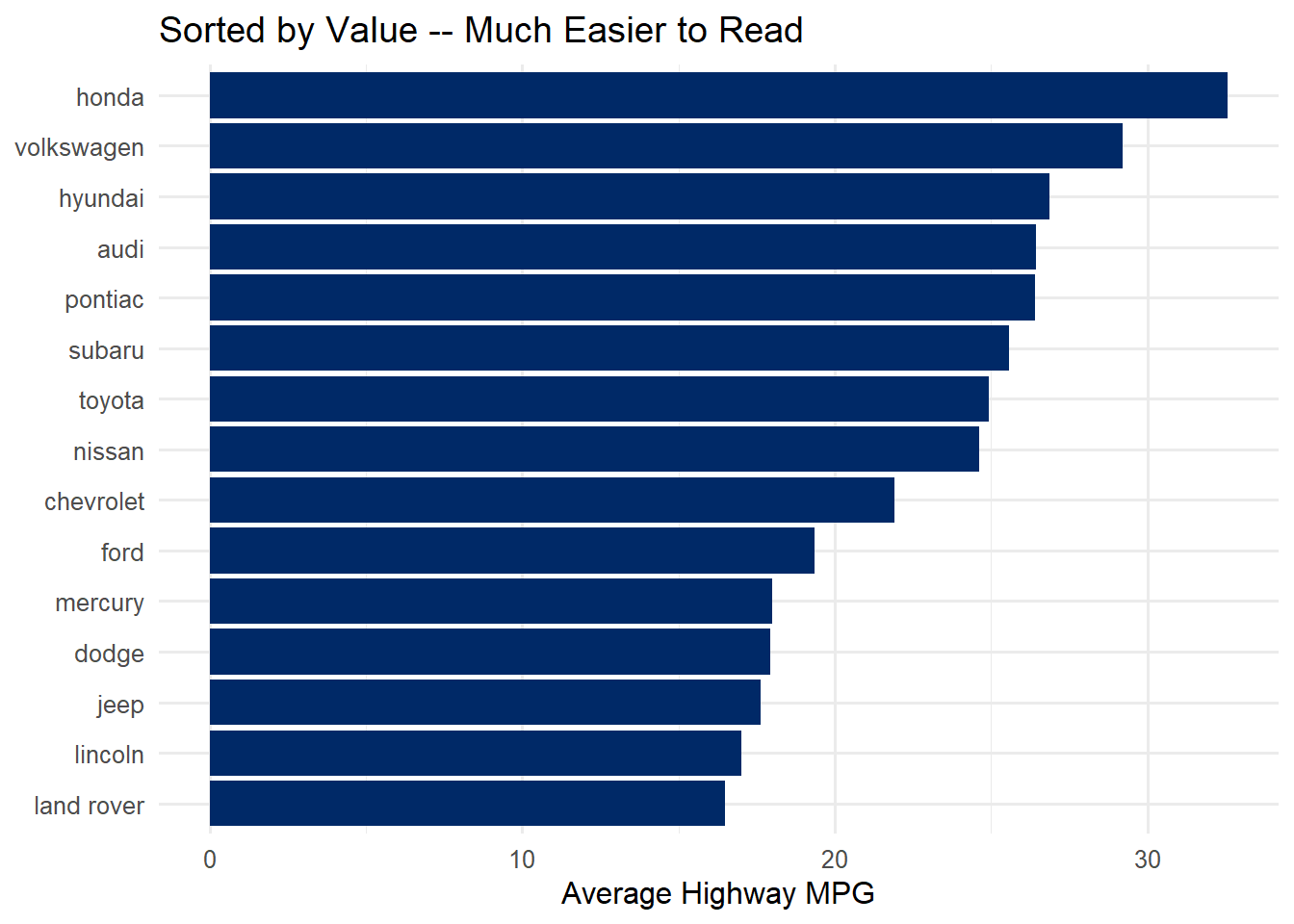
# Rank manufacturers by average highway MPG (best to worst)mpg %>%group_by(manufacturer) %>%summarise(avg_hwy =mean(hwy), .groups ="drop") %>%arrange(desc(avg_hwy))
# A tibble: 15 × 2
   manufacturer avg_hwy
   <chr>          <dbl>
 1 honda           32.6
 2 volkswagen      29.2
 3 hyundai         26.9
 4 audi            26.4
 5 pontiac         26.4
 6 subaru          25.6
 7 toyota          24.9
 8 nissan          24.6
 9 chevrolet       21.9
10 ford            19.4
11 mercury         18
12 dodge           17.9
13 jeep            17.6
14 lincoln         17
15 land rover      16.5
6.5 Common Errors and How to Fix Them
When you are working through this chapter’s code, you will almost certainly encounter some of these errors. This is normal. Here is a quick reference for diagnosing and fixing them.
“Error: object ‘hwy’ not found”
Inside dplyr verbs, use bare column names (no quotes): filter(hwy > 30), not filter("hwy" > 30).
“Error in filter(): ! object ‘mpg’ not found”
Did you load the tidyverse? You need to run library(tidyverse) at the top of your script before using any dplyr functions or built-in datasets like mpg.
“Error: unexpected PIPE”
The %>% pipe must go at the end of a line, not the start of the next line.
# WRONG — pipe at the start of a line
mpg
 %>% filter(year == 2008)

# RIGHT — pipe at the end of a line
mpg %>%
 filter(year == 2008)
“.groups argument” warning
This is a warning, not an error – your code still runs. But to silence it and avoid unexpected behavior, add .groups = "drop" inside summarise():
summarise(avg = mean(hwy), .groups = "drop")
“Column ___ doesn’t exist”
Check your spelling. R is case-sensitive.Hwy is not the same as hwy. Use names(mpg) or glimpse(mpg) to see the exact column names.
pivot_longer() does not seem to work
Make sure cols = specifies which columns to pivot. If your column names start with numbers (like 2020), you must wrap them in backticks:
You have just learned the six core dplyr verbs. Now build a data transformation pipeline interactively. The sandbox below lets you toggle each verb on and off to see how the data changes at each step — no need to write code.
🧪 dplyr Pipeline Builder — Transform Data Step by Step
If the app takes a few seconds to load on first visit, that is normal — the server is waking up.
Exploration Tasks:
Start with no pipeline steps enabled. Look at the raw data — how many rows and columns are there?
Enable filter — how many rows remain? What criterion was applied?
Add select — which columns were kept? Why might you drop the others?
Toggle on mutate — what new column was created? Examine how it was calculated.
Finally, add arrange — does sorting reveal any patterns you did not notice before?
What You Should Have Noticed: Each verb does one specific thing, and the pipe (%>%) chains them together into a readable, step-by-step transformation. The order matters — filtering before grouping produces different results than grouping before filtering. Building pipelines incrementally (one verb at a time) helps you catch errors early.
AI & This Concept When asking AI to wrangle data, describe your pipeline step by step: “Filter to rows where year > 2000, then group by country, then compute mean GDP per capita.” AI tools produce much cleaner dplyr code when you break the transformation into explicit steps rather than asking for the end result all at once.
6.7 4. Reshaping with pivot_longer()
Most data you download from the internet comes in wide format – designed for human reading, with categories spread across column headers. But ggplot2 needs long format – one row per observation, with categories in their own column.
pivot_longer() converts wide data to long data. It has three key arguments:
Argument
Purpose
Example
cols
Which columns to pivot
cols = c(City, Highway) or cols =2020:2022`| |names_to| Name for the new column that will hold the old column names |names_to = “type”| |values_to| Name for the new column that will hold the values |values_to = “mpg”`
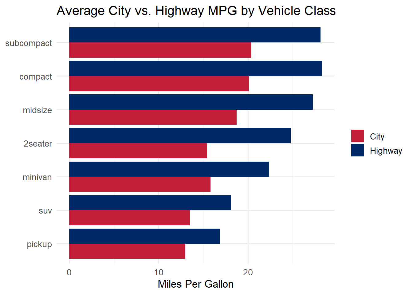
Let us walk through a complete example. We want to compare city and highway fuel economy by vehicle class, shown side by side in a grouped bar chart. To get two bars per class (one for city, one for highway), we need a column that says “City” or “Highway” – which means we need to pivot.
Step 1: Summarise the data
Code
# Calculate average city and highway MPG by classmpg_summary <- mpg %>%group_by(class) %>%summarise(City =mean(cty),Highway =mean(hwy),.groups ="drop" )mpg_summary
# A tibble: 7 × 3
  class       City Highway
  <chr>      <dbl>   <dbl>
1 2seater     15.4    24.8
2 compact     20.1    28.3
3 midsize     18.8    27.3
4 minivan     15.8    22.4
5 pickup      13      16.9
6 subcompact  20.4    28.1
7 suv         13.5    18.1
Notice that City and Highway are separate columns. We cannot map both to a single y-axis in ggplot2 while also coloring by type.
Step 2: Pivot to long format
Code
# Pivot so that "City" and "Highway" become values in a new columnmpg_long <- mpg_summary %>%pivot_longer(cols =c(City, Highway),names_to ="type",values_to ="mpg" )mpg_long
# A tibble: 14 × 3
   class      type      mpg
   <chr>      <chr>   <dbl>
 1 2seater    City     15.4
 2 2seater    Highway  24.8
 3 compact    City     20.1
 4 compact    Highway  28.3
 5 midsize    City     18.8
 6 midsize    Highway  27.3
 7 minivan    City     15.8
 8 minivan    Highway  22.4
 9 pickup     City     13
10 pickup     Highway  16.9
11 subcompact City     20.4
12 subcompact Highway  28.1
13 suv        City     13.5
14 suv        Highway  18.1
Now we have a type column with values “City” and “Highway” and an mpg column with the corresponding values. This is tidy data: each row is one class-type combination.
Step 3: Plot
Code
ggplot(mpg_long, aes(x =fct_reorder(class, mpg), y = mpg, fill = type)) +geom_col(position ="dodge") +scale_fill_manual(values =c("City"="#C41E3A", "Highway"="#002967")) +coord_flip() +labs(title ="Average City vs. Highway MPG by Vehicle Class",x =NULL, y ="Miles Per Gallon", fill =NULL) +theme_minimal(base_size =13)
Warning
Common pitfall: Forgetting to pivot before plotting. If you try to map both cty and hwy to the y-axis in a single ggplot call, you will run into trouble. The tidy approach is always: pivot first, then map the new category column to fill or color.
6.8 Try It: Tidy Data Transformer
You have just seen how pivot_longer() reshapes wide data into tidy (long) format. Now try it interactively. The sandbox below shows messy (wide) data on the left and the tidy (long) result on the right — color-coded so you can see exactly which columns become which rows.
🧪 Tidy Data Transformer — See pivot_longer() in Action
If the app takes a few seconds to load on first visit, that is normal — the server is waking up.
Exploration Tasks:
Start with the Quarterly Sales dataset. How many rows and columns does the wide table have? How many does the tidy table have? Why did the number of rows increase?
Change the names_to label from “quarter” to “time_period” — watch how the generated R code and the tidy table column header update in real time.
Uncheck one column (e.g., Q4) from the pivot controls. How does the tidy table change? How many rows disappeared?
Switch to the City Temperatures dataset. Notice how the default names_to and values_to labels change to match the context. Why is “month” a better column name than “quarter” for this dataset?
What You Should Have Noticed: Pivoting is a mechanical operation — each selected column in the wide data generates one new row per existing row in the tidy data. The color bands make this mapping visible: a blue column in the wide table becomes blue-tinted rows in the long table. The names_to column stores the old column names, and the values_to column stores the old column values. Understanding this mapping is the key to knowing when and how to use pivot_longer().
AI & This Concept When asking AI to reshape data, describe what the wide and long versions should look like: “I have columns Q1, Q2, Q3, Q4 and I want a single ‘quarter’ column with a ‘revenue’ column for the values.” Giving AI a concrete before-and-after description produces much more reliable pivot_longer() code than vague requests like “make my data tidy.”
6.9 5. Controlling Chart Order with forcats
By default, ggplot2 orders categorical axes alphabetically. This is almost never what you want. A bar chart ordered alphabetically makes it hard to compare values because the bars have no meaningful progression.
The forcats package (part of the tidyverse – it loads automatically with library(tidyverse)) gives you functions to reorder factor levels. The three most useful for visualization:
Function
What it does
When to use it
fct_reorder(category, value)
Reorder by another variable
Bar charts sorted by value
fct_infreq(category)
Order by frequency
Bar charts of counts
fct_lump_n(category, n)
Keep top n, lump rest into “Other”
Too many categories
The one you will use most often is fct_reorder(). Here is the difference it makes:
Code
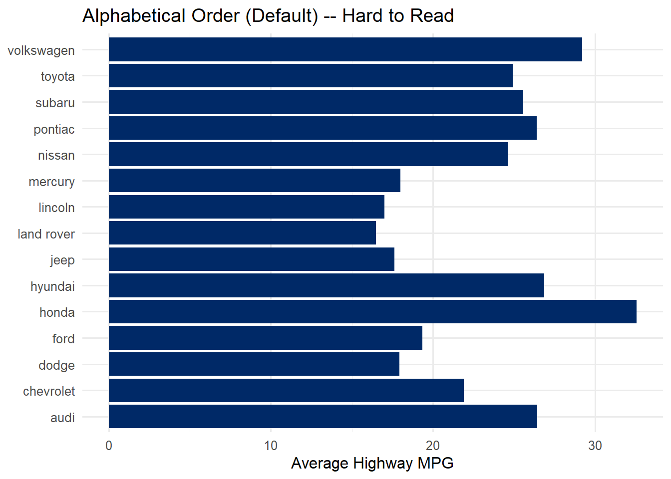
# WITHOUT fct_reorder — alphabetical order (hard to compare)mpg %>%group_by(manufacturer) %>%summarise(avg_hwy =mean(hwy), .groups ="drop") %>%ggplot(aes(x = avg_hwy, y = manufacturer)) +geom_col(fill ="#002967") +labs(title ="Alphabetical Order (Default) -- Hard to Read",x ="Average Highway MPG", y =NULL) +theme_minimal(base_size =12)
Code
# WITH fct_reorder — sorted by value (easy to compare)mpg %>%group_by(manufacturer) %>%summarise(avg_hwy =mean(hwy), .groups ="drop") %>%mutate(manufacturer =fct_reorder(manufacturer, avg_hwy)) %>%ggplot(aes(x = avg_hwy, y = manufacturer)) +geom_col(fill ="#002967") +labs(title ="Sorted by Value -- Much Easier to Read",x ="Average Highway MPG", y =NULL) +theme_minimal(base_size =12)
The only difference between the two charts is one line: mutate(manufacturer = fct_reorder(manufacturer, avg_hwy)). That single line transforms the chart from confusing to clear. Always sort your bar charts by value unless there is a natural ordering (like months or rankings) that takes priority.
Tip
fct_reorder() is your best friend for bar charts. The pattern is always the same: fct_reorder(category_column, numeric_column). This reorders the categories so that they appear in order of the numeric value. It works with horizontal bars (y = fct_reorder(...)) and vertical bars (x = fct_reorder(...)).
6.10 6. A Brief Note on String Cleaning
Real-world data often has messy text: inconsistent capitalization, extra whitespace, typos. The stringr package (part of the tidyverse) provides functions for cleaning strings. All stringr functions start with str_ for easy discovery.
You do not need to master stringr at this point, but here are the three functions you are most likely to need:
Function
What it does
Example
str_trim()
Removes leading/trailing spaces
" hello " becomes "hello"
str_to_lower()
Converts to lowercase
"HELLO" becomes "hello"
str_to_title()
Converts to title case
"hello world" becomes "Hello World"
Code
# Quick example: cleaning messy name datamessy_names <-c(" John Smith ", "JANE DOE", "bob jones")tibble(original = messy_names,cleaned = messy_names %>%str_trim() %>%str_to_title())
# A tibble: 3 × 2
  original       cleaned
  <chr>          <chr>
1 " John Smith " John Smith
2 "JANE DOE"     Jane Doe
3 "bob jones"    Bob Jones
If you need more string manipulation in a future project, the R for Data Science chapter on strings is an excellent reference: https://r4ds.hadley.nz/strings.
6.11 7. Putting It All Together: A Complete Pipeline
This is the section where everything connects. We will build a complete pipeline step by step, showing the output after each operation so you can see exactly what each verb does to the data.
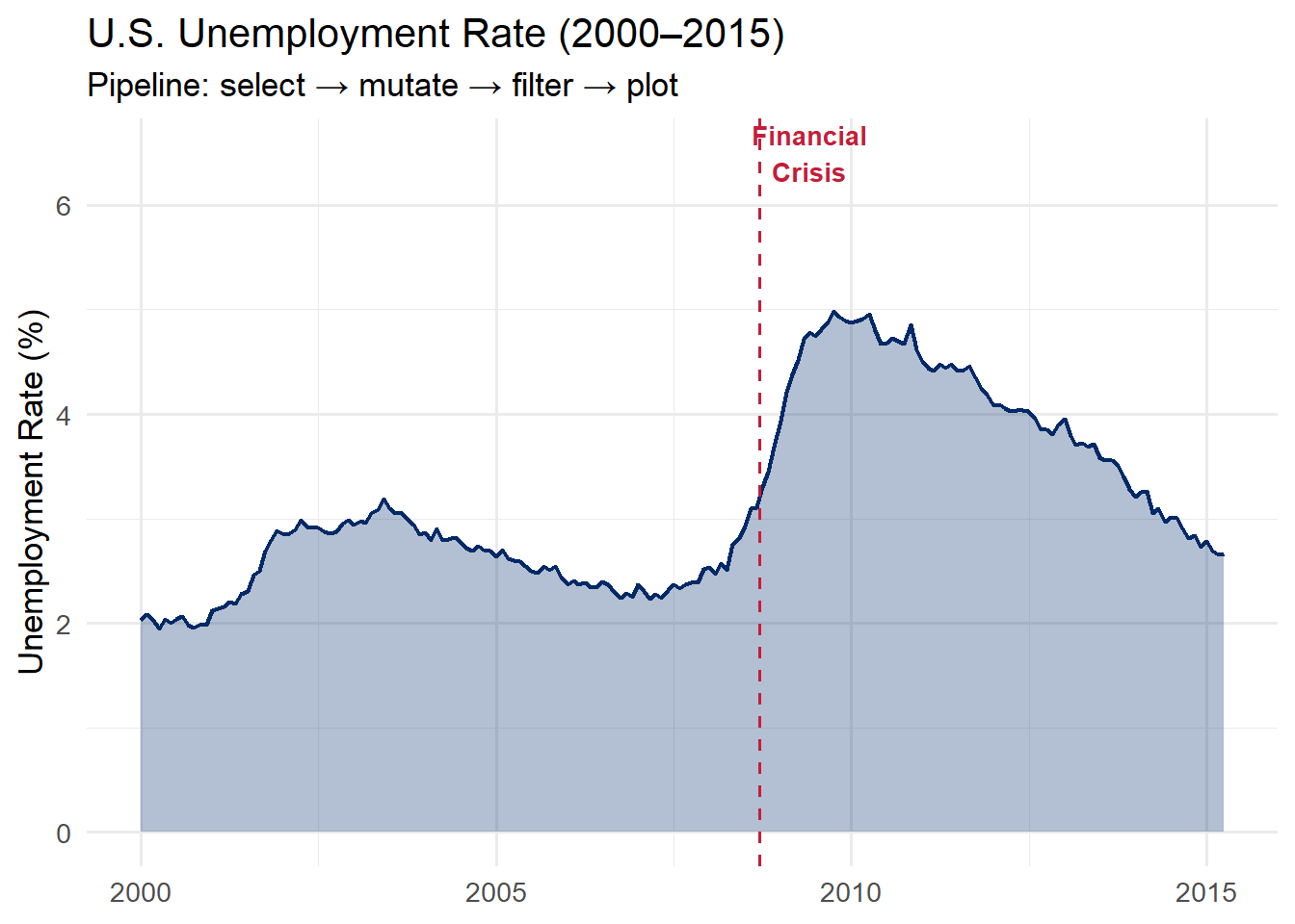
Our goal: Create a polished visualization of U.S. unemployment trends from 2000 to 2015, starting from the raw economics dataset built into ggplot2.
Step 1: Look at the raw data
Code
# What does the raw data look like?economics %>%head(5)
The economics dataset has columns for date, population (pop), unemployment count (unemploy), and others. But it does not have an unemployment rate. We need to compute that.
Step 2: Select the columns we need
Code
# Narrow down to just the columns we needeconomics %>%select(date, unemploy, pop) %>%head(5)
We filter to January 2000 and later because we want to focus on the modern era, including the 2008 financial crisis.
Step 5: Save and plot
Code
# Store the wrangled data, then plot iteconomics_clean <- economics %>%select(date, unemploy, pop) %>%mutate(unemploy_rate = unemploy / pop *100) %>%filter(date >="2000-01-01")ggplot(economics_clean, aes(x = date, y = unemploy_rate)) +geom_area(fill ="#002967", alpha =0.3) +geom_line(color ="#002967", linewidth =0.8) +geom_vline(xintercept =as.Date("2008-09-15"),linetype ="dashed", color ="#C41E3A") +annotate("text", x =as.Date("2009-06-01"), y =6.5,label ="Financial\nCrisis", color ="#C41E3A",fontface ="bold", size =3.5) +labs(title ="U.S. Unemployment Rate (2000\u20132015)",subtitle ="Pipeline: select \u2192 mutate \u2192 filter \u2192 plot",x =NULL, y ="Unemployment Rate (%)") +theme_minimal(base_size =13)
Here is the pattern laid bare:
select() narrows down to the columns we need
mutate() computes the unemployment rate from raw counts
filter() restricts to the time period of interest
ggplot() maps the wrangled data to visual form
This is the pattern you will use again and again: wrangle first, then plot.
Why separate the wrangling from the plotting? Keeping them in distinct steps (even if you could combine them) makes your code easier to debug. If the plot looks wrong, you can inspect the intermediate data frame (economics_clean) to see whether the problem is in the wrangling or the visualization. Debug one thing at a time.
Ethical Reflection: Data as Human Stories
Data wrangling is not merely a technical exercise. It is an act of care. Behind every row in a dataset is a person, a community, a lived experience. When we clean data, we make choices – what to keep, what to discard, what to transform. These choices shape the stories the data can tell.
Respecting the humanity behind data extends to how we handle data. Cleaning data respectfully means:
Not erasing outliers without understanding who they represent
Preserving context rather than reducing people to numbers
Questioning categories that may reflect bias or oversimplification
Thoughtful, reflective decision-making applies directly to wrangling. When you filter rows, you decide whose stories are told. When you group and summarise, you decide what patterns are highlighted. Approach these decisions with the same care and ethical awareness that responsible data practice demands.
Ask yourself: Who is included in this dataset? Who is excluded? What assumptions am I making when I clean and reshape this data?
6.12 8. Quick Reference
Here is a one-page summary of everything covered in this chapter. Bookmark this section for when you are working on exercises.
The six dplyr verbs:
data %>%
 filter(condition) # keep rows where condition is TRUE
 select(col1, col2) # keep only these columns
 mutate(new = expr) # create a new column
 group_by(category) # set up groups
 summarise(stat = fn(x)) # collapse to summary statistics
 arrange(desc(column)) # sort rows
For future reference: Two advanced dplyr features you may encounter in online code examples are across() (which applies a function to multiple columns at once) and the .by argument (a modern alternative to group_by() that automatically ungroups the result). You do not need these for this book, but they are useful to recognize when you see them.
6.13 Challenge: Pipe Dream
🎮 Pipe Dream — Get the verbs in order or the pipeline breaks
If the app takes a few seconds to load on first visit, that is normal — the server is waking up.
How to Play:
Enter your name and click Start Game
Each round describes a data wrangling goal in plain English
Drag dplyr verb cards into the correct pipeline order, then predict the resulting rows and columns
Complete all 8 rounds, then review your completion report
6.14 9. Exercises
Exercise 1: Storm Analysis with dplyr
Using the storms dataset (built into dplyr), complete the following pipeline. Fill in each blank (___) to make the code work.
Your task: Find the top 10 strongest hurricanes (Category 4 and above) and create a lollipop chart showing their maximum wind speeds.
The column for hurricane category is called category
Group by name to get one row per storm
Use max(wind) to find the highest wind speed per storm
slice_max() keeps the top n rows by a given column
Exercise 2: Pivoting Practice
The table4a dataset (built into tidyr) stores TB case counts in wide format, with years as column names. Your job: pivot it to tidy format and create a line chart.
Code
# Step 1: Look at the datatable4a# Step 2: Pivot and plottable4a %>%pivot_longer(cols =c(`___`, `___`),names_to ="___",values_to ="___") %>%mutate(year =as.integer(year)) %>%ggplot(aes(x = ___, y = ___, color = ___)) +geom_line(linewidth =1.2) +geom_point(size =3) +scale_color_manual(values =c("Afghanistan"="#002967","Brazil"="#C41E3A","China"="#B4975A")) +labs(title ="TB Cases by Country",x ="Year", y ="Cases", color =NULL) +theme_minimal(base_size =13)
Hints:
table4a has columns named 1999 and 2000 – since they start with numbers, wrap them in backticks
names_to should be "year" and values_to should be "cases"
In the ggplot aesthetics, map x = year, y = cases, color = country
Exercise 3: Complete dplyr Pipeline
Build a complete pipeline that filters, summarises, reorders, and plots the mpg dataset.
Your task: Create a horizontal bar chart showing the average highway MPG for each manufacturer, using only 2008 vehicles, sorted from highest to lowest.