A systematic framework for constructing visualizations layer by layer in R
4.1 Learning Objectives
By the end of this chapter, you will be able to:
Explain the grammar of graphics framework and its seven components
Build ggplot2 graphics layer by layer from data to finished visualization
Distinguish between aesthetic mappings inside and outside aes()
Use a variety of geometries (points, lines, bars, histograms, boxplots)
Apply faceting to create small multiples
Customize scales, labels, and themes for publication-quality graphics
Combine multiple plots into a single figure using the patchwork package
Save plots at appropriate sizes and resolutions with ggsave()
Grammar of Graphics Layer Builder
4.2 The Grammar of Graphics
In 1999, statistician Leland Wilkinson published The Grammar of Graphics, a book that would fundamentally change how we think about building visualizations. Wilkinson’s central insight was that statistical graphics are not a collection of unrelated chart types – scatterplots, bar charts, histograms, and so on – but rather that every graphic can be described as a combination of a few underlying components, assembled according to a set of rules.
Just as English grammar gives us rules for constructing sentences from nouns, verbs, and adjectives, the grammar of graphics gives us rules for constructing visualizations from data, aesthetics, and geometries. A sentence is not just a random collection of words; it follows a structure. A graphic is not just a random collection of marks on a page; it follows a structure too.
In 2005, Hadley Wickham translated Wilkinson’s theoretical framework into a practical R package called ggplot2 (the “gg” stands for “grammar of graphics”). Wickham’s implementation, described in his 2010 paper “A Layered Grammar of Graphics,” organizes every visualization into a series of layers. This is the system we will use for the rest of this book.
The “gg” in ggplot2 stands for Grammar of Graphics. The “2” indicates that this is the second iteration of Wickham’s package. The first version, ggplot, was never widely released. When we refer to “ggplot” in code, we mean the ggplot() function from the ggplot2 package.
4.2.1 The Seven Layers
Every ggplot2 graphic is constructed from up to seven layers. Not every plot uses all seven, but understanding each one gives you complete control over your visualizations:
Layer
Description
Example
Data
The dataset being visualized
ggplot(mpg, ...)
Aesthetics
Mappings from data variables to visual properties
aes(x = displ, y = hwy, color = class)
Geometries
The visual marks that represent data points
geom_point(), geom_line(), geom_col()
Facets
Splitting the plot into panels by a variable
facet_wrap(~class)
Statistics
Statistical transformations of the data
stat_smooth(), binning, counting
Coordinates
The coordinate system
coord_flip(), coord_polar()
Themes
Non-data visual appearance
theme_minimal(), font sizes, grid lines
Think of it this way: the data is your raw material. Aesthetics are the instructions for how to translate that material into visual form. Geometries are the shapes that appear on the page. Facets let you repeat the same plot for subsets of the data. Statistics transform your data before it reaches the geometry. Coordinates define the space in which everything is drawn. And themes control the final appearance of everything that is not data.
Note
Ethical Reflection: Intentional Design
The grammar of graphics is, at its heart, a discipline of intentionality. It asks you to be deliberate about every layer – to choose your data carefully, to map variables to aesthetics purposefully, to select geometries that reveal rather than obscure. This mirrors the practice of thoughtful, reflective decision-making: every choice should be made with reflection, every element should serve the truth. When you build a ggplot, ask yourself at each layer: Does this serve clarity? Does this help the viewer see what is real?
4.3 Try It: Grammar of Graphics Layer Builder
You have just learned how ggplot2 builds visualizations layer by layer. Now construct your own plot interactively. The sandbox below lets you toggle each layer on and off and see how the plot changes — no coding required.
🧪 Grammar of Graphics Layer Builder
If the app takes a few seconds to load on first visit, that is normal — the server is waking up.
Exploration Tasks:
Start with only the data and geom_point layers enabled. What do you see?
Add a smooth line — how does the story change?
Toggle on faceting — what new patterns emerge when the data is split by group?
Experiment with different themes — which one do you find most readable and professional?
What You Should Have Noticed: Each layer adds a distinct piece of information to the plot. The beauty of the Grammar of Graphics is that layers are independent — you can add, remove, or modify any layer without affecting the others. This modular approach makes ggplot2 incredibly flexible.
AI & This Concept When asking AI to build a ggplot, describe the layers you want explicitly: “Add a scatter layer, then a smooth line, then facet by category.” AI tools produce better results when you use the grammar of graphics vocabulary — geom, aesthetic, facet, scale, theme — rather than vague requests like “make a nice chart.”
4.4 Common ggplot2 Errors
Before we start writing code, let us address the errors you are most likely to encounter. Study this box carefully and bookmark it. Nearly every beginner hits at least one of these during their first experience with ggplot2.
Troubleshooting ggplot2: The Six Most Common Errors
1. Error: unexpected '+'
You started a new line before the +. The + must be at the end of the previous line, not the beginning of the next.
# WRONG -- R thinks line 1 is a complete command
ggplot(mpg, aes(x = displ, y = hwy))
 + geom_point()

# RIGHT -- the + tells R "there is more coming"
ggplot(mpg, aes(x = displ, y = hwy)) +
 geom_point()
2. Error: object 'displ' not found
Did you forget aes()? Column names must be wrapped inside aes() so that ggplot2 knows to look for them in the data frame, not in your global environment.
# WRONG
ggplot(mpg, x = displ, y = hwy) + geom_point()

# RIGHT
ggplot(mpg, aes(x = displ, y = hwy)) + geom_point()
3. Error: could not find function "ggplot"
You forgot to load the package. Run library(tidyverse) (or library(ggplot2)) at the top of your script before calling any ggplot functions. This must be done every time you start a new R session.
4. Plot colors are not changing
Are you putting color = "blue"inside or outsideaes()? Inside aes() maps a variable to color (each value gets a different color). Outside aes() sets a single fixed color for all points.
# Maps the variable class to color (a legend appears)
geom_point(aes(color = class))

# Sets ALL points to blue (no legend)
geom_point(color = "blue")

# COMMON MISTAKE -- puts a literal string inside aes()
# This creates a legend with one entry labeled "blue"
geom_point(aes(color = "blue"))
5. Error: stat_count() must not be used with a y aesthetic
You used geom_bar() but also provided a y aesthetic. geom_bar() counts rows for you – it creates its own y. If you already have pre-computed y values, use geom_col() instead.
# WRONG -- geom_bar() tries to count, but you gave it y
ggplot(df, aes(x = category, y = value)) + geom_bar()

# RIGHT -- geom_col() uses the y values you provide
ggplot(df, aes(x = category, y = value)) + geom_col()
6. Error: cannot open the connection with ggsave()
The file path you specified does not exist, or you do not have write permission. Check that the folder exists before saving. Use dir.exists("my_folder") to verify.
# Check the folder exists first
dir.exists("output") # returns TRUE or FALSE

# Save to an existing folder
ggsave("output/my_plot.png", width = 8, height = 5, dpi = 300)
4.5 Building a Plot Layer by Layer
The best way to understand the grammar of graphics is to build a plot one layer at a time. We will use the mpg dataset, which is built into ggplot2 and contains fuel economy data for 234 cars.
Code
library(tidyverse)
── Attaching core tidyverse packages ──────────────────────── tidyverse 2.0.0 ──
✔ dplyr     1.1.4     ✔ readr     2.1.5
✔ forcats   1.0.0     ✔ stringr   1.5.1
✔ ggplot2   4.0.0     ✔ tibble    3.3.0
✔ lubridate 1.9.4     ✔ tidyr     1.3.1
✔ purrr     1.1.0
── Conflicts ────────────────────────────────────────── tidyverse_conflicts() ──
✖ dplyr::filter() masks stats::filter()
✖ dplyr::lag()    masks stats::lag()
ℹ Use the conflicted package (<http://conflicted.r-lib.org/>) to force all conflicts to become errors
Let us begin with nothing but the data and an aesthetic mapping, and then add layers one at a time. Each step below is a separately runnable code chunk – run them in order and watch the plot evolve.
4.5.1 Step 1: Data and Aesthetic Mapping
This creates an empty canvas. ggplot2 knows what data to use and which variables to map to the x and y axes, but it has no instructions for how to draw anything yet.
Code
ggplot(mpg, aes(x = displ, y = hwy))
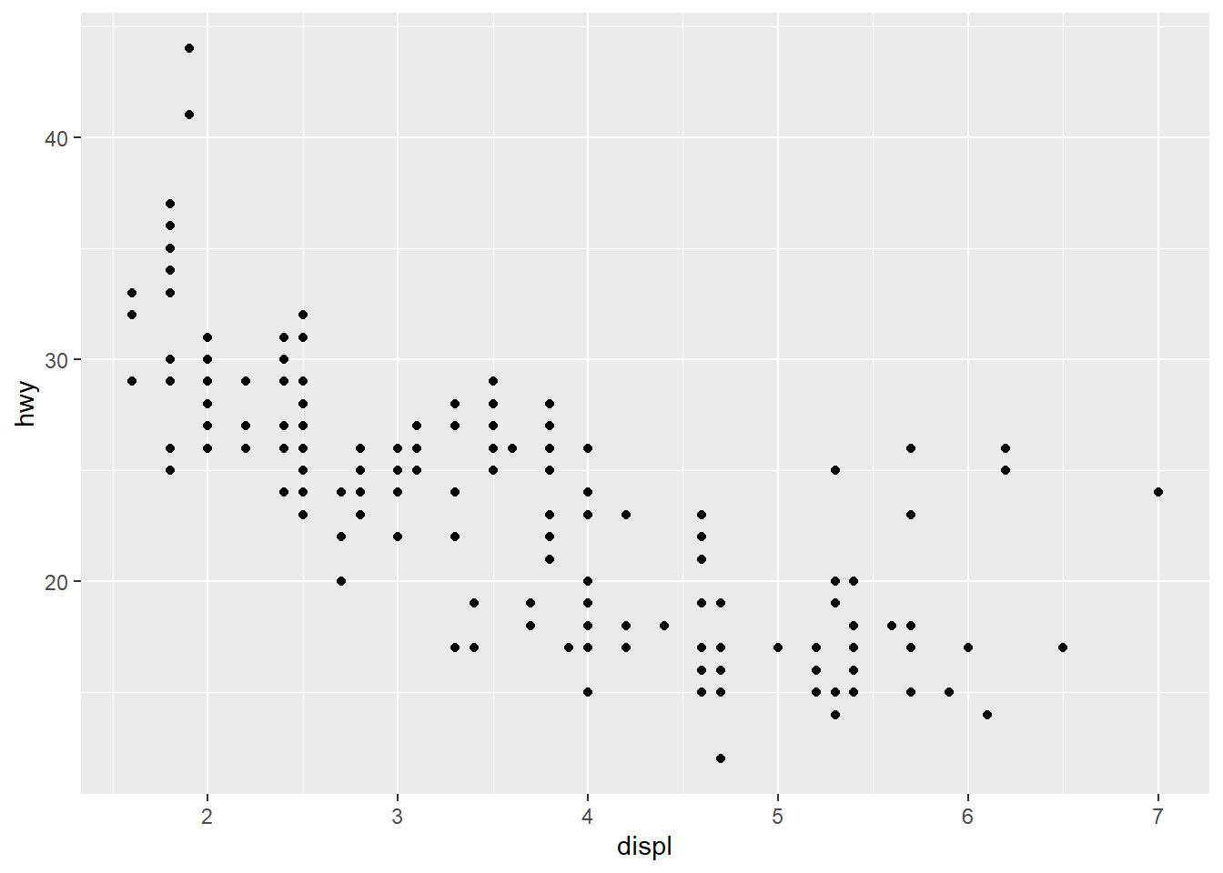
4.5.2 Step 2: Add a Geometry
Now we add geom_point(), and the data appears as a scatterplot. The geometry tells ggplot2 how to represent each observation – in this case, as a dot.
Code
ggplot(mpg, aes(x = displ, y = hwy)) +geom_point()
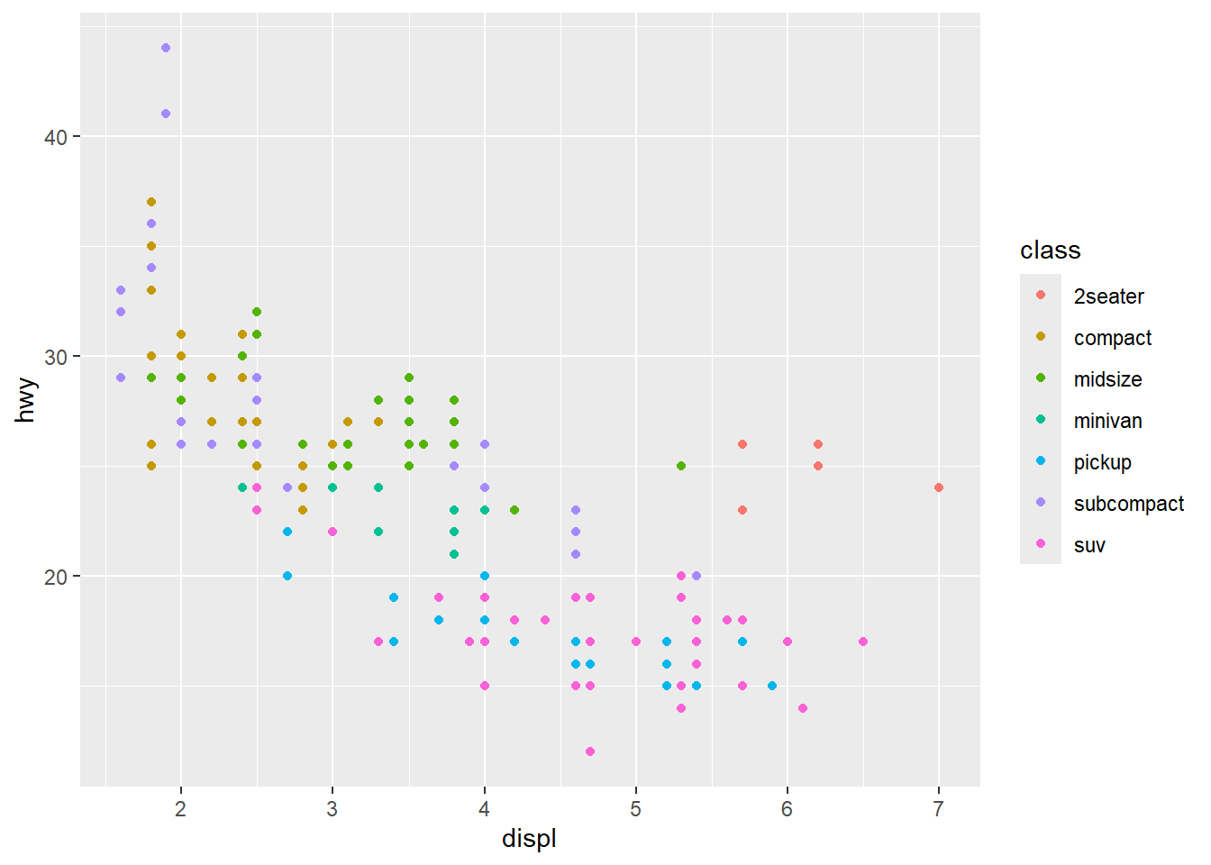
4.5.3 Step 3: Map Color to a Variable
By adding color = class inside aes(), each vehicle class gets a distinct color. A legend is automatically generated.
Code
ggplot(mpg, aes(x = displ, y = hwy, color = class)) +geom_point()
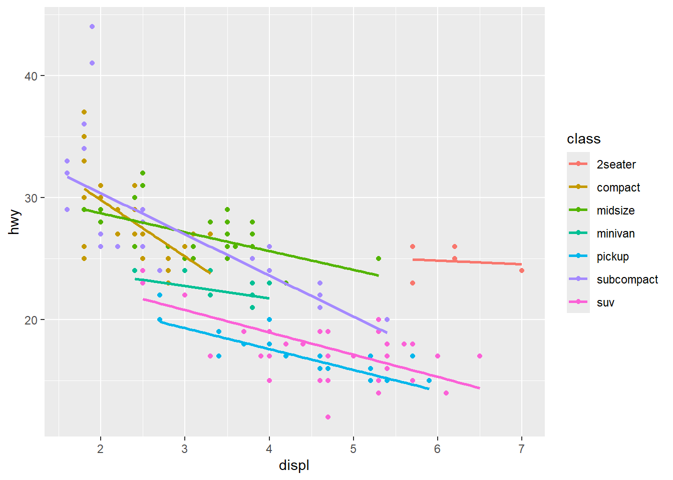
4.5.4 Step 4: Add a Statistical Layer
A linear smoother for each class reveals the group-level trends. The se = FALSE argument suppresses the confidence interval shading to keep the plot clean.
Code
ggplot(mpg, aes(x = displ, y = hwy, color = class)) +geom_point() +geom_smooth(method ="lm", se =FALSE)
`geom_smooth()` using formula = 'y ~ x'
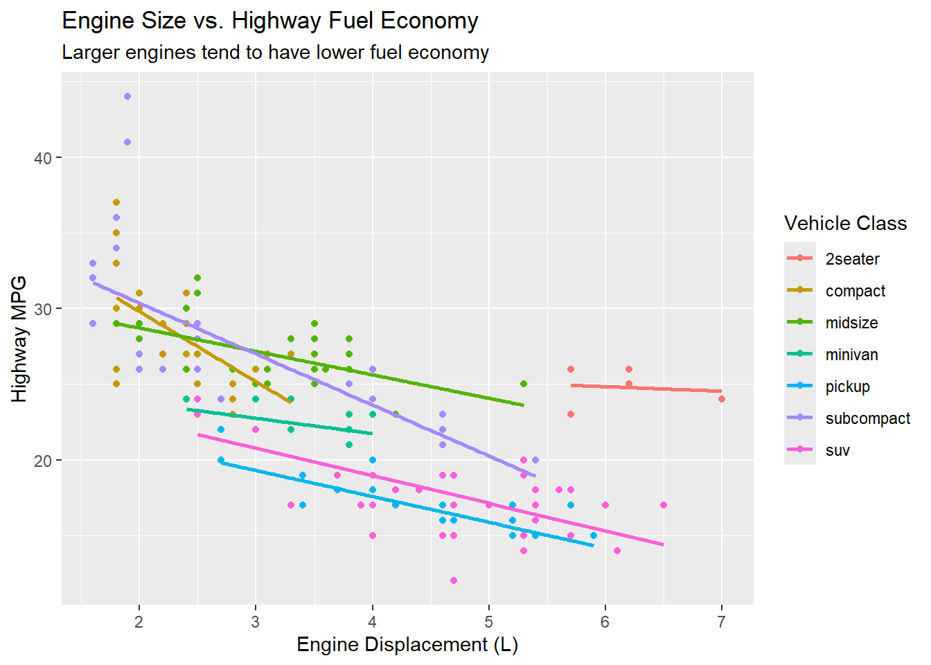
4.5.5 Step 5: Add Labels
Good labels tell the reader what they are looking at. The labs() function sets the title, subtitle, axis labels, and legend title all in one call.
Code
ggplot(mpg, aes(x = displ, y = hwy, color = class)) +geom_point() +geom_smooth(method ="lm", se =FALSE) +labs(title ="Engine Size vs. Highway Fuel Economy",subtitle ="Larger engines tend to have lower fuel economy",x ="Engine Displacement (L)",y ="Highway MPG",color ="Vehicle Class" )
`geom_smooth()` using formula = 'y ~ x'
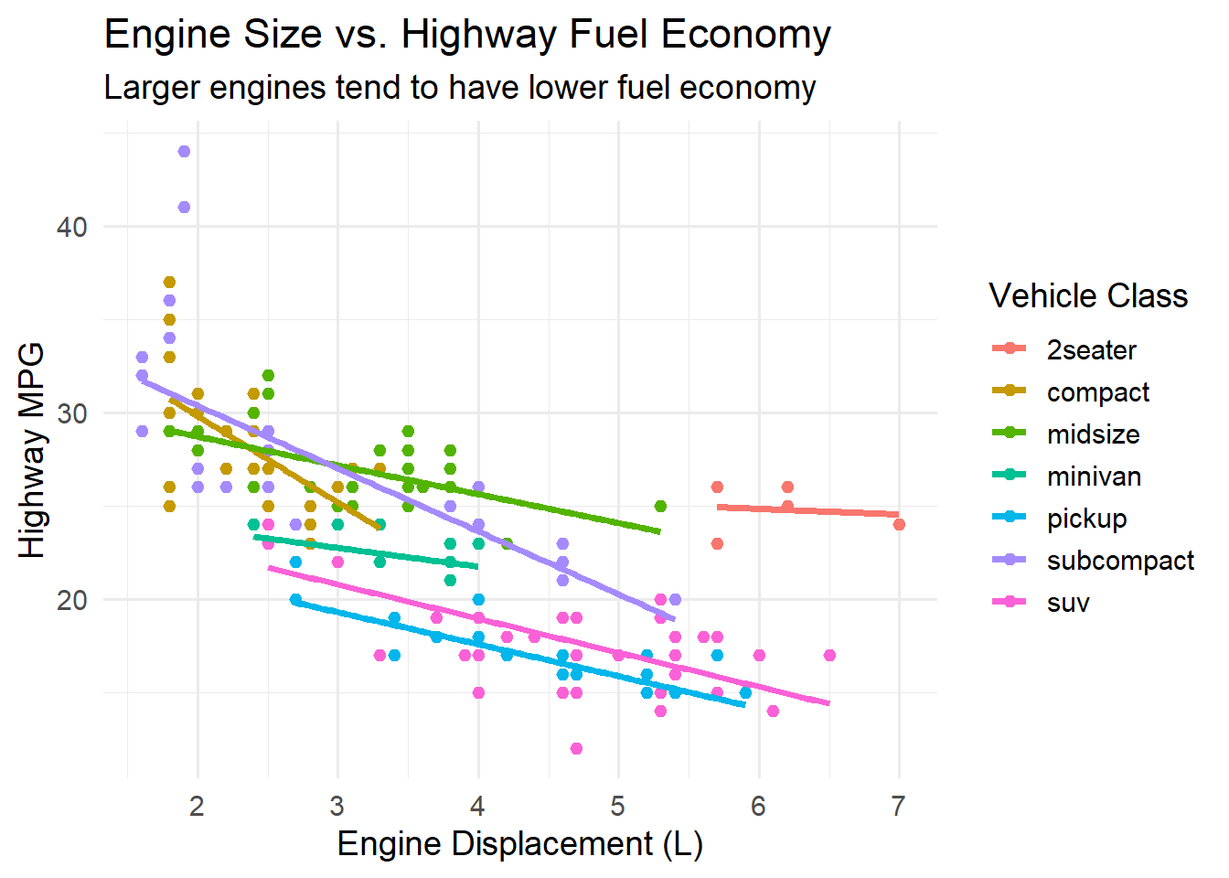
4.5.6 Step 6: Apply a Theme
Finally, we replace the default gray background with a cleaner theme_minimal(). The base_size argument controls the overall font size.
Code
ggplot(mpg, aes(x = displ, y = hwy, color = class)) +geom_point() +geom_smooth(method ="lm", se =FALSE) +labs(title ="Engine Size vs. Highway Fuel Economy",subtitle ="Larger engines tend to have lower fuel economy",x ="Engine Displacement (L)",y ="Highway MPG",color ="Vehicle Class" ) +theme_minimal(base_size =14)
`geom_smooth()` using formula = 'y ~ x'
Notice how each layer adds something specific. The plot evolves from an empty coordinate system to a rich, informative graphic. This is the power of the layered grammar: you can think about one thing at a time.
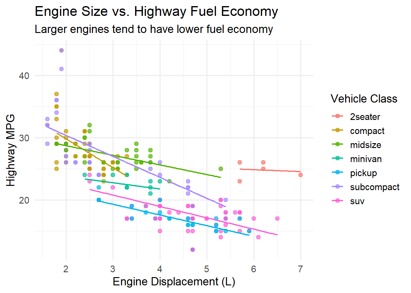
4.5.7 The Fluent Pipeline Style
Here is the same final plot written as a single, fluent pipeline – the style you will typically use in practice:
Code
ggplot(mpg, aes(x = displ, y = hwy, color = class)) +geom_point(size =2, alpha =0.7) +geom_smooth(method ="lm", se =FALSE, linewidth =0.8) +labs(title ="Engine Size vs. Highway Fuel Economy",subtitle ="Larger engines tend to have lower fuel economy",x ="Engine Displacement (L)",y ="Highway MPG",color ="Vehicle Class" ) +theme_minimal(base_size =14)
`geom_smooth()` using formula = 'y ~ x'
Tip
Tip: The + operator in ggplot2 is how you add layers. It is conceptually similar to the %>% pipe, but ggplot2 was created before the pipe became standard in R, so it uses + instead. A common mistake is to use %>% inside a ggplot chain – this will produce an error. Use %>% to pipe data intoggplot(), then switch to + for adding layers.
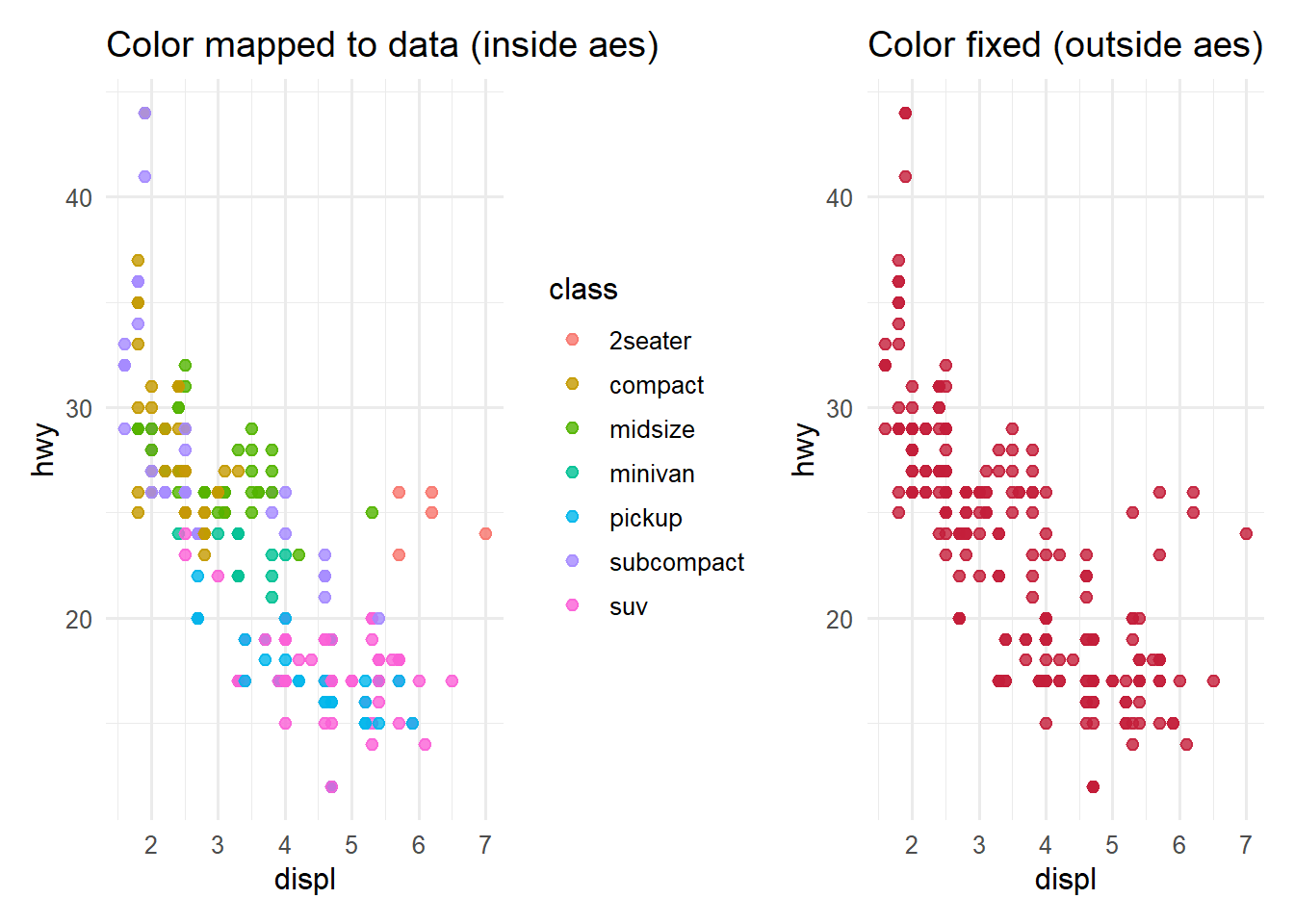
4.6 Aesthetic Mappings – aes()
Aesthetics are the bridge between your data and the visual properties of your plot. The aes() function maps variables in your data to visual channels such as position (x, y), color, size, shape, and transparency (alpha).
The critical distinction to understand is:
Inside aes(): The visual property varies with the data. Each data value gets a different color, size, or position.
Outside aes(): The visual property is fixed for all observations. Every point gets the same color, size, or shape.
This is one of the most common sources of confusion for beginners, so let us see the difference side by side:
Code
library(patchwork)# Color MAPPED to a data variable (inside aes)p1 <-ggplot(mpg, aes(x = displ, y = hwy)) +geom_point(aes(color = class), size =2, alpha =0.8) +labs(title ="Color mapped to data (inside aes)") +theme_minimal(base_size =12)# Color SET to a fixed value (outside aes)p2 <-ggplot(mpg, aes(x = displ, y = hwy)) +geom_point(color ="#C41E3A", size =2, alpha =0.8) +labs(title ="Color fixed (outside aes)") +theme_minimal(base_size =12)p1 + p2
In the left panel, each vehicle class gets its own color, and a legend is automatically generated. In the right panel, every point is accent red regardless of its class, and there is no legend because color is not encoding any information.
Here is a summary of common aesthetic mappings:
Aesthetic
Description
Example
x, y
Position on the axes
aes(x = displ, y = hwy)
color
Outline color (points, lines) or fill color (text)
aes(color = class)
fill
Interior fill color (bars, boxes, areas)
aes(fill = class)
size
Size of points or width of lines
aes(size = cyl)
shape
Shape of points (circle, triangle, square, etc.)
aes(shape = drv)
alpha
Transparency (0 = invisible, 1 = opaque)
aes(alpha = year)
linetype
Type of line (solid, dashed, dotted)
aes(linetype = drv)
4.7 Try It: Aesthetic Mapping Sandbox
You have just learned how aes() maps data variables to visual properties. Now experiment interactively — pick which variables map to color, size, and shape, and watch both the plot and the generated R code update in real time.
🧪 Aesthetic Mapping Sandbox
If the app takes a few seconds to load on first visit, that is normal — the server is waking up.
Exploration Tasks:
Start with just X and Y (the defaults). All points are navy — color carries no information.
Set Color to class — how many vehicle classes can you distinguish at a glance?
Now also set Size to cty — does adding a third channel help or hurt readability?
Turn on all three optional aesthetics. Read the overload warning — do you agree?
What You Should Have Noticed: Each aesthetic channel can encode one variable. Mapping too many variables at once creates cognitive overload — the viewer cannot track more than 3-4 channels simultaneously. The generated code panel shows you exactly what aes() call produces each plot, reinforcing the connection between code and visual output.
AI & This Concept When prompting AI to build a ggplot, specify your aesthetic mappings explicitly: “Map class to color and cty to size inside aes().” AI tools often default to fixed colors when you say “make it colorful” instead of mapping a data variable. Using the vocabulary — aes(), mapped vs. fixed, aesthetic channel — gets better results.
4.8 Geometries
Geometries – or geoms – are the visual marks that represent your data. Choosing the right geom is one of the most important decisions you make when building a visualization. Each geom is suited to different types of data and different analytical questions.
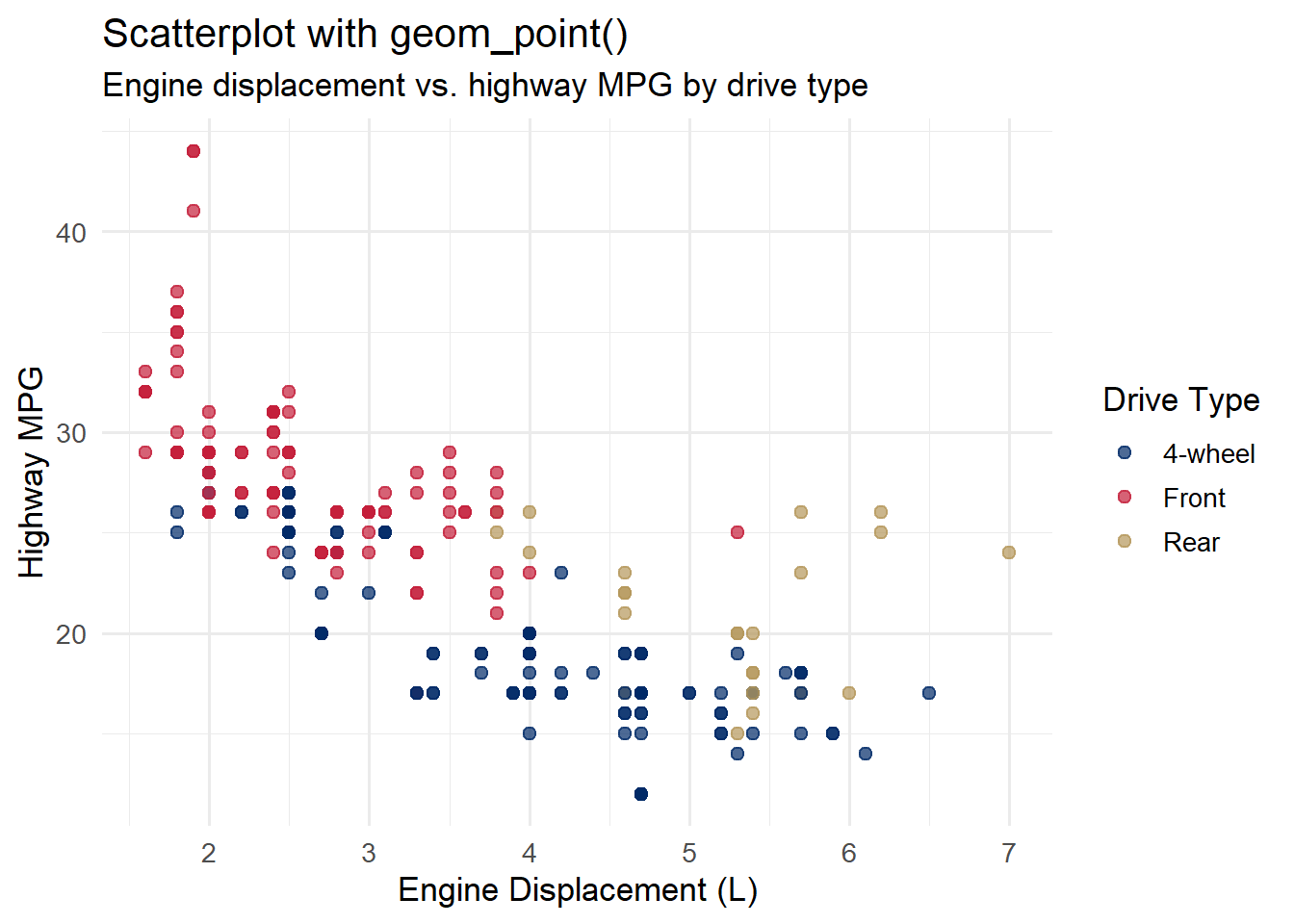
4.8.1 Points (geom_point)
Scatterplots are the workhorse of exploratory data analysis. Use geom_point() when you want to show the relationship between two continuous variables.
Code
ggplot(mpg, aes(x = displ, y = hwy, color = drv)) +geom_point(size =2, alpha =0.7) +scale_color_manual(values =c("4"="#002967", "f"="#C41E3A", "r"="#B4975A"),labels =c("4"="4-wheel", "f"="Front", "r"="Rear") ) +labs(title ="Scatterplot with geom_point()",subtitle ="Engine displacement vs. highway MPG by drive type",x ="Engine Displacement (L)",y ="Highway MPG",color ="Drive Type" ) +theme_minimal(base_size =13)
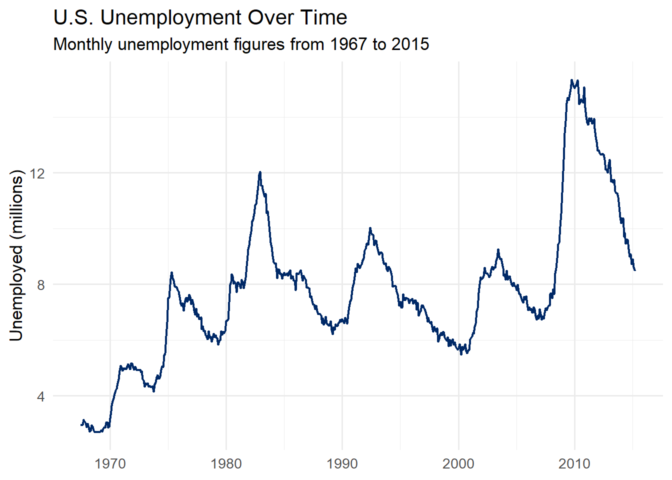
4.8.2 Lines (geom_line)
Line charts are ideal for showing trends over time. Use geom_line() when you have a continuous x-axis (often a date or time) and want to emphasize the flow of values.
Code
economics %>%ggplot(aes(x = date, y = unemploy /1000)) +geom_line(color ="#002967", linewidth =0.8) +labs(title ="U.S. Unemployment Over Time",subtitle ="Monthly unemployment figures from 1967 to 2015",y ="Unemployed (millions)",x =NULL ) +theme_minimal(base_size =13)
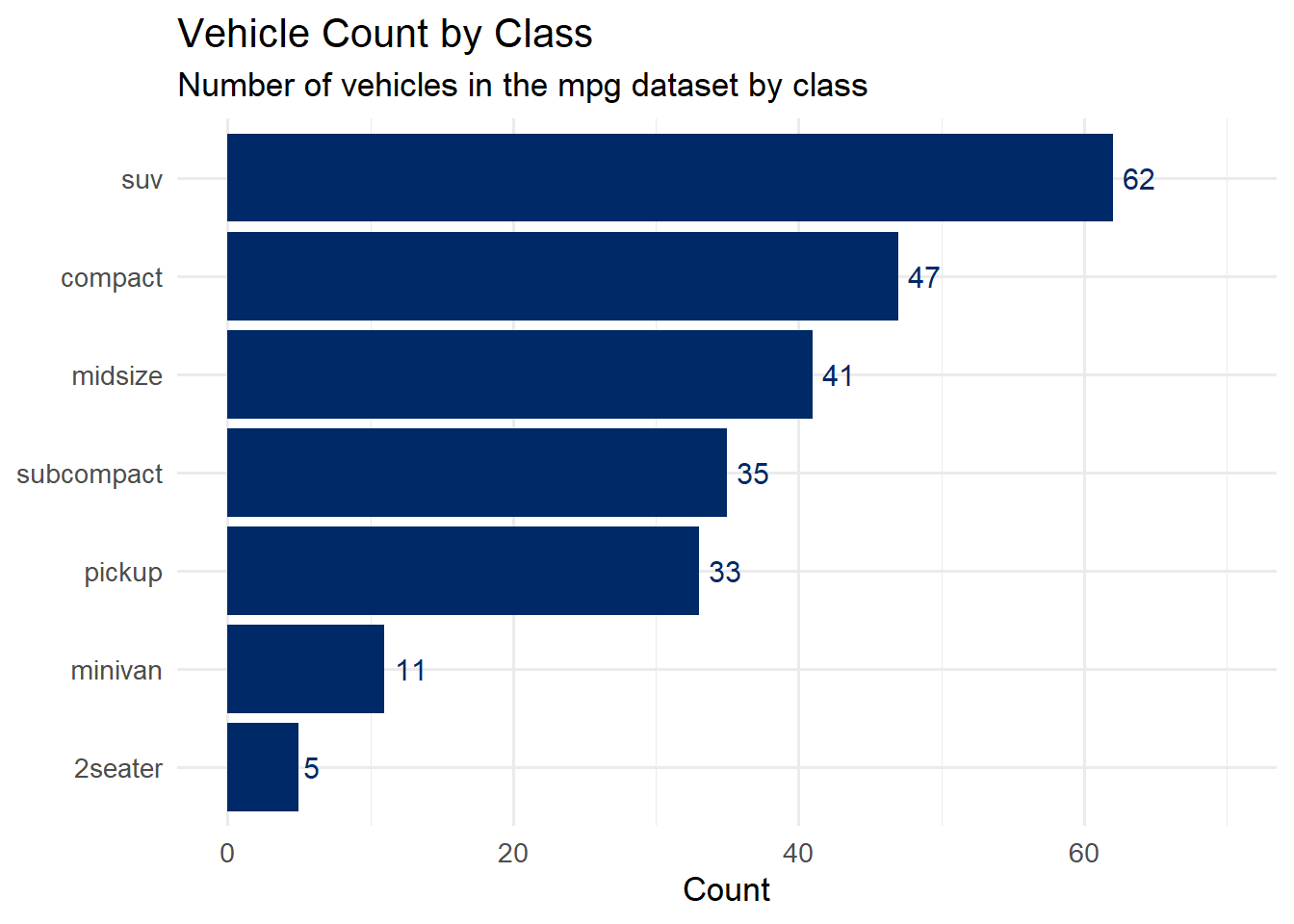
4.8.3 Bars (geom_col / geom_bar)
Bar charts are excellent for comparing quantities across categories. Use geom_col() when your data already contains the values you want to plot; use geom_bar() when you want ggplot2 to count observations for you.
Code
mpg %>%count(class) %>%mutate(class =fct_reorder(class, n)) %>%ggplot(aes(x = n, y = class)) +geom_col(fill ="#002967") +geom_text(aes(label = n), hjust =-0.3, size =4, color ="#002967") +labs(title ="Vehicle Count by Class",subtitle ="Number of vehicles in the mpg dataset by class",x ="Count",y =NULL ) +expand_limits(x =70) +theme_minimal(base_size =13)
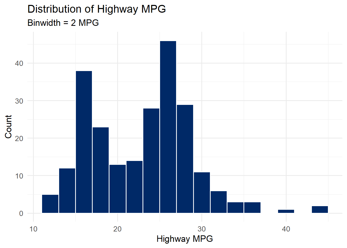
4.8.4 Histogram (geom_histogram)
Histograms show the distribution of a single continuous variable by dividing it into bins and counting the number of observations in each bin.
Code
ggplot(mpg, aes(x = hwy)) +geom_histogram(binwidth =2, fill ="#002967", color ="white") +labs(title ="Distribution of Highway MPG",subtitle ="Binwidth = 2 MPG",x ="Highway MPG",y ="Count" ) +theme_minimal(base_size =13)
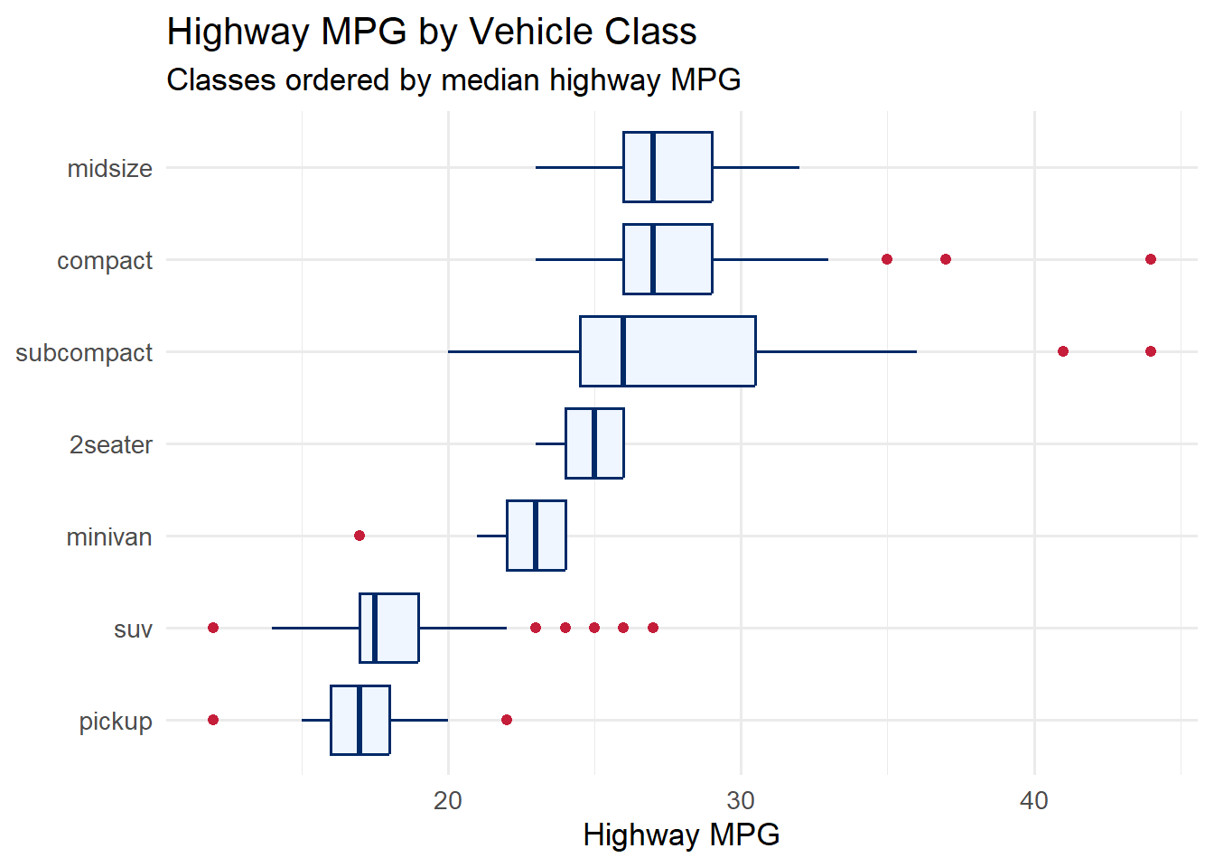
4.8.5 Boxplot (geom_boxplot)
Boxplots summarize the distribution of a continuous variable across groups. They show the median, interquartile range, and outliers at a glance.
Code
ggplot(mpg, aes(x =fct_reorder(class, hwy, .fun = median), y = hwy)) +geom_boxplot(fill ="#eff6ff", color ="#002967", outlier.color ="#C41E3A") +coord_flip() +labs(title ="Highway MPG by Vehicle Class",subtitle ="Classes ordered by median highway MPG",x =NULL,y ="Highway MPG" ) +theme_minimal(base_size =13)
Tip
Choosing the Right Geom: The choice of geometry depends on the types of variables you have and the question you are asking. Two continuous variables? Start with geom_point(). One continuous variable? Try geom_histogram() or geom_density(). One categorical and one continuous? Consider geom_boxplot() or geom_col(). A trend over time? Use geom_line(). When in doubt, try several and see which one reveals the most about your data.
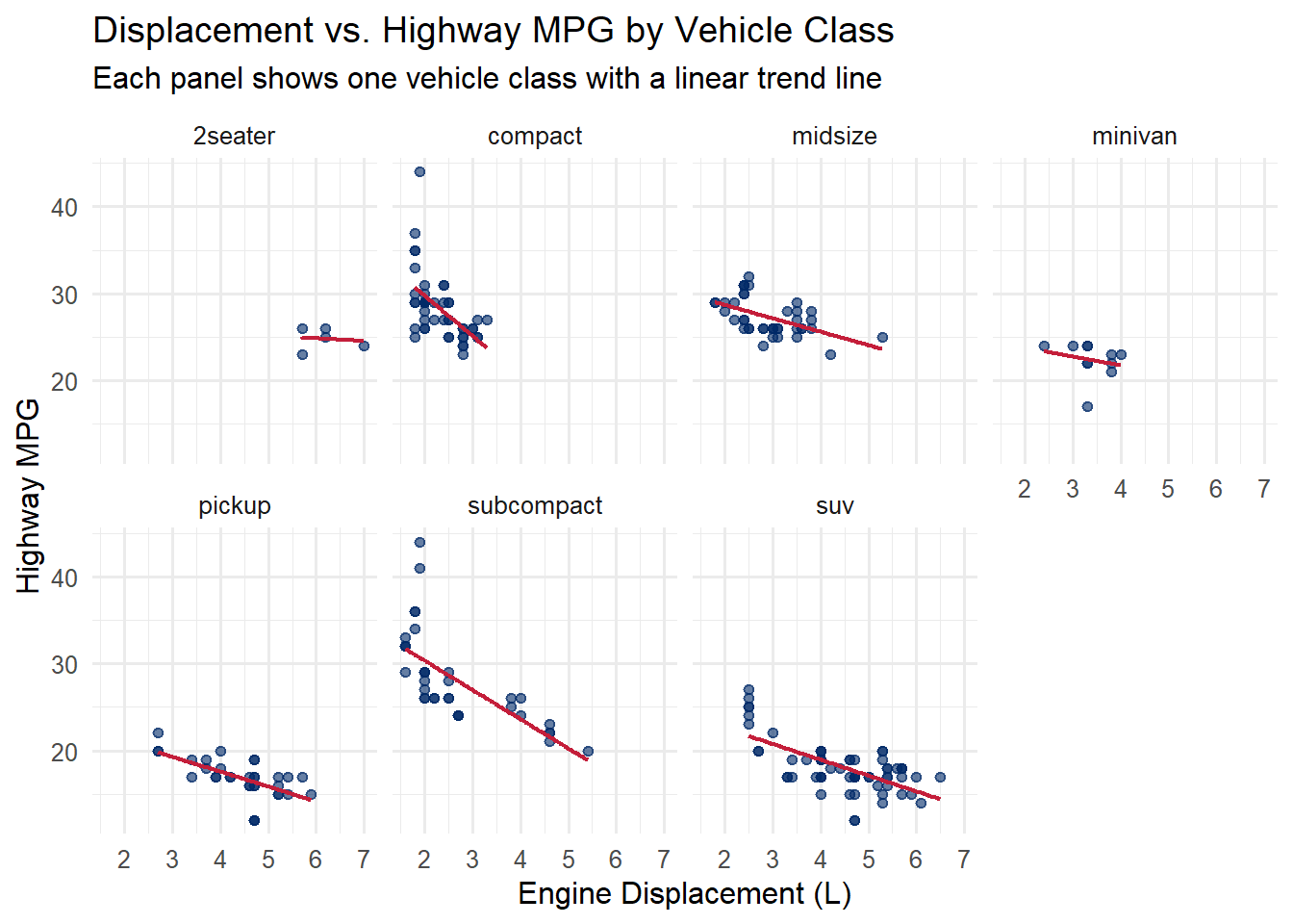
4.9 Faceting
Faceting splits your data by one or more categorical variables and creates a separate panel for each level. This technique – sometimes called small multiples – is one of the most powerful tools in data visualization. It allows your viewer to compare patterns across groups while keeping a consistent scale.
ggplot2 provides two faceting functions:
facet_wrap(~variable) – wraps panels into a rectangular layout. Best when you have a single faceting variable.
facet_grid(row_variable ~ col_variable) – creates a matrix of panels. Best when you want to cross two variables.
Code
ggplot(mpg, aes(x = displ, y = hwy)) +geom_point(color ="#002967", alpha =0.6, size =1.5) +geom_smooth(method ="lm", se =FALSE, color ="#C41E3A", linewidth =0.8) +facet_wrap(~class, ncol =4) +labs(title ="Displacement vs. Highway MPG by Vehicle Class",subtitle ="Each panel shows one vehicle class with a linear trend line",x ="Engine Displacement (L)",y ="Highway MPG" ) +theme_minimal(base_size =12)
`geom_smooth()` using formula = 'y ~ x'
Notice how the faceted view reveals patterns that a single scatterplot obscures. For example, the relationship between displacement and fuel economy is very different for 2-seater sports cars (which are light despite large engines) compared to SUVs.
Scales in facets: By default, all panels share the same x and y scales. This is usually what you want because it makes comparisons fair. If you need each panel to have its own scale (for example, when the ranges differ dramatically), use scales = "free", scales = "free_x", or scales = "free_y" inside facet_wrap().
4.10 Scales
Scales control how data values are mapped to visual properties. Every aesthetic mapping has an associated scale, whether or not you specify one explicitly. When you write aes(x = displ), ggplot2 automatically creates a continuous x scale. When you write aes(color = class), it creates a discrete color scale.
Customizing scales gives you control over:
Axis breaks and labels – where tick marks appear and what they say
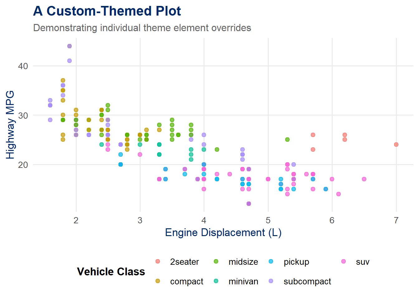
Themes control all of the non-data visual elements of your plot: background colors, grid lines, font sizes, axis tick marks, legend placement, and more. A well-chosen theme can elevate a serviceable plot into a professional, publication-ready graphic.
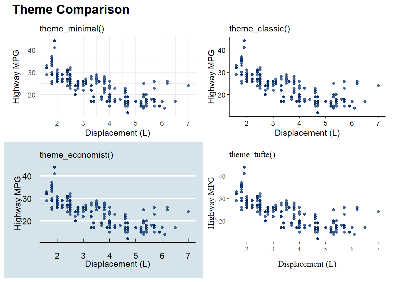
4.11.1 Built-in Themes
ggplot2 ships with several built-in themes:
theme_gray() – the default gray background with white grid lines
theme_minimal() – a clean, minimal design (our course default)
theme_classic() – a traditional look with axis lines and no grid
theme_bw() – black and white with a border
theme_void() – completely blank (useful for maps and diagrams)
The ggthemes package adds many more, inspired by famous publications and designers:
theme_economist() – styled like The Economist magazine
theme_fivethirtyeight() – styled like FiveThirtyEight
theme_tufte() – inspired by Edward Tufte’s minimalist philosophy
Tip: Build a reusable theme. If you find yourself applying the same theme() overrides to every plot, create a custom theme function. You can then apply it with a single + theme_viz() call:
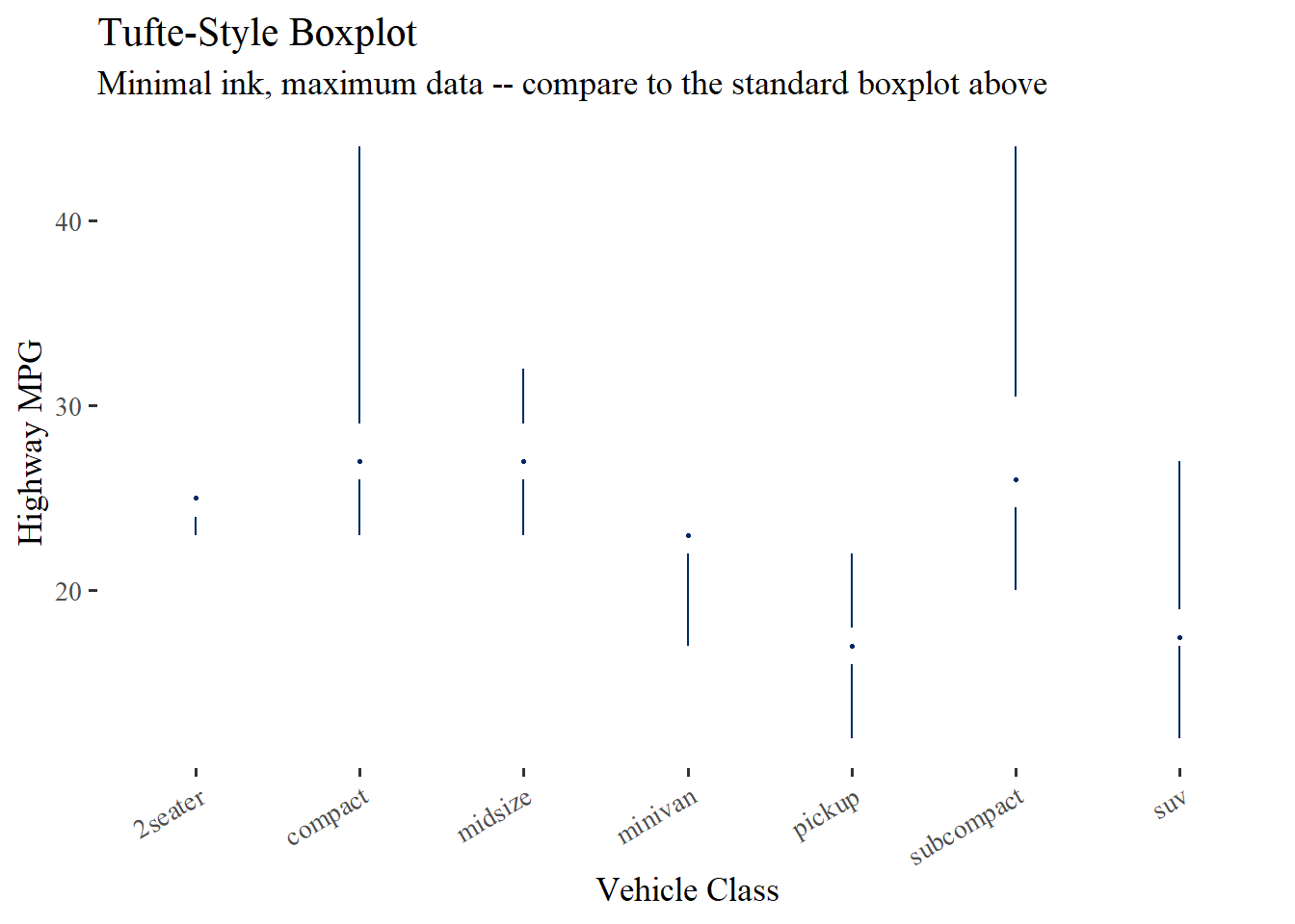
Edward Tufte proposed a stripped-down version of the boxplot that removes the “box” entirely, replacing it with a thin line for the interquartile range and a point or gap for the median. This maximizes the data-ink ratio while preserving all essential information. The ggthemes package provides geom_tufteboxplot() for this purpose.
Code
ggplot(mpg, aes(x = class, y = hwy)) +geom_tufteboxplot(color ="#002967") +labs(title ="Tufte-Style Boxplot",subtitle ="Minimal ink, maximum data -- compare to the standard boxplot above",x ="Vehicle Class",y ="Highway MPG" ) +theme_tufte(base_size =13) +theme(axis.text.x =element_text(angle =30, hjust =1))
Warning: The following aesthetics were dropped during statistical transformation: y.
ℹ This can happen when ggplot fails to infer the correct grouping structure in
  the data.
ℹ Did you forget to specify a `group` aesthetic or to convert a numerical
  variable into a factor?
Warning: Using the `size` aesthetic in this geom was deprecated in ggplot2 3.4.0.
ℹ Please use `linewidth` in the `default_aes` field and elsewhere instead.
Warning: Using the `size` aesthetic with geom_segment was deprecated in ggplot2 3.4.0.
ℹ Please use the `linewidth` aesthetic instead.
Compare this to the standard boxplot in the Geometries section above. The Tufte version conveys the same distributional information – median, spread, outliers – using far less ink. Every mark on the page is doing real work. This is the data-ink ratio in action.
About ggthemes: The ggthemes package provides several Tufte-inspired elements including theme_tufte(), geom_tufteboxplot(), and geom_rangeframe(). These are excellent tools for applying design principles directly in ggplot2.
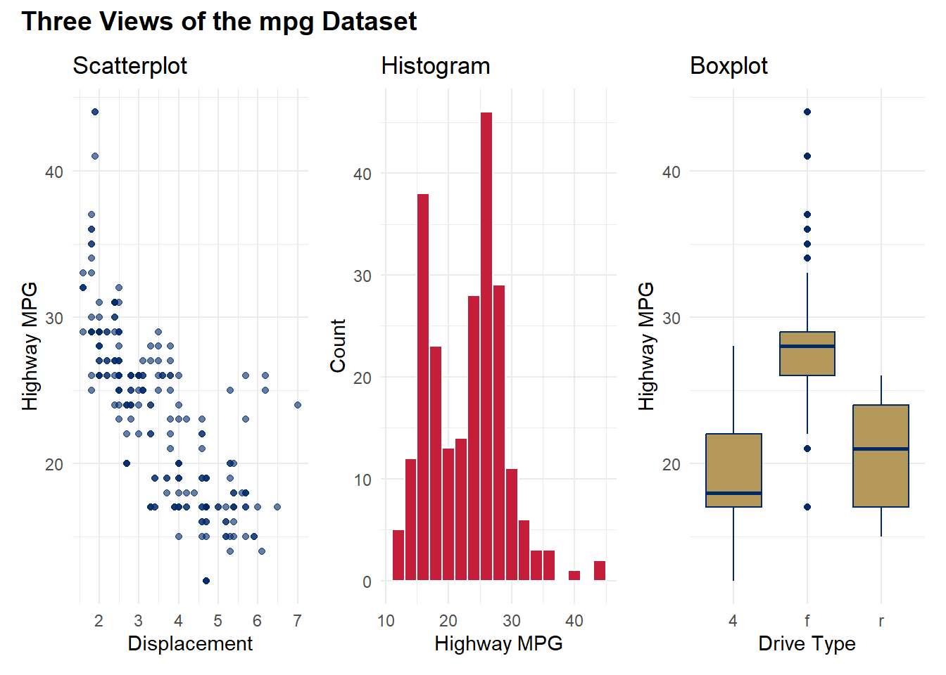
4.12 Combining Multiple Plots with patchwork
The patchwork package makes it easy to combine multiple ggplot2 plots into a single figure. You have already seen it in action above. Here is a quick reference for its operators:
Operator
Effect
p1 + p2
Side by side
p1 / p2
Stacked vertically
p1 + p2 + plot_layout(ncol = 1)
Stacked with explicit layout
(p1 + p2) / p3
Two on top, one on bottom
plot_annotation(title = "...")
Add an overall title
Code
p_scatter <-ggplot(mpg, aes(displ, hwy)) +geom_point(color ="#002967", alpha =0.6) +labs(title ="Scatterplot", x ="Displacement", y ="Highway MPG") +theme_minimal(base_size =11)p_hist <-ggplot(mpg, aes(x = hwy)) +geom_histogram(binwidth =2, fill ="#C41E3A", color ="white") +labs(title ="Histogram", x ="Highway MPG", y ="Count") +theme_minimal(base_size =11)p_box <-ggplot(mpg, aes(x = drv, y = hwy)) +geom_boxplot(fill ="#B4975A", color ="#002967") +labs(title ="Boxplot", x ="Drive Type", y ="Highway MPG") +theme_minimal(base_size =11)p_scatter + p_hist + p_box +plot_annotation(title ="Three Views of the mpg Dataset",theme =theme(plot.title =element_text(face ="bold", size =14)) )
4.13 Saving Plots with ggsave()
Once you have created a publication-quality graphic, you need to save it at the right size and resolution. The ggsave() function makes this straightforward:
Code
# Save the last plot displayedggsave("my_plot.png", width =8, height =5, dpi =300)# Save a specific plot objectmy_plot <-ggplot(mpg, aes(displ, hwy)) +geom_point(color ="#002967") +theme_minimal()ggsave("my_plot.png", plot = my_plot, width =8, height =5, dpi =300)# Save as PDF (vector format -- great for print)ggsave("my_plot.pdf", plot = my_plot, width =8, height =5)# Save as SVG (vector format -- great for web)ggsave("my_plot.svg", plot = my_plot, width =8, height =5)
Resolution guidelines:
Screen/web: 72–150 dpi is sufficient
Presentations: 150–200 dpi
Print/publication: 300 dpi or higher
Vector formats (PDF, SVG) are resolution-independent and are preferred for publications
4.14 Putting It All Together
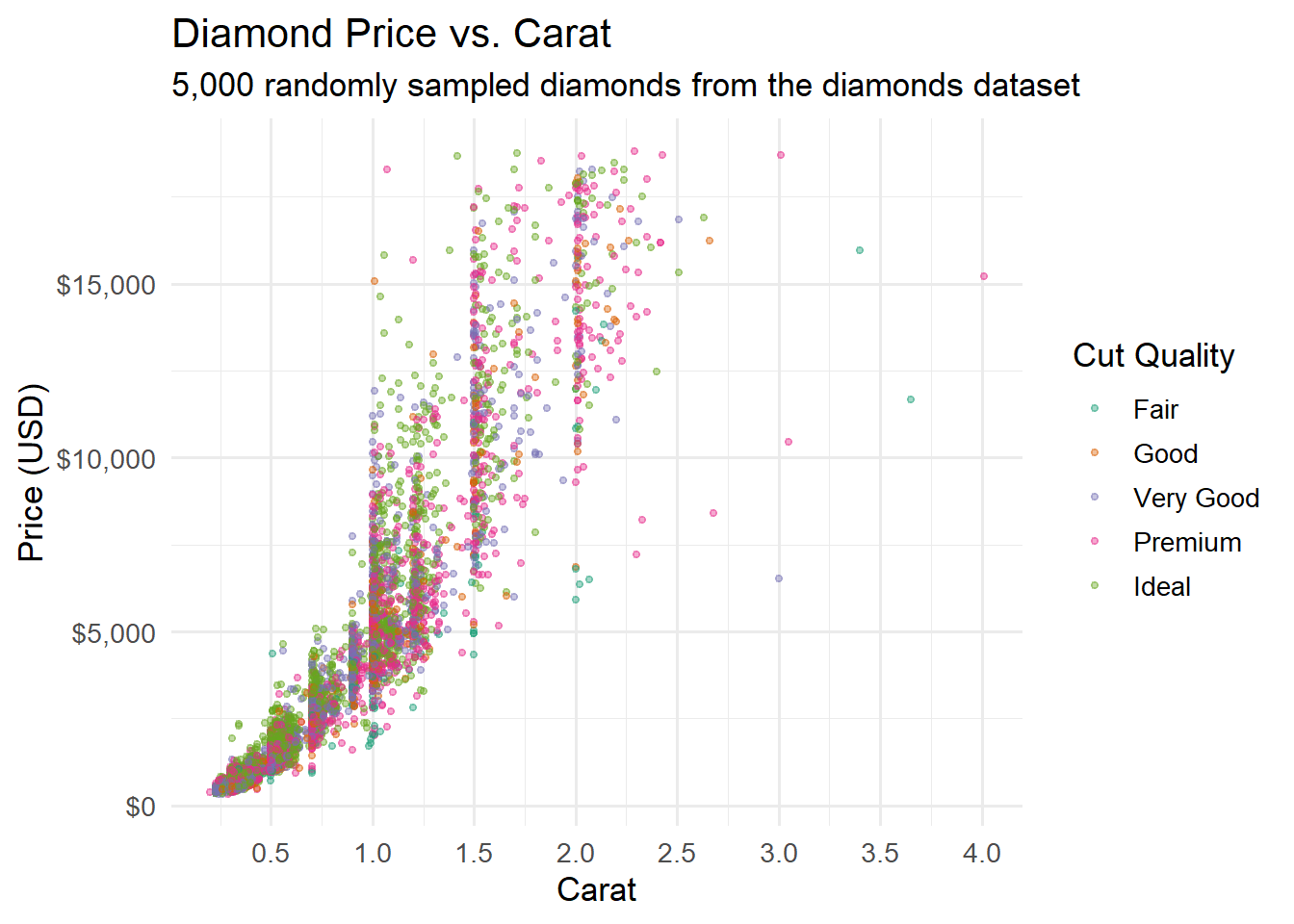
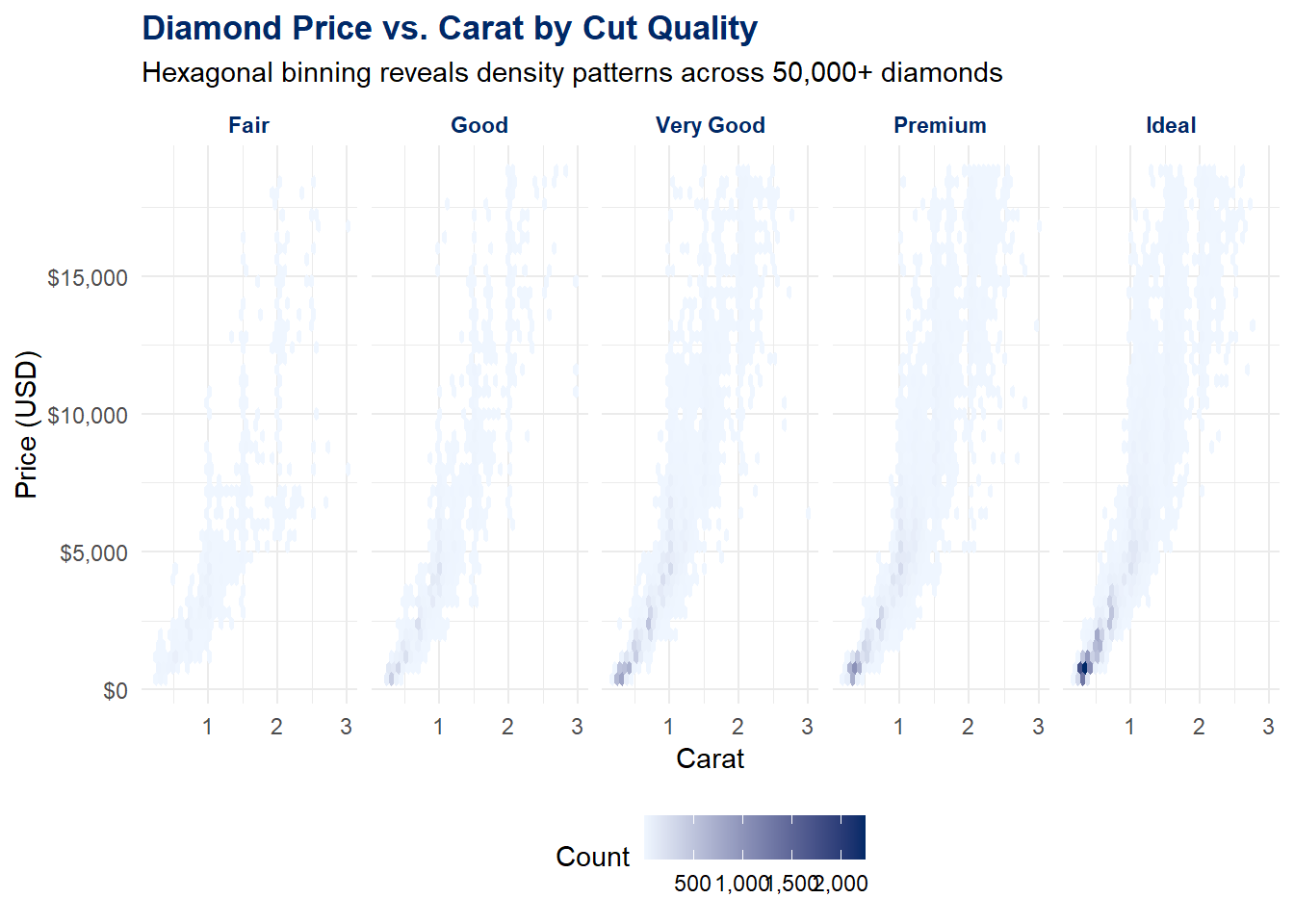
Let us build one more polished visualization that incorporates everything we have learned in this chapter. We will use the diamonds dataset to create a comprehensive view of diamond characteristics:
Code
diamonds %>%filter(carat <=3) %>%ggplot(aes(x = carat, y = price)) +geom_hex(bins =40) +scale_fill_gradient(low ="#eff6ff", high ="#002967", labels =comma_format()) +scale_y_continuous(labels =dollar_format()) +facet_wrap(~cut, ncol =5) +labs(title ="Diamond Price vs. Carat by Cut Quality",subtitle ="Hexagonal binning reveals density patterns across 50,000+ diamonds",x ="Carat",y ="Price (USD)",fill ="Count" ) +theme_minimal(base_size =11) +theme(plot.title =element_text(face ="bold", color ="#002967"),strip.text =element_text(face ="bold", color ="#002967"),legend.position ="bottom" )
This single plot uses data (diamonds), aesthetics (x, y, fill), a geometry (hexagonal bins), a scale (gradient fill, dollar-formatted y-axis), faceting (by cut), labels, and a customized theme. Every layer of the grammar of graphics is working together.
Note
Ethical Reflection: The Pursuit of Excellence in Visualization
The pursuit of excellence calls us not to settle for what is merely adequate but to strive for the best we can produce. In data visualization, this means not settling for the default. The default gray theme, the default axis labels, the default color palette – these are starting points, not endpoints. Every design choice is an opportunity to communicate more clearly, more honestly, more beautifully. As Wickham himself wrote, “A good visualization shows you things you did not expect, or raises new questions about the data.” Pursue that higher standard.
4.15 Challenge: Layer Cake
🎮 Layer Cake — Stack the grammar of graphics in the right order
If the app takes a few seconds to load on first visit, that is normal — the server is waking up.
How to Play:
Enter your name and click Start Game
Each round shows a target plot and scrambled ggplot2 layer fragments
Drag and drop the layers into the correct order — the app renders your ordering vs. the correct one
Complete all 8 rounds, then review your completion report
4.16 Exercises
Chapter 3 Exercises
Exercise 1: Your First Layered Plot
Using the mpg dataset, build a scatterplot of cty (city MPG, x-axis) vs. hwy (highway MPG, y-axis). Fill in the blanks in the template below. Map the drv variable to color using the book’s accent colors, add axis labels and a title, and apply theme_minimal().
After completing the template, write 1–2 sentences interpreting the relationship between city and highway fuel economy. Is there a pattern? Do the drive types cluster differently?
Exercise 2: Bar Chart with geom_col()
The code below summarizes the diamonds dataset by cut, calculating the average price for each cut quality. Fill in the blanks to create a horizontal bar chart with direct labels. Remember: geom_col() is for pre-computed values, geom_bar() is for counting.
After completing the template, answer: which cut has the highest average price? Is this what you expected? Why or why not? (Hint: think about the relationship between cut quality and carat size in the diamonds dataset.)
Exercise 3: Faceted Exploration
Install the palmerpenguins package (install.packages("palmerpenguins")) and create a faceted scatterplot. Fill in the blanks below.
Template – fill in the ___ blanks:
library(palmerpenguins)penguins %>%filter(!is.na(sex)) %>%ggplot(aes(x = bill_length_mm, y = ___, color = ___)) +geom_point(alpha =0.6, size =2) +geom_smooth(method ="___", se =FALSE) +scale_color_manual(values =c("female"="#C41E3A", "male"="#002967")) +facet_wrap(~___, ncol =3) +labs(title ="Penguin Bill Dimensions by Species and Sex",x ="Bill Length (mm)",y ="___",color ="Sex" ) +theme_minimal(base_size =12)
Write 2–3 sentences interpreting what the faceted view reveals. How do bill dimensions differ across species? Does the relationship between bill length and bill depth change by species?
Exercise 4: Theme Customization and patchwork
Create two plots of the mpg dataset – a scatterplot and a boxplot – and combine them side by side using patchwork. Fill in the blanks below. Then write a custom theme_viz() function and apply it to both plots.
Template – fill in the ___ blanks:
library(patchwork)# Define the custom themetheme_viz <-function(base_size =13) {theme_minimal(base_size = base_size) %+replace%theme(plot.title =element_text(face ="___", color ="#002967", size = base_size +3),plot.subtitle =element_text(color ="#666666"),axis.title =element_text(color ="___"),panel.grid.minor =element_blank(),legend.position ="___" )}# Plot 1: scatterplotp1 <-ggplot(mpg, aes(x = displ, y = hwy)) +geom_point(color ="#002967", alpha =0.6) +labs(title ="Engine Size vs. MPG", x ="Displacement (L)", y ="Highway MPG") +theme_viz()# Plot 2: boxplotp2 <-ggplot(mpg, aes(x = ___, y = hwy)) +geom_boxplot(fill ="#eff6ff", color ="#002967") +labs(title ="MPG by Drive Type", x ="Drive Type", y ="Highway MPG") +theme_viz()p1 + p2 +plot_annotation(title ="___",theme =theme(plot.title =element_text(face ="bold", size =15)) )
Exercise 5: Complete Visualization from Scratch
Using any built-in dataset (mpg, diamonds, economics, or mtcars), build a polished visualization entirely from scratch – no template. Your plot must include at least five of the seven grammar of graphics layers:
Data
Aesthetics (at least two mapped variables)
Geometry (your choice)
Faceting OR a second geometry layer
Labels (title, subtitle, axis labels)
A customized scale (color, axis formatting, or both)
A customized theme (modify at least two theme() elements)
Save your final plot using ggsave() at 300 dpi, 8 inches wide and 5 inches tall. In a few sentences below your code, explain what story your visualization tells and which design choices you made to support that story.
4.17 Attributions
This book material draws on and is inspired by the work of many scholars and practitioners:
Wilkinson, L. – The Grammar of Graphics (Springer, 1999; 2nd ed. 2005). The foundational theoretical framework for systematic visualization construction.
Wickham, H. – ggplot2: Elegant Graphics for Data Analysis (Springer, 3rd ed.). The definitive guide to the R implementation of the grammar of graphics.
Wickham, H. (2010). “A Layered Grammar of Graphics.” Journal of Computational and Graphical Statistics, 19(1), 3–28. The academic paper describing ggplot2’s design philosophy.
Tufte, E.R. – The Visual Display of Quantitative Information (Graphics Press, 1983, 2001). Foundational design principles including the data-ink ratio and lie factor.
Vivek H. Patil – foundational design and materials for data visualization.