Understand when to use each chart type and articulate why one choice is better than another
Apply the principle of matching visual encoding to the analytical question
Chart Type Explorer
5.2 Setup
Before we begin, load the core packages we will use throughout this chapter. Several chart types require specialized packages that extend ggplot2. If you have not installed them yet, see the Common Errors box below.
Code
library(tidyverse)
── Attaching core tidyverse packages ──────────────────────── tidyverse 2.0.0 ──
✔ dplyr     1.1.4     ✔ readr     2.1.5
✔ forcats   1.0.0     ✔ stringr   1.5.1
✔ ggplot2   4.0.0     ✔ tibble    3.3.0
✔ lubridate 1.9.4     ✔ tidyr     1.3.1
✔ purrr     1.1.0
── Conflicts ────────────────────────────────────────── tidyverse_conflicts() ──
✖ dplyr::filter() masks stats::filter()
✖ dplyr::lag()    masks stats::lag()
ℹ Use the conflicted package (<http://conflicted.r-lib.org/>) to force all conflicts to become errors
Code
library(ggridges)library(treemapify)
Warning: package 'treemapify' was built under R version 4.5.2
Code
library(gapminder)
Warning: package 'gapminder' was built under R version 4.5.2
Code
library(GGally)
Common Errors You May Encounter in This Chapter
This chapter uses several extension packages. If you run into errors, check this list first:
Error: could not find function "geom_density_ridges_gradient" This function lives in the ggridges package, which is not part of the tidyverse. You need to install it once and then load it:
install.packages("ggridges")library(ggridges)
Error: could not find function "geom_treemap" This function lives in the treemapify package. Install and load it:
install.packages("treemapify")library(treemapify)
ggpairs() takes forever to run / R appears frozen The ggpairs() function computes pairwise plots for every combination of columns. If you pass a dataset with many columns, the computation time grows quadratically. Always use select() to pick only 4–5 numeric columns before passing to ggpairs():
Bubble chart sizes look wrong / small countries invisible Use scale_size_area() instead of scale_size_continuous(). The scale_size_area() function ensures that the area of each bubble is proportional to the data value, which is the perceptually correct mapping. With scale_size_continuous(), the radius is mapped linearly, causing larger values to appear disproportionately huge.
Heatmap text is unreadable / labels disappear into dark tiles Adjust the size parameter in geom_text() to make labels larger or smaller. On dark tiles, switch the text color to "white" or a light value. You can also use conditional coloring:
Or simply pick a text color that contrasts well with your palette (e.g., "white" on dark sequential scales).
5.3 Choosing the Right Chart
The single most important decision in data visualization is choosing the right chart type. A beautiful chart that uses the wrong encoding is worse than a plain chart that uses the right one. The chart type you select should be driven entirely by the relationship you want to show in your data.
Here is a framework for thinking about chart selection:
Comparison of values across categories: bar chart, lollipop chart, dumbbell chart, dot plot
Distribution of a single variable or across groups: histogram, density plot, violin plot, ridgeline plot, boxplot
Relationship between two or more variables: scatterplot, bubble chart, heatmap, correlogram
Composition showing parts of a whole: stacked bar chart, treemap, waffle chart
Change over time: line chart, area chart, sparkline
There is no universal “best” chart. The best chart is the one that most clearly communicates the specific insight you want your audience to take away. A bar chart is not inherently better or worse than a treemap – it depends on the question you are answering.
Each of the following sections introduces a chart type, explains when it is most useful, and provides working R code you can adapt for your own projects.
5.4 Try It: Chart Type Explorer
You have just seen that different chart types serve different analytical purposes. Now explore them interactively. The sandbox below lets you switch between chart types using the same dataset, so you can see how the choice of chart changes the story.
🧪 Chart Type Explorer — Pick the Right Tool for the Job
If the app takes a few seconds to load on first visit, that is normal — the server is waking up.
Exploration Tasks:
Start with the bar chart view. What comparison does it emphasize?
Switch to a lollipop chart — how does it compare to the bar chart for readability?
Try the heatmap — what relationships does it reveal that the other charts do not?
Look at the treemap — when might this be more useful than a bar chart?
What You Should Have Noticed: No single chart type is “best.” Each one highlights different aspects of the data. Bar charts excel at precise comparisons, lollipop charts reduce visual clutter, heatmaps reveal patterns across two dimensions, and treemaps show part-to-whole relationships with hierarchy. The right choice depends on what question you are trying to answer.
AI & This Concept When asking AI to create a visualization, always tell it what comparison you want to make, not just “chart this data.” For example, “Show how categories rank from highest to lowest” will get you a sorted bar chart, while “Show correlations between all numeric variables” will get a heatmap. The more specific your intent, the better the chart.
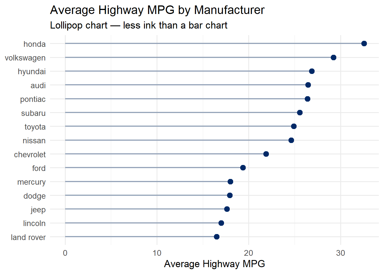
5.5 Lollipop Charts
Lollipop charts are an elegant alternative to bar charts. They convey the same information – a categorical variable mapped to a quantitative value – but with far less ink. Edward Tufte would approve: the data-to-ink ratio is much higher.
Use a lollipop chart when you have a ranked comparison of values across categories, especially when you have many categories where thick bars would feel heavy.
5.5.1 The Code
Code
mpg %>%group_by(manufacturer) %>%summarise(avg_hwy =mean(hwy)) %>%mutate(manufacturer =fct_reorder(manufacturer, avg_hwy)) %>%ggplot(aes(x = avg_hwy, y = manufacturer)) +geom_segment(aes(x =0, xend = avg_hwy, yend = manufacturer),color ="#94a3b8", linewidth =0.8) +geom_point(color ="#002967", size =3) +labs(title ="Average Highway MPG by Manufacturer",subtitle ="Lollipop chart — less ink than a bar chart",x ="Average Highway MPG", y =NULL) +theme_minimal(base_size =13)
5.5.2 How It Works
The lollipop chart is built from two geoms layered together:
geom_segment() draws the thin line (the “stick”) from zero to the data value
geom_point() draws the dot (the “candy”) at the end
Notice that we use fct_reorder() to sort the manufacturers by their average MPG. This is critical – an unsorted lollipop chart is much harder to read. Always sort by the quantitative variable unless there is a natural ordering (like months or rankings) that takes priority.
Tip
When to choose a lollipop over a bar chart: Lollipop charts shine when you have 8 or more categories. With fewer categories, a standard bar chart is fine. With many categories, the thin stems of a lollipop chart reduce visual clutter significantly.
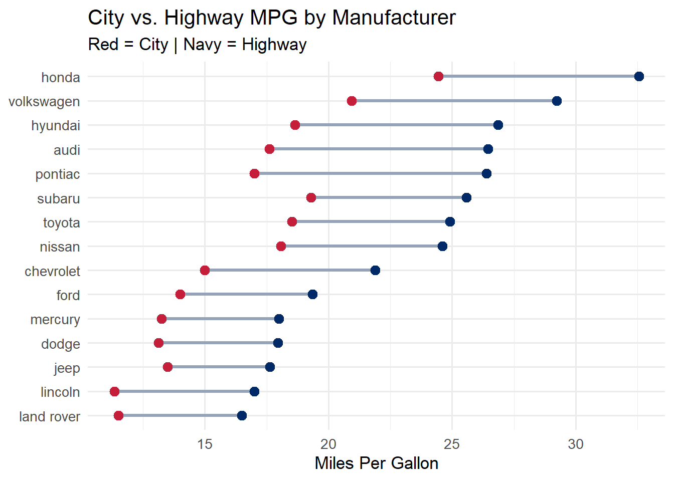
5.6 Dumbbell Charts
Dumbbell charts (also called DNA charts or connected dot plots) show the difference between two values for each category. They are ideal for before/after comparisons, paired measurements, or showing the gap between two groups.
The “dumbbell” shape – two dots connected by a line – naturally draws the eye to the distance between the two values, making it easy to compare gaps across categories.
Code
dumbbell_data <- mpg %>%group_by(manufacturer) %>%summarise(city =mean(cty), highway =mean(hwy)) %>%mutate(manufacturer =fct_reorder(manufacturer, highway))ggplot(dumbbell_data) +geom_segment(aes(x = city, xend = highway, y = manufacturer, yend = manufacturer),color ="#94a3b8", linewidth =1.2) +geom_point(aes(x = city, y = manufacturer), color ="#C41E3A", size =3) +geom_point(aes(x = highway, y = manufacturer), color ="#002967", size =3) +labs(title ="City vs. Highway MPG by Manufacturer",subtitle ="Red = City | Navy = Highway",x ="Miles Per Gallon", y =NULL) +theme_minimal(base_size =13)
The segment connects the two values, and the colored dots mark each endpoint. The color legend is embedded in the subtitle to keep the chart clean. Notice how easy it is to see which manufacturers have the largest gap between city and highway fuel economy.
Tip
Dumbbell charts are underused. Many analysts default to grouped bar charts for paired comparisons, but dumbbell charts are almost always more readable. The connecting line makes the comparison explicit, while grouped bars force the viewer to mentally bridge the gap.
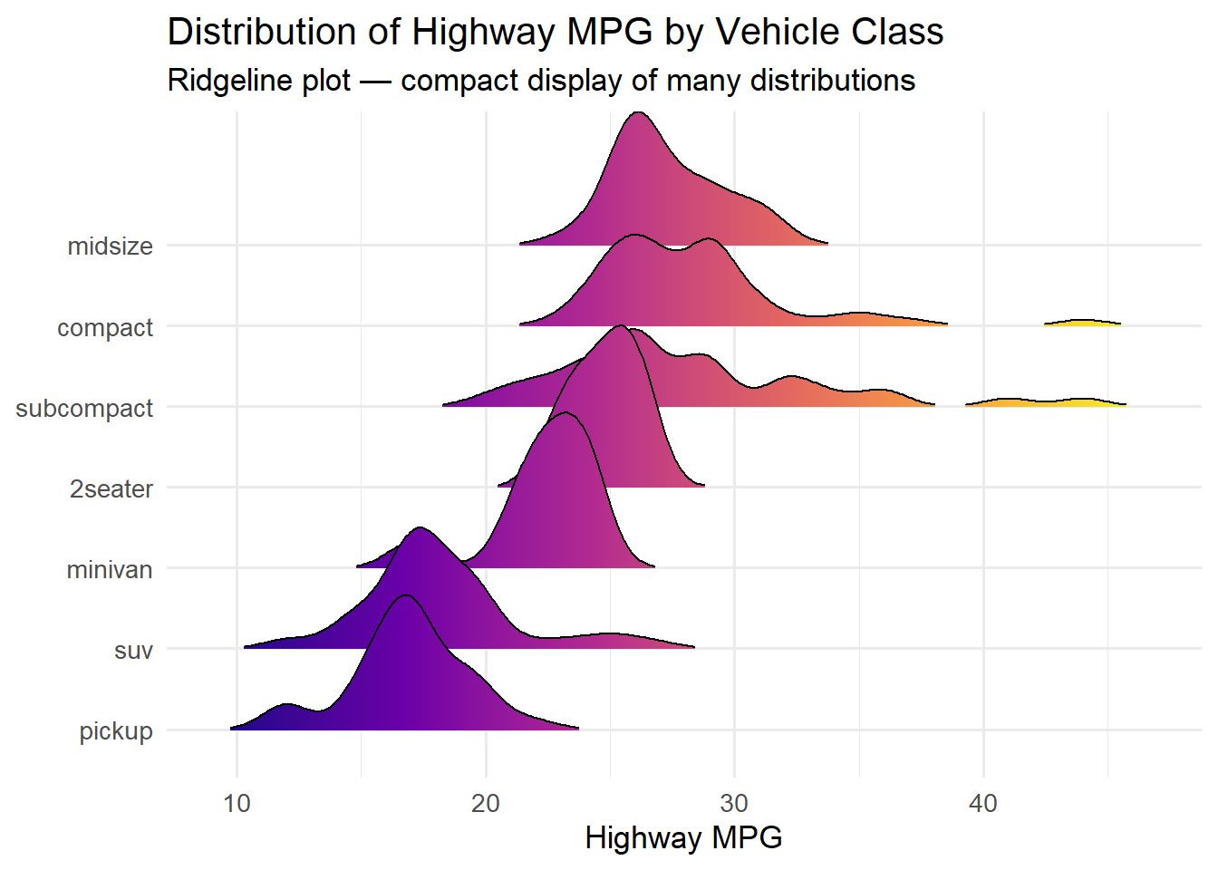
5.7 Ridgeline Plots (Joy Plots)
Ridgeline plots display the distribution of a variable across multiple groups, stacked vertically with slight overlap. They are one of the most visually striking chart types in the ggplot2 ecosystem, and they are remarkably effective at revealing distributional differences.
The name “joy plot” comes from the iconic cover of Joy Division’s Unknown Pleasures album, which featured a similar stacked-ridge visualization of radio pulsar data.
Code
ggplot(mpg, aes(x = hwy, y =fct_reorder(class, hwy, .fun = median), fill =after_stat(x))) +geom_density_ridges_gradient(scale =2, rel_min_height =0.01) +scale_fill_viridis_c(option ="plasma") +labs(title ="Distribution of Highway MPG by Vehicle Class",subtitle ="Ridgeline plot — compact display of many distributions",x ="Highway MPG", y =NULL) +theme_minimal(base_size =13) +theme(legend.position ="none")
Picking joint bandwidth of 0.966
The scale parameter controls how much the ridges overlap. A value of 2 means each ridge can extend up to twice the allocated row height. The rel_min_height parameter trims the tails to avoid distracting wisps at the edges.
The gradient fill using after_stat(x) maps the x-axis value to a color, reinforcing the positional encoding with a color encoding. This is a form of redundant encoding – using two visual channels for the same variable – which can improve readability.
When to use ridgeline plots: They work best when you have 5–15 groups and want to compare the full shape of each distribution. With fewer groups, consider overlapping density plots or faceted histograms. With more groups, the overlap becomes too dense to read.
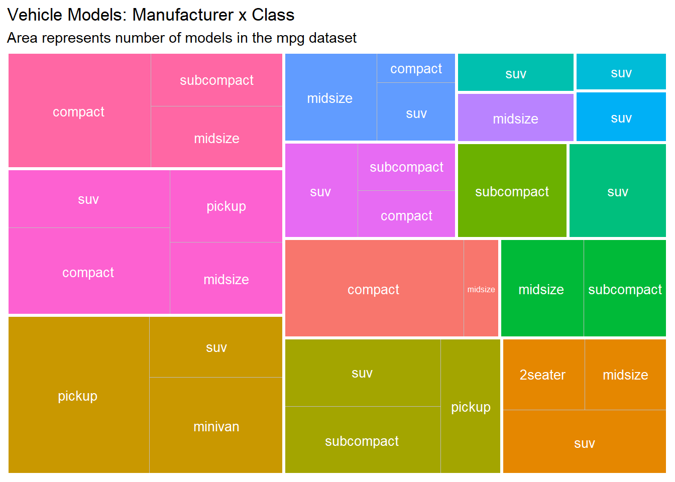
5.8 Treemaps
Treemaps display hierarchical or part-to-whole relationships using nested rectangles. The area of each rectangle is proportional to a quantitative variable, making treemaps an effective way to show composition and relative size simultaneously.
Treemaps are particularly useful when you have two levels of hierarchy (e.g., manufacturer and class, or department and team) and want to show how subcategories contribute to larger groups.
Code
mpg %>%count(manufacturer, class) %>%ggplot(aes(area = n, fill = manufacturer, subgroup = manufacturer, label = class)) +geom_treemap() +geom_treemap_text(color ="white", place ="centre", size =10) +geom_treemap_subgroup_border(color ="white", size =3) +labs(title ="Vehicle Models: Manufacturer x Class",subtitle ="Area represents number of models in the mpg dataset") +theme(legend.position ="none")
The treemapify package provides ggplot2-compatible geoms for treemaps. geom_treemap() draws the filled rectangles, geom_treemap_text() adds labels inside each rectangle, and geom_treemap_subgroup_border() draws thicker borders around the top-level grouping (manufacturer) to make the hierarchy visible.
Tip
Treemaps vs. pie charts: Both show composition, but treemaps are far more effective because we can judge rectangular areas more accurately than circular arc lengths. Treemaps also scale to many more categories and support nested hierarchies.
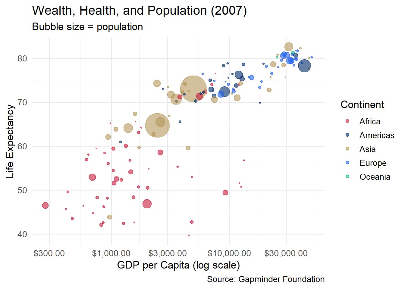
5.9 Bubble Charts
A bubble chart is a scatterplot where a third variable controls the size of each point. When done well, bubble charts can pack an impressive amount of information into a single graphic. The most famous example is Hans Rosling’s Gapminder visualization of global health and wealth.
Code
gapminder %>%filter(year ==2007) %>%ggplot(aes(x = gdpPercap, y = lifeExp, size = pop, color = continent)) +geom_point(alpha =0.6) +scale_x_log10(labels = scales::dollar_format()) +scale_size_area(max_size =15, guide ="none") +scale_color_manual(values =c("Africa"="#C41E3A", "Americas"="#002967","Asia"="#B4975A", "Europe"="#2563eb", "Oceania"="#10b981")) +labs(title ="Wealth, Health, and Population (2007)",subtitle ="Bubble size = population",x ="GDP per Capita (log scale)", y ="Life Expectancy",color ="Continent",caption ="Source: Gapminder Foundation") +theme_minimal(base_size =13)
Several design decisions make this chart work:
Log scale on x-axis: GDP per capita has an extremely skewed distribution. A log scale spreads the data out so that both poor and rich countries are visible.
scale_size_area(): This ensures that the area (not the radius) of each bubble is proportional to the population, which is the perceptually correct mapping.
Alpha transparency: With many overlapping bubbles, transparency prevents large countries from completely obscuring small ones.
Color by continent: This adds a fourth variable, creating a chart that encodes GDP, life expectancy, population, and continent in a single view.
Caution with bubble charts: Do not use more than one size variable. Human perception of area is imprecise, so bubble charts work best when the size variable is used for rough comparisons (“China is much bigger than Norway”) rather than precise readings. If you need precision, use a different encoding.
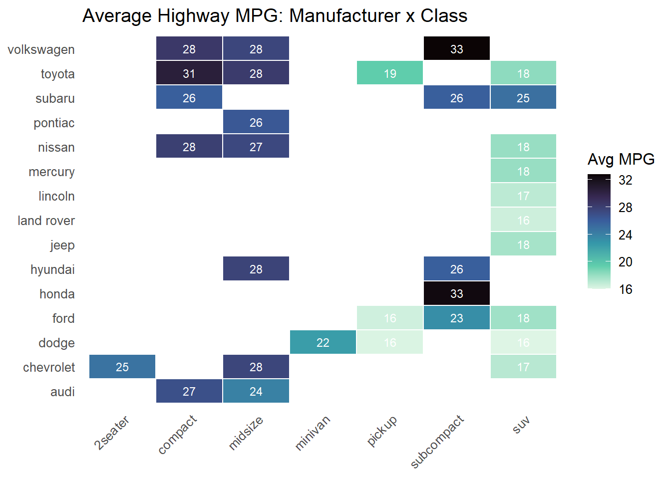
5.10 Heatmaps
Heatmaps use color intensity to represent values in a matrix. They are excellent for spotting patterns, clusters, and outliers in data that has two categorical dimensions and one quantitative dimension.
Code
mpg %>%group_by(manufacturer, class) %>%summarise(avg_hwy =mean(hwy), .groups ="drop") %>%ggplot(aes(x = class, y = manufacturer, fill = avg_hwy)) +geom_tile(color ="white", linewidth =0.5) +geom_text(aes(label =round(avg_hwy, 0)), size =3, color ="white") +scale_fill_viridis_c(option ="mako", direction =-1, na.value ="#f1f5f9") +labs(title ="Average Highway MPG: Manufacturer x Class",fill ="Avg MPG", x =NULL, y =NULL) +theme_minimal(base_size =12) +theme(axis.text.x =element_text(angle =45, hjust =1),panel.grid =element_blank())
Key elements of a good heatmap:
White borders between tiles create visual separation and prevent colors from blending together.
Text labels inside tiles let readers extract exact values, compensating for the imprecision of color perception.
A sequential color scale (like viridis “mako”) maps low values to light colors and high values to dark (or vice versa). Avoid rainbow color scales, which create false perceptual boundaries.
Missing data handling with na.value ensures that empty cells are visually distinct from low-value cells.
The pattern of missing tiles (where no manufacturer makes a vehicle in that class) is itself informative – it reveals the market segmentation strategy of each brand.
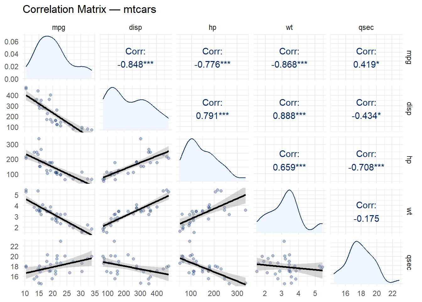
5.11 Correlation Matrices
A correlation matrix visualizes the pairwise relationships between all numeric variables in a dataset. The GGally package provides ggpairs(), which creates a matrix of scatterplots, correlation coefficients, and density curves in a single call.
Code
mtcars %>%select(mpg, disp, hp, wt, qsec) %>%ggpairs(upper =list(continuous =wrap("cor", color ="#002967")),lower =list(continuous =wrap("smooth", alpha =0.3, color ="#002967")),diag =list(continuous =wrap("densityDiag", fill ="#eff6ff", color ="#002967")) ) +labs(title ="Correlation Matrix — mtcars") +theme_minimal(base_size =11)
Lower triangle: Scatterplots with smoothed trend lines (visual relationships)
Diagonal: Density plots (individual distributions)
This layout is efficient because the upper and lower triangles are mirror images – they show the same pairs, just in different forms. Together, they give you both the number and the shape of each relationship.
Tip
Reading correlations: Look for the strongest relationships first. In the mtcars data, wt and mpg have a strong negative correlation (heavier cars get worse mileage), while disp and hp have a strong positive correlation (bigger engines tend to be more powerful). These are exactly the patterns you would expect from domain knowledge, which is reassuring.
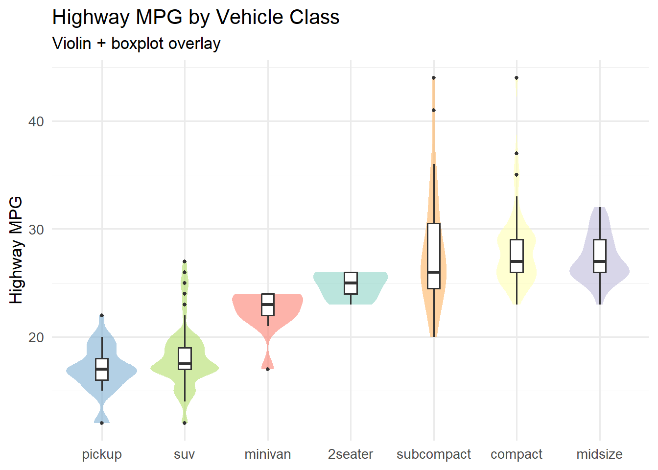
5.12 Violin Plots
Violin plots combine the summary statistics of a boxplot with the distributional shape of a density plot. The “violin” shape shows where the data is concentrated, while the embedded boxplot marks the median and interquartile range.
Code
ggplot(mpg, aes(x =fct_reorder(class, hwy, .fun = median), y = hwy, fill = class)) +geom_violin(alpha =0.6, color =NA) +geom_boxplot(width =0.15, fill ="white", outlier.size =1) +scale_fill_brewer(palette ="Set3") +labs(title ="Highway MPG by Vehicle Class",subtitle ="Violin + boxplot overlay",x =NULL, y ="Highway MPG") +theme_minimal(base_size =13) +theme(legend.position ="none")
The combination of violin and boxplot is more informative than either alone:
The violin shows whether the distribution is unimodal, bimodal, or skewed – information that a boxplot hides entirely.
The boxplot adds precise reference points (median, quartiles) that are difficult to read from a density shape alone.
Notice that we set color = NA on the violin to remove the outline and fill = "white" on the boxplot so it sits cleanly inside the violin shape.
5.13 A Decision Framework
When you are faced with a new dataset and need to choose a chart type, work through these questions:
“What is my primary question?”
I want to…
Consider these chart types
Compare values across groups
Bar chart, lollipop chart, dumbbell chart
Show a distribution
Histogram, density plot, violin, ridgeline
Show a relationship
Scatterplot, bubble chart, heatmap
Show composition / parts-whole
Stacked bar chart, treemap, waffle chart
Show change over time
Line chart, area chart, sparkline
“How many categories do I have?”
2–5 categories: Almost any chart type works
6–15 categories: Lollipop, ridgeline, and heatmaps handle this range well
15+ categories: Consider filtering, grouping, or using small multiples
“Who is my audience?”
General public: Stick to familiar types (bar, line, scatter)
Technical audience: You can use more specialized types (ridgeline, correlogram, treemap)
Decision makers: Prioritize clarity and annotate key takeaways directly on the chart
The “one more chart” rule: If you have time, always try at least one alternative chart type for your data. You may discover that a different encoding reveals a pattern you missed. Visualization is an iterative process.
5.14 Ethical Reflection
Note
Using Skills in Service of Others – Chart Choice as an Act of Service
Choosing the right chart type is not merely a technical skill – it is an act of service to your audience. When you select a visualization that clearly communicates a pattern, you empower others to understand and act. When you choose a chart that obscures or misleads, you fail in that responsibility.
Respecting the humanity behind data means considering your audience’s background, literacy, and needs. A ridgeline plot may be beautiful and information-rich, but if your audience has never seen one before, a simpler chart with careful annotation may serve them better. The goal is not to showcase your technical skills but to illuminate truth.
The wrong chart can mislead; the right one illuminates. As you practice building different chart types in this chapter, ask yourself: Am I choosing this chart because it serves my audience, or because it looks impressive? The answer to that question is the difference between decoration and communication.
5.15 Challenge: Chart Matchmaker
🎮 Chart Matchmaker — The right chart for the right question
If the app takes a few seconds to load on first visit, that is normal — the server is waking up.
How to Play:
Enter your name and click Start Game
Each round presents a business question and data description
Select the best chart type from the grid of 7 options
Complete all 10 rounds, then review your completion report
5.16 Exercises
Chapter 4 Exercises
Exercise 1: Lollipop Chart with Gapminder
Using the gapminder package, filter the data to the year 2007 and a single continent of your choice. Create a lollipop chart showing life expectancy by country, sorted from highest to lowest. Use dark navy (#002967) for the dots and a light gray for the stems. Add a meaningful title and subtitle.
The xend in geom_segment() should be the same variable mapped to the x-axis.
The yend should be the same variable mapped to the y-axis.
dark navy is #002967.
Exercise 2: Ridgeline Plot of Diamond Prices
Using the built-in diamonds dataset, create a ridgeline plot showing the distribution of price by cut quality. Use fct_reorder() to sort the cuts by median price. Experiment with the scale parameter and choose a color palette that works well.
The x aesthetic should be the variable whose distribution you want to show (price).
The first argument to fct_reorder() is the factor variable (cut), and the second is the numeric variable to sort by (price).
Try scale values between 1.5 and 3 to see how the overlap changes.
Viridis options include "magma", "plasma", "inferno", "viridis", and "mako".
Exercise 3: Dumbbell Chart – Before and After
Using the gapminder dataset, compare life expectancy in 1952 vs. 2007 for countries in the Americas. Create a dumbbell chart that shows both values for each country, connected by a line. Use accent red (#C41E3A) for 1952 and dark navy (#002967) for 2007.
Fill in the blanks:
Code
library(gapminder)dumbbell_americas <- gapminder %>%filter(continent =="Americas", year %in%c(___, ___)) %>%select(country, year, lifeExp) %>%pivot_wider(names_from = year, values_from = lifeExp,names_prefix ="year_") %>%mutate(country =fct_reorder(country, ___))ggplot(dumbbell_americas) +geom_segment(aes(x = year_1952, xend = ___, y = country, yend = ___),color ="#94a3b8", linewidth =1.2) +geom_point(aes(x = ___, y = country), color ="#C41E3A", size =3) +geom_point(aes(x = ___, y = country), color ="#002967", size =3) +labs(title ="___",subtitle ="Red = 1952 | Navy = 2007",x ="Life Expectancy (years)", y =NULL) +theme_minimal(base_size =12)
Hints:
Sort countries by their 2007 life expectancy (year_2007) for a clean visual ordering.
The xend in geom_segment() should be year_2007.
The first geom_point() maps x to the 1952 column; the second maps x to the 2007 column.
Exercise 4: Heatmap of mtcars Correlations
Compute the correlation matrix for the numeric columns in mtcars, then reshape it into a long format suitable for geom_tile(). Create a heatmap of the correlations with text labels inside each tile. Use a diverging color scale (e.g., blue for negative, white for zero, red for positive).
The fill aesthetic and the label value both use the correlation column.
For scale_fill_gradient2(), a natural choice is low = "#002967" (navy for negative), mid = "white", and high = "#C41E3A" (red for positive).
Consider adding panel.grid = element_blank() to remove grid lines behind the tiles.
Exercise 5: Three Charts, One Dataset
Choose a dataset and a question. Then create three different chart types that attempt to answer the same question. For example, if your question is “How does highway MPG vary by vehicle class?”, you might create a boxplot, a violin plot, and a ridgeline plot.
For each chart, write 2–3 sentences explaining what the chart reveals and what it hides. Then write a brief paragraph (4–5 sentences) arguing which of the three is the most effective for your specific question and audience. There is no single right answer – the point is to practice evaluating trade-offs.
Here is a starter template to get you going:
Code
library(tidyverse)# Choose your dataset and question:# Dataset: ___# Question: "How does ___ vary by ___?"# Chart 1: ___# (your code here)# Chart 2: ___# (your code here)# Chart 3: ___# (your code here)
Write your comparison paragraph below each chart in your R Markdown document.
5.17 Attributions
This book material draws on and is inspired by the work of many scholars and practitioners:
Vivek H. Patil – foundational design and materials for data visualization
Wilke, C.O. – Fundamentals of Data Visualization (O’Reilly, 2019), Chapters 6–12
Healy, K. – Data Visualization: A Practical Introduction (Princeton University Press, 2018)
Wickham, H. – ggplot2: Elegant Graphics for Data Analysis (Springer, 3rd edition)
Schwabish, J. (2014). “An Economist’s Guide to Visualizing Data.” Journal of Economic Perspectives, 28(1), 209–234.